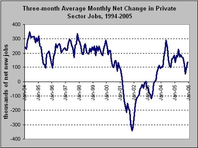
Net New Jobs in the Private Sector - three month moving average - 1994-2005

Long Term
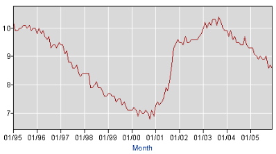 %
%The Want Work Percentage. This number includes those who want a job but who are not classified as "unemployed" by the BLS. It also includes those working part time who want full-time employment.
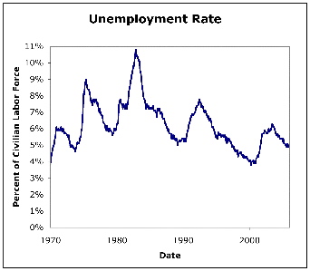
Thirty five years of the unemployment percentage
 .
.Comparing Seasonally Adjusted numbers to raw numbers for the unemployment percentage.
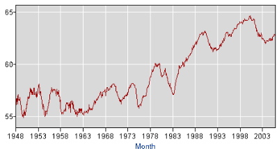
The Employment Population Ratio
 The last three years of the unemployment rate
This is a continuation of the previous two posts.
The earliest post, How A Journalist Should Cover The Economy ... made a series of six graphs available through 6 separate links. This coverage gave a lot more perspective to the employment situation than many writers on the subject who only discussed the trends at work with words - a poor substitute in the world of trends.
The previous post, The Scarcest Resource: Our Time helped you to navigate to the middle of a single web page where a series of 7 graphs were physically near each other and viewable by paging up and down or scrolling rather than by linking.
In this post, we continue our experiment by placing these seven into a single post - giving each one a very brief commentary.
Please let us know which method works best for you.
Please compare the ease of use and time required to get the full picture from this approach.
What obvious deficiency jumps right out when you see these all so close to each other? Hint: what would Tufte say?
No comments:
Post a Comment