The initial starting belief of this Change Over Time blog is that if you want to change the world, the best approach is to build better tools and then learn how to harness their power.
Peter Drucker tells us that FOCUS is the key to success and we follow his advice with a focus on timelines and trend data that tracks the areas of our lives that are most important to us. A key to unlocking the meaning of these data is a continuing search for the tools and methods and principles that best help us analyze, visualize, report and discuss our findings. We are on the lookout for tools that simplify, clarify, and especially those that save us time as we share our findings and collaborate with expert and non-expert alike. We wish to discover what the data means for us in our lives and what actional steps we might take for making the world a better place.
Why do we focus on trends and timelines?
First: Timeline data is often widely available for a substantical collection of key measures in every area of human interest. We are simply overflowing with such data. Where it is not available, it appears almost always possible to create a new data collector that will gather the missing metrics.
Second: Our observation is that most of the time, the available data is not put to its best use as key principles that would guarantee success are openly violated. Lots of opportunity appears within easy reach.
Third: In one domain after another, we have been establishing and documenting proof that substantial improvements in how we use trend data are already available or well within our reach by following a straightforward set of rules and principles and we can point to a growing number of examples on the web that show these approaches in action.
Fourth: In some cases, the existing work makes collaboration (especially between expert and non-expert) somewhat easier, but the collaboration aspect of making best use of trend data does not seem to have been actively explored. I believe that a handful of principles and standard practices can help us learn how to collaborate better by at least an order of magnitude. As we do so, we will advance towards having better and better control for shaping the future and achieving our fondest dreams.
Limited examples of how to use trend data more powerfully are popping up on the web. One of our goals on this blog is to find these examples of excellent practice. We want to use these best practices as models for what is possible if the underlying principles were applied to other domains and trend data collections. For example, we gave some examples drawn from the St Louis Federal Reserve Bank's interactive trending capabilitites named FRED. Other examples can be found at The Big Picture , the Bureau of Labor Statistics, Bureau of Justice Statistics , and Professor Pollkatz .
Here are the TimeLine Collaboration Principles that I believe are going to prove most important to the goal of this blog of making the best use of trend data. We have already discussed some of these in previous posts and will be preparing additional posts for these principles to explain the logic behind them in greater detail.
1. Share the data series with the chart. Make sure it is readily reausable
2. Multi-dimensionality is key
3. Data set includes entire time range even if chart doesn't
4. Explain how calculated quantities were obtained
5. Make sure the explanatory text is in close physical proximity to the trend chart
6. Data + Charts + Text creates a full package that encourages further conversation
7. Ask the expert in the subject matter domain: What are the most important factors?
8. Then, make sure you measure and record and create a timeline history of every one of these
9. If you have the most important factors, you'll find charts with but a single variable still tell a powerful story
10. Make sure the Axes and Titles and other text graphics are easily readable
Monday, August 28, 2006
Sunday, August 27, 2006
Housing Starts & Housing Sales for Single Family
Housing has been in the news this week. These 10 year charts of single family housing starts and housing sales give a good picture of the recent reversal seen in housing.


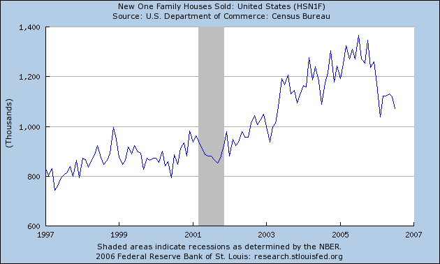
Source: FRED's Household Sector Category from the St. Louis Federal Reserve.
Household Credit Market Debt - Year over Year % change

Here is another worthwhile chart from the FRED household category.
This is the 20 year chart showing the year over year percentage increase in Household Credit Market Debt.
The year over year increase is now about 12% following a mostly upward trend beginning back around 1992 when the annual percent increase was about 5%. This is still well below the rates seen in the mid 1980s.
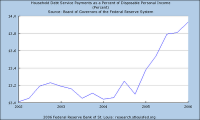
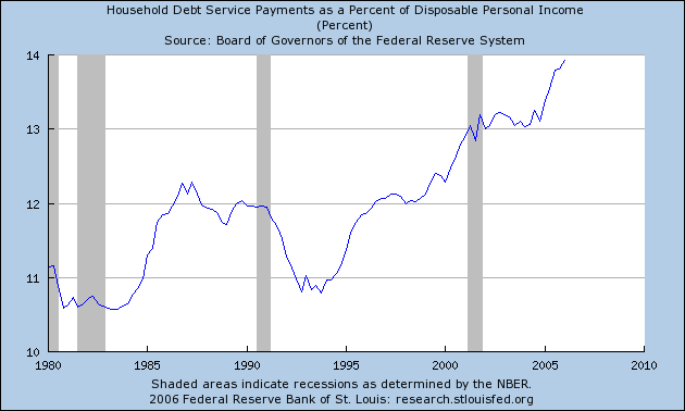
Household Debt Payments as a percent of Disposable Income
Here are three view of Household Debt Service Payments as a percent of Disposable Income created from the FRED site of the St Louis Federal Reserve. You can look at this metric and other related household metrics at: Fred's Household Sector Page.
The first view is the 5 year view. This was pretty flat for 3 years, then showed a sharp upswing at the end of 2004.
The second chart shows the 25+ year view going back to 1980. Notice the upsweep from 1992 to the present (Q1 2006).
The first view is the 5 year view. This was pretty flat for 3 years, then showed a sharp upswing at the end of 2004.

The second chart shows the 25+ year view going back to 1980. Notice the upsweep from 1992 to the present (Q1 2006).
The third is the 10 year chart shows more clearly both the upsweep and 3 year pause.
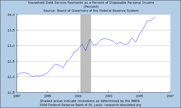
I find these charts give an eye-opening view of a what has been a non-HEADLINE factor that may prove important in how our current economic situation evolves. How much debt can the US public sustain before there begins to be some push back? The more debt service, the smaller the remaining disposable income to deal with the twin factors of rising gas prices and inflation in general and stagnant real median wage.
What do you think?
Trend Watching with FRED - First Impressions
I have just started working with FRED and find it amazingly helpful and powerful and a cut above other economics related database engines out on the web that I have used in the past.
Here are some of my first observations and impressions.
a) I experienced quite high performance and rapid response time as I selected each option such as changing from 5 year view to 10 year view. I noticed consistently better response time than I have experienced with most other web db engines.
b) I loved how they had pulled trend series from many different sources and make them all available in one place. They currently are tracking over 3,000 different series from a dozen or more primary sources in a wide variety of categories.
C) the FRED graphing engine has a new feature which gives it the ability to plot a second series so it can be compared with the one you are looking at. The default option is to show these two series with a dual Y axis representation which often helps make relationships between two factors more visible. The option to plot both series on the same scale is also available and is sometimes preferable. The rapid response to shift between views makes features such as these even more valuable.
D) With a single mouse click, you can get the trend for the metric you have chosen updated for three different standard time frames of 5 years, 10 years, or max years. Similarly, you can switch between the raw data metric value and other representations such as Year over Year Percentage Change with a single click. If you click the two previous links, you will see the CPI raw data which is not very interesting and the YoY % which is much more reveailing. Sometimes these transformations reveal previously hidden and important detail. Coupled with the fast response these single click options proved very helpful at grasping both the big picture and rich detail of each factor examined. The general design of the FRED user interface provides many other options with single mouse click options. For me, this meant that it radically speeded up the time required for analysis and also improved understanding.
F) If you find a trend metric that you want to examine in more detail , FRED makes make it easy to view or download the raw data. I haven't done much with this feature yet, but it will surely prove valuable for future work.
G) the description of the each metric at the bottom of the html page is very helpful for gaining a basic understanding of unfamiliar metrics and pointing you back to the original source of the data and further documentation.
H) If you create a personal account with the St. Louis Fed, you gain the ability to create your own personalized data lists of your favorite metrics drawn from their collection of 3000+. This looks like it will prove to be a big time-saver going forward. I have only "played" with this so far, but I see this aiding my future interactions as it will let me quickly drill down to the metrics I have judged most important. The end result will be faster navigation with fewer many fewer key strokes.
K) Once you have a data list created, you can download all the data for the metrics on your list. A really handy feature of this capability is what FRED describes as "cross tabulation". If your list has many metrics that report on the same time frequency, all of these metrics will end up in a single spreadsheet page, making future work with this set of trends much simpler and saving huge amounts of time compared to the situation when each trend is downloaded separately as seems to be the (unfortunate) standard for other web db engines I have worked with.
So, bottom line, FRED looks like it is a top notch resource for anyone interested in digging beyond the Headline Numbers by watching a multi-dimensional set of trends change over time and trying to understand their meaning and importance.
I expect I will be using FRED as one of my primary sources in the coming months.
FRED - Federal Reserve Economic Data
Thanks to several references from Barry Ritholz' at his blog The Big Picture, I learned of the great trend watching work that the St. Louis Federal Reserve Bank is posting on the web site including their monthly report on National Economic Trends.
One of the things I liked especially about the National Economic Trends publication is the way it pulled key metrics together from many different economic data sources and put them all in one place. What this means is that important trends that might only have been observed by a handful of experts are readily made available to non experts who previously didn't even know of their existence. I personally found some of the charts eye opening including the ones showing household debt service and household financial obligations as a percentage of disposable income.
I also liked their clean trend graphics and the frequent use they made of showing quite long time series going back 25 years or more.
Over the weekend, I discovered and began experimenting with their excellent database and trending engine that is available free online at FRED - Federal Reserve Economic Data. My first impressions are that this is going to be a terrific resource for anyone who wishes to grasp a multi-dimensional view of what's happening economically in the US and around the world.
If you haven't already tried it out, you will be pleasantly surprised.
I'll have more to say about some of its excellent features and capabilities in future posts.
Saturday, August 26, 2006
How does a project get to be a year late?
Fred Brooks in his classic book The Mythical Man Month asks and answers this famous question (how does a project get to be a year late? ) with "One day at at a time."
The parallel question for this blog is why did it take 8 months of silence before posting this entry and the answer turns out to be the same: One day at a time.
If I decided to create the trend line for Post Per Month (PPM) for this blog, it would show a pretty serious and easy to detect square wave drop to Zero for February 2006 through July.
What will happen next ? It's anyone's guess. The issues we were discussing are still vital. The standard accepted methods for presenting trend data about how the most important metrics change over time still fall far short of what's possible with today's technology. The opportunity for better understanding, better communication, better collaboration are all still there.
Time will tell.
Trend watching is still important and there are some people out on the web who are doing a good job these days with presenting trend data in a way that encourages collaboration. Over the past 8 months I have continued to seek out and follow the ways trend data is presented. Some of my favorites sites that I think are doing a good job with trend data these days are The Big Picture, Bureau of Labor Statistics, Pollkatz and the St. Louis Fed.
What are your favorites?
Subscribe to:
Posts (Atom)