In a couple of recent posts, I got my initial heads up about interesting time series charts and related articles from Barry's site but neglected to thank him and link back to him for the leads. These included the post on Dealing with Aggregate Data that showed the Dow for the last five years along with the behavior of the individual stocks included in the Dow, and the post Normalizing Headline Numbers that showed the Standard and Poor Index expressed in ounces of gold.
Thank you Barry.
You can follow these links to see his posts on the Dow and on the S&P. Scroll down through his blog on any given day and you will invariably find some excellent and interesting charts and discussion for your consideration.
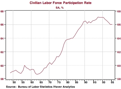
For example, in recent days, he has had some good finds with employment charts from Northern Trust Economic Research that you can view at: Employment Recovery Continues to be Sub-par. These include the one shown below

No comments:
Post a Comment