- The post identifies a key metric (Household Net Worth) that has not received a lot of attention and really looks at that metric all by itself using several alternative views to aid in understanding.
- It includes a long time perspective as well as zoomed in views thereby revealing patterns that would have remained invisible if only a single time span had been chosen.
- The post provides a clear storyline -- sharing with us what Doug was thinking while he looked at these charts and selected them for our edification.
Showing posts with label multiple time intervals. Show all posts
Showing posts with label multiple time intervals. Show all posts
Tuesday, September 20, 2011
Doug Short has an excellent post up today Household Net Worth: The "Real" Story. Check it out. It provides an easy to follow example of some of the principles that we hold most strongly:


Friday, September 16, 2011
A 20 year cumulative view of headline cpi from FRED
Here's another view of the headline CPI number created using some advanced features of FRED (the wonderful St Louis Federal Reserve Economic Data charting program).
The shortest red line shows 11.0 % total inflation over the past 5 years;
the green line shows a total of 27.5% total cpi inflation over the past 10 years;
the brownish line shows 43.9% increase in total inflation over the past 15 years; and
the longest blue lines shows a total increase of inflation of 65.6% over the past 20 years.
If you want to play further with variations to this chart over at FRED or if you want to download the data that was used to create this chart you can use the following link: FRED 20 year cumulative view of cpi
Key take away - except for a little hiccup in 2001 and for a dramatic drop in 2009, headline cpi inflation has increased at a rather steady and substantial rate as can be seen by the readily visible even slope of these trend lines. It also looks like the latest rise over the past year has been bring the cumulative number back previous trend line..
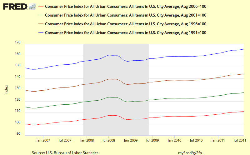 | ||||
| This chart shows the cumulative effect of cpi inflation over the past 5, 10, 15, and 20 years http://research.stlouisfed.org/fredgraph.png?g=2fo |
Update: 20 September 2011
The first key thing that I see in this chart is the relatively steady slopes of the 10, 15, and 20 year cumulative changes in inflation. For example, the blue line (20 year) shows a sharp dip during the most recent recession, but then quickly ramps back to close to the same trend line. Similary for the 15 year (brown line). Even though it is claimed that headline cpi is too volatile, when we deal with cumulative change as shown above, that by itself smooths out almost all the volatility.
What this means is that if we use cumulative data, we do not need to resort to thinking we need to use Core Cpi or other less volatile measures of inflation. We can include energy and food and still get a clear, smooth picture of what's going on and how it might impact real citizen households.
The second thing that is important to note in these charts is the considerable magnitude of the cumulative change for each for these periods (e.g. 27.5% for the past 10 years) as listed below. These changes can be compared with changes in nominal income achieved over similar periods - e.g. for households that fall in different income percentile categories as shown in the recent Census Bureau report: Income, Poverty, and Health Insurance Coverage: 2010 which includes an adjustment for CPI. What we learn from that report is that cumulative changes in income over time are different for different groupings of citizen (e.g. by income level or by race). This in turn leads to differential impacts of changes in cumulative inflation on each groups. In the most recent 20 year periods, some groups have been advancing their standard of living while other groups have seen their standard of living reduced.
We plan to discuss the Census Bureau report and work up some of these figures in more detail in future posts.
The shortest red line shows 11.0 % total inflation over the past 5 years;
the green line shows a total of 27.5% total cpi inflation over the past 10 years;
the brownish line shows 43.9% increase in total inflation over the past 15 years; and
the longest blue lines shows a total increase of inflation of 65.6% over the past 20 years.
If you want to play further with variations to this chart over at FRED or if you want to download the data that was used to create this chart you can use the following link: FRED 20 year cumulative view of cpi
Key take away - except for a little hiccup in 2001 and for a dramatic drop in 2009, headline cpi inflation has increased at a rather steady and substantial rate as can be seen by the readily visible even slope of these trend lines. It also looks like the latest rise over the past year has been bring the cumulative number back previous trend line..
Thursday, September 15, 2011
Calculated Risk's view of CPI
Bill McBride of the always excellent Calculated Risk blog has now weighed in with his approach to the latest CPI figures with his post on Key Measures of Inflation increase in August
Bill includes both the BLS CPI number and the Cleveland Fed's median cpi and trimmed mean cpi (alternative measures of core inflation). Key take away is
Adding new variation to the preceding CPI charts, the Calculated Risk cpi chart covers the almost 22 year period from January 1990. All three representations of core inflation are tracking close to each other over the past year but have shown larger differences in the past.
From today's series of CPI posts, we now have 5 different views of CPI
What do you see?
What else do we need to look at?
How else must we transform the underlying CPI metrics to reveal even more important insights?
And recalling a recent post (Creating the context for successful analyses), what's the context for looking at this data in the first place. One place to start might be to take a look at the interesting link to the Cleveland Fed that Bill McBride provided in his post: Measuring Inflation.
Bill includes both the BLS CPI number and the Cleveland Fed's median cpi and trimmed mean cpi (alternative measures of core inflation). Key take away is
"On a year-over-year basis, these measures of inflation are increasing, and are near the Fed's target."
Adding new variation to the preceding CPI charts, the Calculated Risk cpi chart covers the almost 22 year period from January 1990. All three representations of core inflation are tracking close to each other over the past year but have shown larger differences in the past.
 |
| http://cr4re.com/charts/charts.html?CPI#category=CPI&chart=InflationAugust2011.jpg
Update: 20 September 2011
From this chart, the uptick over the past year for all three measures looks quite sharp and of course we cannot tell what it will do next.
On the other hand, this 21+ year view also shows a clear downtrend in all three measures.which doesn't add up with my personal feelings about actual changes in inflation over that period of time. Remember from one of our previous charts, when we look at Headline CPI, we do not see a similar downward slope.
Of course, none of these measures directly shows the longer term cumulative impacts inflation and all three rule out aspects of inflation that actually impact ordinary citizens to end up with values that surely seem to be less than what American households really experiencing. My view is that these specialized metrics are at best a distraction from the main event: the cumulative inflation impact on each separate interesting sub-component of cpi. .
|

- A year over year view from the BLS news release showing just the past 12 months for just headline CPI
- An almost 12 year view of year over year inflation from Doug Short showing both headline and core cpi
- An almost 22 year view of year over year inflation from Calculated Risk showing three different metrics that reflect core inflation
- A 54+ year view of year over year inflation from Doug Short showing both headline and core cpi metrics
- The cumulative effect of inflation since the year 2000 broken down by categories such as energy, health care, and college tuition.
What do you see?
What else do we need to look at?
How else must we transform the underlying CPI metrics to reveal even more important insights?
And recalling a recent post (Creating the context for successful analyses), what's the context for looking at this data in the first place. One place to start might be to take a look at the interesting link to the Cleveland Fed that Bill McBride provided in his post: Measuring Inflation.
A Unique View of CPI from Doug Short
If you want to look at charts that help you understand what's going on in our economy, Doug Short's Updates is a great place to start. His charts are crisp, clear, concise and easy to understand and he provides a wide multidimensional view of many potentially inter-related metrics all launching from his Update landing page.
Here is one of his charts that gives a unique view to the CPI data that I have not seen expressed elsewhere and is worthy of emulation and further extension..
In the previous two posts, we showed year over year data which is a traditional and well respected method for smoothing out the month to month variability. But as we all know, inflation is cumulative and so it makes sense to look at year over 2 years, year over 5 years, or year over 10 years changes and compare those to how our earning power has changed over that time period. E.g. for those on fixed income in retirement, the longer view translates more directly to the degree to which inflation will impact their lives. A 4 percent difference over the year will have a small effect. A 35% change over 10 years will have a huge impact for anyone whose income is not keeping up.
Doug's breakdown of the component changes is also highly revealing.
Here is one of his charts that gives a unique view to the CPI data that I have not seen expressed elsewhere and is worthy of emulation and further extension..
 |
| http://advisorperspectives.com/dshort/charts/inflation/headline-core-comps.html?inflation-since-2000.gif |

Doug's breakdown of the component changes is also highly revealing.
UPDATE 20 September 2011 at 3:00 PM
Of all the published charts I found online covering the latest release of CPI for August 2011, I found this chart from Doug Short to be by far the most valuable & useful by itself, while inspiring further questions encouraging the viewer to dig deeper. The big advantages of this chart compared to the others are that
- it shows the cumulative impact of inflation over an almost 12 year period
- it breaks down the overall cpi effects into a series of selected and interesting sub-components which show a wide range of cumulative change during this time period.
- it reveals Doug's thinking about which of the subcomponents he things might be the most important to pay closer attention to (Energy, Medical Care, and Tuition)
- And with a little thought it lets us get a hint about how the average headline cpi cumulative increase of 34.2% came about from a weighted average of the three (left most) componentss: a core cpi reading of 26.3% an energy reading of 124% and a food reading of 37.7%. To me this showed up the weakness of focusing on either the headline cpi number or the core cpi number whether by themselves or even when combined becasue doing so leaves the cumulative impact of energy and food invisible to the viewer.
For me, this chart inspired me to dig deeper because it was crystal clear that headline cpi value cannot be understood unless you get a feel for its key components while looking at the cumulative change. This letter eventually to the series of cumulative cpi charts we created in our subsequent posts:
A 20 year cumulative view of headline cpi from FRED - showing cumulative readings of headline CPI by itself for 5, 10, 15, and 20 years periods
Drilling down into CPI 20 year trends - showing a set of interesting sub-components and their 5-20 year cumulative history
Taking a longer view of CPI trends
Doug Short has now posted some longer views of the Consumer Price Index CPI to complement those published by the Bureau of Labor Statistics (BLS). This provides additional context to help us think about what the latest numbers mean.
Here's his view of the data since 2000 with the shaded area from 1.75% to 2.00% representing the Core (CPI less food and energy) target rate for the Federal Reserve.
And here's Doug's really long view since 1957.
Here's his view of the data since 2000 with the shaded area from 1.75% to 2.00% representing the Core (CPI less food and energy) target rate for the Federal Reserve.
 |
| http://advisorperspectives.com/dshort/charts/inflation/headline-core-comps.html?CPI-headline-core-since-2000.gif |

UPDATE 20 September 2011
With the benefit of this 12 year view, we can now put the 1 year view from BLS into better perspective. For example, we can see the headline value of 3.7% (in red) is now back up into it's 2004-2007 range following a 2 step process which looks like a reversion to mean process. Will it overshoot? we can't tell? We also see that the CORE CPI (in blue) looks like it is reverting to the mean of the past 12 years. And here's Doug's really long view since 1957.
 |
| http://advisorperspectives.com/dshort/charts/inflation/headline-core-comps.html?CPI-headline-core.gif |

UPDATE 20 September 2011
In this much longer view, some further nuances come into view including the obvious 3 peaks of inflation in 1970, 1975, and 1980, the much lower inflation rates from 1960 to 1965. We can also see how the Headline CPI and the Core CPI are more likely to diverge from each other after 1985. We also see the CORE rate showing a steady decline since 1990 that was not matched by the Headline CPI.
Doug also has some charts showing the PCE (Personal Consumption Expenditure) Index and the Core PCE Index as shown below since 2000.:
 |
| http://advisorperspectives.com/dshort/updates/CPI-Headline-and-Core.php |
Check out Doug's original post for additional details.
We will keep our eyes open for other alternatives view of these metrics that get posted today.
Thursday, August 25, 2011
Showing a key metric with multiple views: a nice example
Bill McBride's Calculated Risk blog has some crisp charts showing the latest new unemployment claims. The main chart shows this key metric since January 2000.

A second chart shows the same metric going all the way back to January 1971.

Both charts use a 4 week moving average to smooth out the more erratic week to week behavior. Bill's use of a dual chart approach helps present a much more complete picture of this important metric that puts recent behavior in context. Of course, even his "short" period is almost 11 years long so doesn't suffer from the common weakness of plotting too few data points.
Additional employment related charts showing other metrics and other views can be found in the Employment tab of Calculated Risk's Graph Gallery. Bill is prolific and posts some of the best looking, most unique charts related to economics and finance. Check out his gallery for yourself. You won't be disappointed
Despite these two excellent charts, one weakness I see in Calculated Risk's presentation of this important unemployment metric is that the verbal storytelling is weak. Bill's charts have potential explanatory power with important stories to tell, especially combined with the other charts in the Employment tab of the gallery, but these stories are left mostly as an exercise for the viewer.
In the blog post, the "story" told is mostly quotes from the dull boilerplate in the Department of Labor's UNEMPLOYMENT INSURANCE WEEKLY CLAIMS REPORT. This text discusses this metric with a very short term focus of only the preceding 4 weeks.
A second weakness is that the reporting (like almost all other reporting on the subject) only talks about and shows charts for this one Headline Initial Claims metric from the report while other complementary metrics are shunted aside. For example, some key missing metrics that are mentioned in the DOL report and whose short and long term time series charts could help us better understand the unemployment situation include:
Do you know of others posting on the initial claims number who are crafting more complete stories than the standard laid down by the DOL report?


A second chart shows the same metric going all the way back to January 1971.


Both charts use a 4 week moving average to smooth out the more erratic week to week behavior. Bill's use of a dual chart approach helps present a much more complete picture of this important metric that puts recent behavior in context. Of course, even his "short" period is almost 11 years long so doesn't suffer from the common weakness of plotting too few data points.
Additional employment related charts showing other metrics and other views can be found in the Employment tab of Calculated Risk's Graph Gallery. Bill is prolific and posts some of the best looking, most unique charts related to economics and finance. Check out his gallery for yourself. You won't be disappointed
Despite these two excellent charts, one weakness I see in Calculated Risk's presentation of this important unemployment metric is that the verbal storytelling is weak. Bill's charts have potential explanatory power with important stories to tell, especially combined with the other charts in the Employment tab of the gallery, but these stories are left mostly as an exercise for the viewer.
In the blog post, the "story" told is mostly quotes from the dull boilerplate in the Department of Labor's UNEMPLOYMENT INSURANCE WEEKLY CLAIMS REPORT. This text discusses this metric with a very short term focus of only the preceding 4 weeks.
A second weakness is that the reporting (like almost all other reporting on the subject) only talks about and shows charts for this one Headline Initial Claims metric from the report while other complementary metrics are shunted aside. For example, some key missing metrics that are mentioned in the DOL report and whose short and long term time series charts could help us better understand the unemployment situation include:
- insured unemployment rate - the percentage of "covered" workers collecting regular state benefits
- insured unemployment - the number of people currently collecting regular state benefits
- total persons claiming benefits in all programs
- total persons unemployed
- percentage of total unemployed who are collecting benefits in all programs
- total unemployed who are NOT collecting benefits
- headline unemployment percentage
- employment population ratio
- participation rate
- number of workers who are part time for economic reasons
- number unemployed for over 26 weeks
- number unemployed for over 26 weeks as percentage of civilian labor force
Do you know of others posting on the initial claims number who are crafting more complete stories than the standard laid down by the DOL report?
Subscribe to:
Posts (Atom)