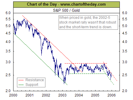
www.chartoftheday.com offers a free weekly chart. Their offering for December 30th, 2005 is a particularly nice example of the concept of using normalization to reveal otherwise hidden details. In this case, reproduced here, they have taken the Headline Standard & Poor index and divided it by the price of an ounce of gold.
The picture is a lot different than if you look at the S & P behavior by itself.
Other possible normalizations that might reveal more of what is going on include dividing the S & P by the price of a barrel of oil, or by the number of dollars it takes to purcahse one euro. Similar graphs can be drawn for the DOW and the NASDAQ.
No comments:
Post a Comment