Over the at Professor Mike Thoma's Economist's View, I have discovered a literal treasure trove of recent timeline graphics. My hat is off to Professor Thoma.
You can find this great assemblage at: Economist's View: Graphs.
Warning, this web page is about 8 MB and can take a while to load even on a high speed link.
However, if you are interested in seeing a wide range of examples of the ways different contributors on the web use graphics to present their points of view, this is a great place to start. Professor Thoma has included links back to the original postings where these graphs appeared to sites such as Angry Bear, Calculated Risk, Economist's View, Brad DeLong, Macroblog, New Economist, Econbrowser, The Big Picture, and Prudent Investor.
In total, there are over 300 pictures showing some of the most important metrics that impact our lives. For this collection, it's pretty clear than some bloggers are making good use of timeline graphics, can everyone else be far behind?
I plan on commenting on some of the best graphics in future post.
Thank you, Professor Thoma.
Sunday, July 31, 2005
Timelines on the Web - Part V - Employment
Econbrowser: How many people should be working in America?
Professor James D. Hamilton's Econbrowser blog often provides excellent examples of the use of timelines to add to explanatory power and to promote conversation and collaboration around issues in our lives that affect us greatly.
His post a week ago on the recent scene regarding the employment situation in the U.S. is an excellent example of the ways that skillful use of time series graphics can add to the conversation and encourage further constructive conversation. [By the way, I call this TimeLine Collaboration (TLC) and one of the primary goals of this blog is encourage wider use of time series data in exactly this way.]
The trigger for the Econbrowser post was a Policy Brief written by Katherine Bradbury of The Federal Reserve Bank of Boston. Ms. Bradbury's brief is itself an excellent example of how best to make use of time series graphics to provide depth, breadth and insight to a complex topic.
Here's an example of one of her excellent and easily readable charts.
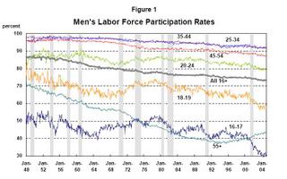
I plan to discuss her full document in more detail in a later post.
For now, I would like to focus on why I find Professor Hamilton's post on this subject so useful and helpful.
First, the post leads off with 9 links to others who have been commenting on the policy brief. This is really helpful for someone new joining the conversation.
Second, complementing the many excellent graphics in the policy brief, Professor Hamilton teases out three new time series graphs to dig deeper into the more subtle aspects of the question at hand. The graphs punctuate and support the arguments he makes with words. And the graphs themselves are easily readable and clear and quickly tell their story.
Here's one example where he draws out a single series from the policy brief figure 1 to help bring it more to our attention:
Professor James D. Hamilton's Econbrowser blog often provides excellent examples of the use of timelines to add to explanatory power and to promote conversation and collaboration around issues in our lives that affect us greatly.
His post a week ago on the recent scene regarding the employment situation in the U.S. is an excellent example of the ways that skillful use of time series graphics can add to the conversation and encourage further constructive conversation. [By the way, I call this TimeLine Collaboration (TLC) and one of the primary goals of this blog is encourage wider use of time series data in exactly this way.]
The trigger for the Econbrowser post was a Policy Brief written by Katherine Bradbury of The Federal Reserve Bank of Boston. Ms. Bradbury's brief is itself an excellent example of how best to make use of time series graphics to provide depth, breadth and insight to a complex topic.
Here's an example of one of her excellent and easily readable charts.
I plan to discuss her full document in more detail in a later post.
For now, I would like to focus on why I find Professor Hamilton's post on this subject so useful and helpful.
First, the post leads off with 9 links to others who have been commenting on the policy brief. This is really helpful for someone new joining the conversation.
"When Brad DeLong, Paul Krugman, Angry Bear, Economist's View, William Polley, VodkaPundit, The Big Picture, Lifelike Pundits, and Reading the World (among others)
all tell me to look at this policy brief by Katharine Bradbury, then, ok, I'll have a look at it."
Second, complementing the many excellent graphics in the policy brief, Professor Hamilton teases out three new time series graphs to dig deeper into the more subtle aspects of the question at hand. The graphs punctuate and support the arguments he makes with words. And the graphs themselves are easily readable and clear and quickly tell their story.
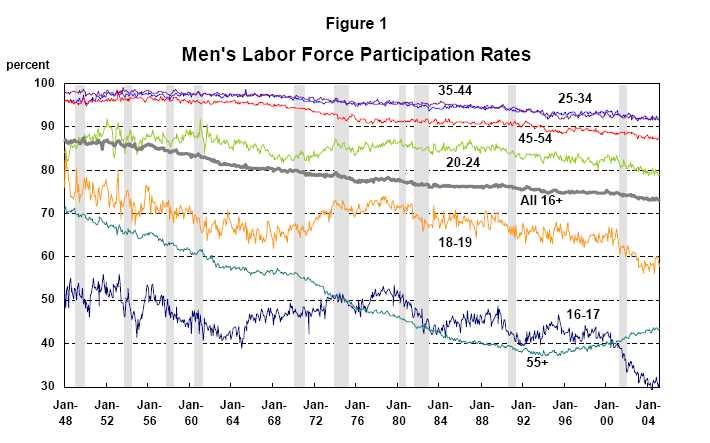
Here's one example where he draws out a single series from the policy brief figure 1 to help bring it more to our attention:
Note: I would have preferred to see this graph scaling from about 80 to 100 (rather than 40 to 100) on the Y axis to help visualize the trend more clearly. With a different Y axis scaling, the eye would be able to zoom in and detect trending over interesting sub-periods (e.g. the past 5 years). Right now, that kind of information is rather hard to read directly from this chart.
Professor Hamilton's blog directly includes timeline graphics with much greater frequency than many of the other popular economics blogs on the web. For example in following the 9 links for those who commented on the policy brief (and following further links from these 9) , embedded time series graphics were few and far between.
The text at these links was commenting on important metric after important metric and on their relationship, but it was the norm that there was nary a picture to clarify and reinforce the words. What a pity.
My view is that the inclusion of more pictures like those in the original policy brief and like those in Professor Hamilton's post will promote more and better conversations and understanding.
My open question to those who comment so regularly on matters economic is
I cannot imagine these economic experts coming to their conclusions or formulating the gist of their analyses in words without actually having looked at the time series that best inform the question at hand. When they show us their conclusions without at least showing us a few key pieces of the data upon which these conclusions were made, how does an impartial observer evaluate their work?WHY SO FEW GRAPHS?
In fact, how can evaluation of any theories or hypotheses or explanations offered by these economics experts even be possible without looking at some of the data?
Since our own time is often the scarcest resource that determines what gets done and what doesn't, the lack of supporting charts in these posts (where the chief content is interpretation in the trends) effectively rules out proper evaluation in most cases.
What's left is whether we TRUST the writer or not. Not a good recipe for communication, collaboration and learning together about the things that matter most.
We will return to questions such as these in future posts.
Saturday, July 30, 2005
Timelines on the Web - Part IV - Iraq Electricity

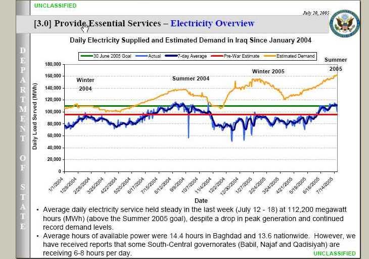
Here's the situation in Iraq with Electricity Demand and Current Generating Capacity.
It comes from the Iraq Weekly Status Report dated July 20, 2005 at: http://www.defendamerica.mil/downloads/Iraq-WeeklyUpdate-20050720.pdf
The image there will be clearer than the one I have included with this post. Check out the whole document which includes some other informative time series graphs on building a solid foundation for progress in Iraq.
What other metrics would we need to look at if we were to have a good feel and understanding for what is happening on the ground in Iraq?
COMMENTARY
I find the electricity chart to be clear and readable and readily understandable. What would make this data even more interesting would be to see what these same metrics looked like going back to 1980. Then, we could put the current demand and output in better perspective.
How does this report compare with what we are seeing on the Evening News?
Timelines on the Web - Part III - Criminal Justice
Key Crime & Justice Facts at a Glance
Here's a useful example of how a very complex domain of interest (Criminal Justice) can be represented as a series of time series pictures that highlight some of the important factors at work.
http://www.ojp.usdoj.gov/bjs/pub/pdf/charts.pdf
It's a set of 13 attractive and easy to read time series graphs all combined in a single PDF file for easy distribution. This PDF includes information about crime rates, prison populations, expenditures and so on.
DETAILS
This particular example includes factors such as:
1. violent crimes committed
2. violent crimes reported
3. arrests for violent crimes
4. property crime rates
5. crime rate by gender of victim
6. drug abuse violations by adults
7. drug abuse violations by juveniles
8. the homicide rate per 100,000 population
9. rape rates per 1,000 persons over 12 years old
10. violent crime by perceived age of offender
11. homicide by age of victim
12. correctional populations by jail, parole, prison, and probation
13. state prison population by offense type
14. prisoners on death row
15. executions
16. direct expenditures by level of government
Back at the Department of Justice, Bureau of Justice Statistics web site, at http://www.ojp.usdoj.gov/bjs/dtdata.htm you can find all these important metrics and literally thousands more.
For example, you can download a CSV file on reported crime from http://bjsdata.ojp.usdoj.gov/dataonline/Search/Crime/State/DownCrimeStatebyState.cfm/CrimeStatebyState.csv
COMMENTARY
While these pictures don't tell you everything you might ever want to know, they certainly are more than sufficient to begin an interesting and useful conversation about the trends in the area of Criminal Justice.
The domains of interest that most impact our lives are often complex and can only be understood by examining all of the most important factors in some detail to see how each of these changes over time. This particular presentation is in my opinion an excellent example of how to begin a conversation on these important topics.
As an alternative way to skillfully jump start a conversation, the related web page at: http://www.ojp.usdoj.gov/bjs/glance.htm provides a slightly larger set of charts in thumbnail format.
The thumbnails can be clicked through larger size image and some background infomration on that set of metrics. The larger size image can in turn be clicked through to see the underlying data.
The "At A Glance' page has the added bonus of providing a brief, 25 word or less statement about each thumbnail graph to help put it into context. E.g. "Serious violent crime levels declined since 1993."
All in all, I find this an excellent example and a skillful approach to presenting a complex subject. An ordinary person with no special expertise in Criminal Justice, Statistics, or Programming but moderately proficient at browsing the web can quickly become informed about the top level trends in Criminal Justice in the United States. And if time and interest permit, that same person can use that web site as a jumping off place for further in depth investigations.
ATTRACTIVE VISUAL FEATURES
Returning to the PDF file, it displayed a number of attractive visual featues that made this series of graphs much easier to read, interpret and digest.
A. The scales on the X and Y axis were extremely easy to read
B. For graphs with multiple series, they were very clearly labeled by attaching the text near the timeline trend which made it easy to figure out which series was which.
C. The number of metrics shown on a single graph was kept to reasonably small number (maximum of 4) which also added to readability. Colors were chosen so each metric was readily distinguishable.
D. Many, but not all, of the graphs used the same date range (1973-2001).
E. The individual graphs frequently included a detailed caption at the bottom that added to the total understanding.
F. Font size all around was very readable on a laptop screen, even when the window was reduced to 1/3 the size of the screen.
WHAT MIGHT HAVE MADE THESE EVEN BETTER
1. Providing a URL in each case that pointed to the source data
2. Organizing the sequence so all the charts covering the same time period were together
3. Including a 25 word or less comment in a prominent position similar to the ones that appear with the thumbnails on the AT A GLANCE page.
4. Having data that is more up to date. This is the most serious flaw in the data available on the PDF and on the AT A GLANCE page. The thumbnails show data through 2003, while the PDF only goes to 2001. If you are interested in Criminal Justice, you probably want to know what happened in 2004 and even in the first 6 months of 2005.
5. Some of these metrics might benefit from being observable as a monthly time series in addition to the the yearly view.
LATE DATA & EARLY WARNING SYSTEMS
Late data can be a serious impediment to proper understanding, especially if you are considering making decisions or interventions today based on the available data. By definition, when data is late, early warning goes out the window. The technology exists today to make this kind of data available in near real time, but in many real world cases, we are finding that really important data is unbelievably late.
We will return to this problem of late data later posts with some ideas on how to best deal with it.
Professor Pollkatz Speaks
Here's some more insight and clarity from Professor Pollkatz who we mentioned in an earlier post.
Check out page 6 of his "Footnotes" PDF where he defends his "fair use" right to use Gallup polling data in creating some uniquely powerful graphics.
http://www.pollkatz.homestead.com/pollkatzfootnotes02july.pdf
I particularly resonated on the following (emphasis added):
My graphics are informative in a way that mere data is not. The information the graphics provide is priceless, illustrating truths about vital public issues that otherwise might go unobserved and displaying those truths for all to see. Any number of people whose eyes might glaze over at columns of numbers or bar charts can read my graphics and understand their significance. Among other things, this reduces the power of unscrupulous journalists and public figures to “lie with statistics.” The graphics are also put to use, by me and others, to offer commentary and criticism on issues of public importance.
...
My graphics, by setting poll results on the same axes so they can be compared and contrasted, illustrate many things that single graphs would leave obscure. Foremost, depicting all the facts together shows broad trends that the vagaries of sampling hide in a single series. Also, viewers of the graphics can follow the relative position of a single poll organization, and decide for themselves whether that pollster exhibits any consistent biases. Omitting any pollster’s data from the graphic would diminish these values, let alone omitting Gallup, the most prominent pollster of all. It would be akin to leaving some neighborhoods out of a regional telephone directory.
I have compiled the data into a database, myself, from public sources. Converting the data to graphics has involved a considerable amount of programming skill (Microsoft Excel), and the Excel macros may themselves be copyrightable. People have written to me asking for help in doing similar graphics on other topics. By any standard, this qualifies my graphics as derivative works.
COMMENTARY:
For me the text "that otherwise might go unobserved" is the fundamental reason for looking for the best possible way to represent numeric time series data in some creative visual format so that all can see.
When done well, this transformation from eye glaze over data to potent pictures definitely has the power to reduce the ability of the unscrupulous among us from spinning stories that are contrary to the underlying facts.
When done brilliantly and creatively as Professor Pollkatz has done in this one small but important domain, it opens up the possibility of communication, collaboration, and greatly enhanced understanding of the factors that most affect our lives.
While moving in this direction may seem conceptually easy, the behind the scenes mechanics of acquiring the data and making it usable represent a serious impediment to our collective ability to transform the data into socially productive forms. This is exemplified with Professor Polkatz statement that "converting the data to graphics has involved a considerable amount of programming skill".
This is a key challenge not just for Professor Pollkatz' polling data but with time series data representing the most important factors in any domain of interest. There are an astronomical number of publicly available and vital data series. Many of these can be readily downloaded on the web.
For example, there are countless possibilities available from the Department of Labor, Department of Labor Statistics at: http://www.bls.gov/data/home.htm . And this web site makes all the data available and provides some powerful built-in capabilities for looking at individual time series. However, if you want to create a composite graphic that was not already designed into their reporting and graphing engine, you are on your own and the job is likely to be complex and time-consuming.
In subsequent posts, I will be addressing the specific question of the scarcity of our personal time and the complexity of the data. The goal will be to develop and refine a methodology and approach that makes the transformation from complex data to powerful time series graphics easier and easier.
If you want to change the world, build better tools.
Tuesday, July 12, 2005
Timelines on the Web - Part II
The Carpetbagger Report � A Reagan legacy - the world's leading jailer
Here's another excellent time series example recently posted on the web by Professor Ed Stephan. For me, Professor Stephan's timeline graph had immediate and visceral impact that fully supported the text portion of the posting.
The immediately obvious shape tells a powerful story about the dramatic changes that have taken place in the U.S. incarceration rate in the past 30 years. I found the red line data on the rate of prisoners per 100,000 population to be especially striking.
One thing that I like about this posting is that it also includes a direct link to the source data in Excel spreadsheet format. This opens the door to anyone interested to delve more deeply into the underlying Census Bureau data at HS-24: Federal and State Prisoners .
Sharing the data so easily in this way makes the possibility of conversation and collaboration between interested parties just so much more likely. Metaphorically, we might think of this as getting the best of two familiar ideas - a picture is worth a thousand words coupled with a journey of a thousand miles begins with a single step. When shared in this way, the data behind the picture can be come the sustenance for a shared journey by two or more parties leading in the end to deeper understanding.
Professor Stephan's regular guest posts at http://www.thecarpetbaggerreport.com/ frequently offer other good examples of the power of timeline graphics to add to the story or to even tell the story all by themselves.
Monday, July 11, 2005
Timelines on the Web - Part I
Here is a recent timeline example that is well worth studying - a visually rich demonstration combining data from many semi-independent sources to create a powerful composite effect showing the week by week poll popularity of President George W. Bush.
http://www.pollkatz.homestead.com/files/pollkatzmainGRAPHICS_8911_image001.gif
Compare the richness of Professor Pollkatz' graphics with the traditional ways polling information is shared with us -- typically as a single data point from a single poll - completely divorced and cut off from any history or context.
So, for example, our ABC evening news might tell us that the popularity rating in late June was 48% in their most recent poll. Think about how much more can be discerned with the Pollkatz graphic that lets us examine all the other recent poll numbers and the evolving pattern over the preceding weeks and months.
You can find some more of the time-series work of Professor Pollkatz (Professor Stuart Eugene Thiel of Depaul University) at:
http://www.pollkatz.homestead.com/
Check out his Approval/Disapproval Spread chart. It's an excellent example of the power of deriving new and revealing time series by arithmetically recombining other time series - in this case calculating the SPREAD by subtracting the DISAPPROVAL value from APPROVAL value.
Subscribe to:
Comments (Atom)