Tuesday, December 21, 2004
Buried Time Series Data on Employment
Here's today's latest Bureau of Labor Statistics report on Regional and State Employment and Unemployment. BLS Regional & State Employment Nov 2004
These reports on based on detailed time series covering many, many variables. Unfortunately, any trends taking place are buried deeply and hidden from view. This 16 page report does not have a single time series chart to show the trends that may or may not be underway. For those who are not faint of heart and love looking at complex tabular data and have lots of time, there are several detailed tables that contain partial time series data for review. There are also a couple of hard to read geographical charts showing current state by state changes in the past 12 months (a implicit time series with only 2 data points).
For those with the time and interest and high speed links and skills, the full time-series can be downloaded, massaged, and analyzed. For the rest of us, we are left with inconclusive text such as the opening summary paragraph:
REGIONAL AND STATE EMPLOYMENT AND UNEMPLOYMENT: NOVEMBER 2004
Regional and state unemployment rates were generally little changed in November. All four regions and 47 states and the District of Columbia recorded changes in their jobless rates of 0.3 percentage point or less from October, the Bureau of Labor Statistics of the U.S. Department of Labor reported today. Over the year, jobless rates declined in all four regions and in 42 states. The national unemployment rate was essentially unchanged over the month at 5.4 percent in November. Nonfarm payroll employment increased in 35 states and the District of Columbia over the month.
This seems to be saying that everything is ok and maybe even good without actually coming out and saying it. The statistics they quote would seem to imply that not much of interest is happening in the regions or the states, that there has been some improvement in the past year (but compared to what), and that employment has grown (but not by how much or compared to anything).
The Economic Policy Institute (EPI) Job Watch takes a look at the same data and comes up with something a lot shorter and a little more user friendly as you can see at: EPI JobWatch: State data and organizations. They also look like they are trying to dig out more interesting facts from the same data, all with a strong point of view that says things really aren't going very well.
Take a look at both of these and see what you think. Who's right? Who's wrong? Who offers more food for thought? Who challenges the reader with more provocative claims?
In neither case, are any of the time series available for easy viewing, so the reader is left depending on the opposing expert writers who prepared these documents or going to a lot of time and trouble trying to actually look at the real data.
Both approaches use what amounts to time-series with exactly two data points and avoid showing us any of the data collected between these two points, or any prior to the earliest points.
Neither leaves me particularly satisfied. Who do I trust when the experts disagree so widely and the data is not readily available?
I would really like to know how our country is doing and what is happening with employment. Are we moving towards a time when we can create enough jobs to keep up with growth in working age population? This is a topic addressed by EPI but completely off the radar in the BLS report.
The EPI main page at: JobWatch does indeed use some time-series to make their points and this is an improvement in my eyes. Still the reader is left mostly dependent on who do they trust when the data reported is so limited.
Finally, take a look at the White House Jobs and Economic Growth: "The State of Our Economy" for yet another way to assess the employment situation. Notice the absence of time series data, and the use of carefully selected two point time series described in words.
Examining cases such as these in near real time, can be instructive in triggering our thinking about how important information can be communicated in a way that gives the reader, viewer, or listener a better chance of judging the facts for themsleves.
Saturday, December 18, 2004
Which View is Correct?
Looking at the Dow Jones Industrial Average through the lens of these different view can be confusing at first. Which view is correct? Why do they look so different? What are they trying to tell me?
This is the time series visual equivalent of the blind men and the elephant story. Each view tell a different part of the story, literally from a different view point. Each view is only part of "THE TRUTH" of the matter. It's up to us to use these visualizations of behavior over time, to help craft a story that is consistent with each different viewpoint and helps tie them together.
Different observers will bring different experience and knowledge about other parts of the world to the table when reviewing these pictures and will as a result craft different stories.
The beauty of the visualized time series approach is that it opens up the possibility for us to sit down together, to view the series together, to share our explanations and stories with each other, to learn from one another. As this process unfolds as we sit side by side in either physical space or virtual space, the doors are open to collaboration. The opportunities are there for us to develop a new and better stories, to bring new facts and time series into the picture, and to develop new ground for common understanding and common action.
Which view is correct? They all are. It's up to us to fit them together.
Where do we go from here? Here's a beginning
The Dow is only a single measure of financial behavior. Even with only a single metric, we have so many choices.
1) we see we can look at it's raw value as reported on the nightly news completely out of context of its life history.
2) we can look at it's behavior over 5 years or 20 years, or for that matter for 1 year, for 1 month, for 1 week, for 1 day, or for 1 hour. Each of these zoomed in or zoomed out views will give us perspective about what's happening.
3) we can normalize its value in terms of some other metric such as the value of the dollar vs. the euro.
4) we could also normalize it terms of inflation as we commonly do with some other metrics such as Gross Domestic Product or Average wages
5) And we can bring into play one or two or a hundred other important measures of financial behavior such as GDP, Wages, Unemployment, interest rates, trade balances, national debt, other currencies vs. the dollar. And each of these can have its own zoomed or unzoomed values, and its own variants and formulaic calculations.
Then our job is to sit with the question we have in mind, to wander through a subset of the combinatoric number of pictures we might view, to construct and share our stories with others who are interested in the same question and who are willing to examine the corpus of data.
The possibility for this kind of TimeLine Collaboration, yet another "TLC", is the thesis of this Blog site.
In the financial sphere, especially in the stock market and other financial markets, the ability for ordinary citizens to wander the visualized time series space of possibilities is quite far advanced. We can learn a lot by seeing what common web sites such as http://www.prophet.net/ offer to those interested in the time series behavior of their favorite stocks.
The value of time series visualization and collaboration is not restricted to the stock market. In any areas of our lives that are important to us, there are essential measures that change over time. Making these measures and their changing ebb and flow readily accessible and visible to ordinary citizens can make a huge difference in our ability to control our own destiny and to shape the future of our dreams.
The challenge for us: Once we move outside the stock market arena, the ability for ordinary people to have access to and to visualize the important time series that exert powerful influences on their lives is reduced almost to zero.
One of the on-going missions of this Blog is radically alter the landscape, to make more and more of the vital time series available to more and more people, to make these series available in a readily reusable and visual form, and to foster collaboration, shared story telling, discussion, learning, and all the fruits that can follow from opening our eyes to the time series (mostly invisible) that are flowing all around us at every moment of our lives
Note: The source of the recent charts of the Dow Jones averages, currency markets and the like is TradeStation.
Monday, December 13, 2004
Dow Jones - A 20 Year View
Changing the time scale makes a big difference in the look and feel of a time-series chart. Here's what the Dow Industrials look like over the past 20 years.
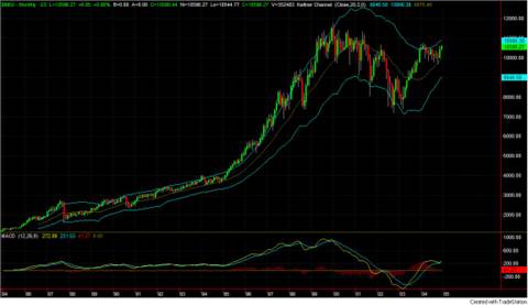
Dow Jones - 20 Year View
Compare this to the 5 year view at: http://photos1.blogger.com/img/165/2326/1024/DowJonesAvg5year.jpg or to the the 5 year view normalized and denominated in Euros at: http://photos1.blogger.com/img/165/2326/1024/DOWperEURO5yearsWeekly.jpg. Each tells a different story.
Dow Jones - 20 Year View
Compare this to the 5 year view at: http://photos1.blogger.com/img/165/2326/1024/DowJonesAvg5year.jpg or to the the 5 year view normalized and denominated in Euros at: http://photos1.blogger.com/img/165/2326/1024/DOWperEURO5yearsWeekly.jpg. Each tells a different story.
Sunday, December 5, 2004
Five Year Views
The set of graphs posted today shows some more key financial variables as they changed over the past 5 years. We'll be commenting on these in more detail in future posts. For now, take a look at these and see what you think they mean. For each picture, you can click to get a larger image where the scales are more readable. What else would you like to see? What is missing?
Enjoy
Enjoy


Saturday, December 4, 2004
Describing pictures with words. No easy task.
Here is the opening of the latest from the US Bureau of Labor regarding the employement situation in the USA. This is a good example of how difficult it is to describe important time series in words. So much is hidden when you do it this way.
Employment Situation Summary: "
In the PDF version, they do show graphs of two key metrics, covering 3 years. Clearly not the whole story. The rest of the document is filled with tables. Lots of good data, for those with the time, patience and interest, but still leaving out a giant swath of the underlying time series and forcing the readers to create the timeline visualizatoins in own heads (if at all).
Employment Situation Summary: "
THE EMPLOYMENT SITUATION: NOVEMBER 2004"
Employment rose in November, and the unemployment rate, at 5.4 percent, was essentially unchanged, the Bureau of Labor Statistics of the U.S. Department of Labor reported today. Nonfarm payroll employment increased by 112,000 over the month, with job gains in several service-providing industries.
Unemployment (Household Survey Data)
Both the number of unemployed persons, 8.0 million, and the unemployment rate, 5.4 percent, were about unchanged in November. The jobless rate has been either 5.4 or 5.5 percent in each month since July. This is slightly below the rates that prevailed in the first half of 2004.
In November, the unemployment rates for the major worker groups--adult men (4.9 percent), adult women (4.8 percent), teenagers (16.6 percent), whites (4.7 percent), blacks (10.8 percent), and Hispanics or Latinos (6.7 percent)--showed little or no change over the month. The unemployment rate for Asians was 4.2 percent in November, not seasonally adjusted. (See tables A-1, A-2, and A-3.)
In the PDF version, they do show graphs of two key metrics, covering 3 years. Clearly not the whole story. The rest of the document is filled with tables. Lots of good data, for those with the time, patience and interest, but still leaving out a giant swath of the underlying time series and forcing the readers to create the timeline visualizatoins in own heads (if at all).

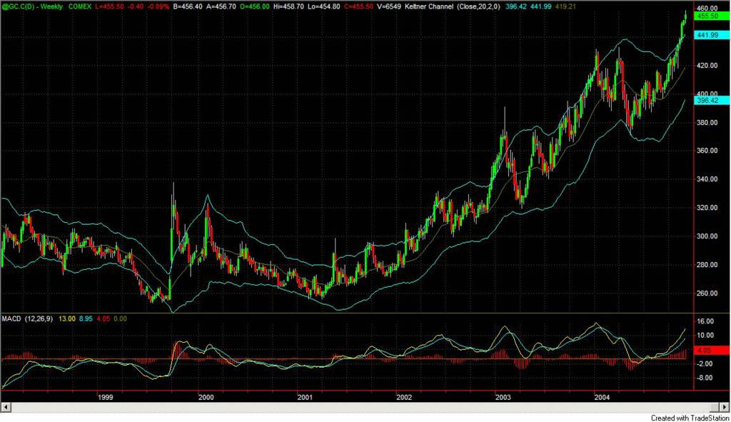
Dow Jones Industrial Average over the past 5 years. (Please CLICK for Full Size Image). This time series picture (denominated in its default of US Dollars) is in marked contrast to the view of the same average denominated in Euros posted earlier today. This picture makes it seem that the Dow has recovered to close to 1999 through 2001 high values. This chart shows a very strong rise from January 2003 through December 2003, a slow drop off during 2004, with a recent sharp rise. Which view is "right"? My sense is that both of these charts have value and help fill in part of the picture. What else do you want to look at after seeing these two charts?

The Dow Jones Industrial Average Denominated in Euros over the past 5 years. Reached a high of 13,000 in 2000 and then again in 2001. Recoverd to a high of 12,000 in 2002 (post 9/11). Then the bottom fell out and it dropped to below 8000 in early 2003. It recovered to around 8,500 later int 2003 and has been stuck there ever since with the most recent behavior showing a decline to the 8,000 range.
Saturday, November 13, 2004
The Power of Simple Timeline Graphics
Here's a simple timeline graph showing only a single variable, the value of home equity as percentage of total home value. It clearly shows the declining trend in this factor over the past 50+ years
Contrast the clarity of this picture to the graphics in the previous post.
The trend since 1985 makes me wish I could see the past 20 years view. A 10 year view and a 5 year view might provide even more insights.
If you were interested in home ownership, what else would you want to look at? If you find this picture useful, you would likely want to see such things as the trends for:
- Average Home Equity in Today's Dollars
- Average Home Value in Today's Dollars
- Home ownership percentage (but dislayed showing labels on the axes)
- Mortgage rates
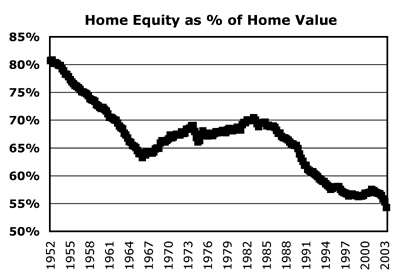
Home Equity Compared to Home Value
Incomplete Graphics
This pair of graphs is an example of timeline use that could benefit from the addition of numeric values for the Y axis. Simply commenting a few data points with their values makes this harder to interpret.
I apologize for not having the reference to the source of this pair of charts. It's unclear why the average mortgage rate for the second chart is missing for the first half of the time period.
It would be great to see this data with labelled Y axes for the past 15 years when there have been dramatic changes in both of these important factors.
One other point these two graphs raise is the choice of minimum and maximum values for the Y axis. Two common alternatives are a) to chose the minimum and maximum values show in the covered time period, and b) to use a minimum value of zero. These charts will have a much different feel if the second choice had been selected.
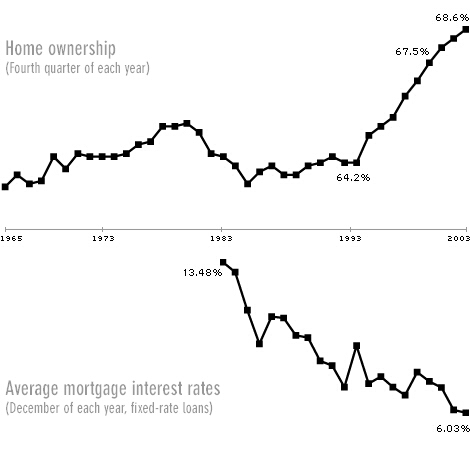
Home Ownership & Mortgage Rates
Friday, November 12, 2004
Alternative View of Unemployment
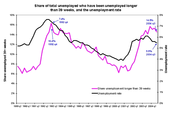
EPI Long Term Unemployment Past 15 Years
This is a common example of timeline use - charting two time series together using different scales (Y Axes) for each series. The Economic Policy Institute (EPI http://www.epinet.org/) often makes use of time series graphics to illustrate the points they are making.
For more information about this particular graphic, check out: http://www.epinet.org/content.cfm/webfeatures_snapshots_11102004 .
Joining a relatively simple graphic as the one above, and a detailed text explanation is a powerful combination that lets the reader/viewer evaluate the claims against the easily visible data in the chart. Contrast this verbal/graphic/numeric combination of evidence with claims that are made only in words. You may or may not agree with what EPI has to say, but at least for the data presented, you don't have to take their word for it. You can see for yourself.
For example, with the data above, if someone had said: "over the past year of economic recovery as measure by growth in GDP, the percentage of the unemployed who have been out of work for more than 39 weeks has stayed close to its 15 year high and is about twice as high as it was four years ago", you could visually inspect the chart and validate or invalidate the claim yourself by eye and by rough approximation. If you had the actual data series numerically (e.g. in an Excel spreadsheet), you could check out these claims precisely.
Without the graphical representation, you would be dependent on your source. Not only that, the whole pattern of change of unemployment over the past 15 year (such as the long period of steady reduction from 1992 to 2000) and the way that these two factors roughly track with each other would be lost.
What do you think after reviewing this graph and the accompanying EPI text? What did they miss? What other factors should be considered? Do their statements extract the essence from the graphics and help viewers understand the situation better? How would you have described this situation?
Contrast the EPI approach in their posting with the recent Bureau of Labor Statistics (BLS) report on unemployment: http://www.bls.gov/news.release/pdf/empsit.pdf which contains a pair of graphs covering trends over the past 3 years.
Or consider the BLS text and table only report of this same information at: http://www.bls.gov/news.release/empsit.nr0.htm . Consider in particular the opening text paragraphs:
THE EMPLOYMENT SITUATION: OCTOBER 2004
Nonfarm payroll employment increased by 337,000 in October, and the unemployment rate was about unchanged at 5.5 percent, the Bureau of Labor Statistics of the U.S. Department of Labor reported today. Construction employment rose sharply over the month, and several service-providing industries also added jobs.
Unemployment (Household Survey Data) Both the number of unemployed persons, 8.1 million, and the unemployment rate, 5.5 percent, were essentially unchanged from September to October. The jobless rate has held fairly steady thus far this year and remains below its most recent high of 6.3 percent in June 2003.
How much would you really understand about unemployment if this was all you were given - text only with no numbers and no graphs and the choice of emphasis and comparison left in the hands of the presenter?
Time scale is very important. The view of unemployment in a 3 year graph (BLS) looks a lot different from the 15 year EPI graph. Neither one of them is "right". Each of them reveals some details and hides others. Understanding trends in full depends on being able to look at a range of time scales and a range of factors. We will be returning to this theme in later posts.
Finally consider one more way that unemployment data could be presented by checking out this entry at The Heritage Foundation which includes many time series graphs and much textual explanation. http://www.heritage.org/Research/Economy/wm582.cfm
You may or may not agree with the conclusions of this document but each statement can be checked against the graphics shown. There are many graphs including both a 25 year and a 15 year view of the unemployment rate which adds further perspective to the charts discussed above.
Putting EPI, BLS and The Heritage Foundation together, what do you think? What else do you need to know? What other factors? What other timescales?
Thursday, November 11, 2004
Hidden Time Series Data - A Basic Example
In every area of our lives, there will be factors whose changing behavior over time directly influences what we experience.
For a simple example, let's consider someone who invests in the stock market. Every day on the car ride home, the evening news will report on the progress of the Dow Jones Industrial Average (DJIA) and the Nasdaq Average. Possible statements might be:
For a simple example, let's consider someone who invests in the stock market. Every day on the car ride home, the evening news will report on the progress of the Dow Jones Industrial Average (DJIA) and the Nasdaq Average. Possible statements might be:
- the Dow was up by 84.36 points (or 0.81%) today to 10,469.84
- the Nasdaq rose today by 26.71 points (or 1.31%) to 2,061.27
The statements might also be simplified or abbreviated to statements such as:
- the Dow was up by over 84 points today
- the Dow rose today to 10,469
- the Nasdaq was up 1.3% today
- the market rose today for the 3rd day in a row for a net gain so far this week of 1.7%
Anyone who has gone to a stock market charting web page such as Big Charts
http://bigcharts.marketwatch.com/default.asp?siteid=&avatar=seen&dist=ctbc
will of course find a lot more interesting information about how these two indices changed over the course of the day in small side by side time series graphics. Clicking on the DJIA graphic reveals the one year roller coaster history of this average as it has varied between approximately 9,600 and 10,800 (as of 2004 November 11).
The net effect of the most common media reports is to hide most of the potentially important information about how these indices have changed over time. If any patterns are visible in the data, you certainly won't be able to see them if all you know is that the Dow was up 84 points for the day.
If you care about what's happening in the markets, and you think that the Dow or Nasdaq can provide helpful insights for your investing decisions, radically limited data presentations such as the ones that are common on the evening news and that restrict themselves to what happened in the last day, are no help at all and can be dangerously misleading.
Lucky for our hypothetical investor, when it comes to markets, all the time series are all dutifully collected, archived, and available (often for free) to the interested investor who is willing to invest some time. Our investor could look at the detail of today's behavior of the Dow (rising steadily during the day on November 11), or use the various on-line tools to view the past week, month, year, or even 10 year period for this index.
In other important areas of our lives, the same approach turns out to be just as important, but may prove to be a lot more difficult to achieve - a topic we will delve into with future posts.
Even in the stock market case where the time series are widely available, the over emphasis and focus on the Dow and Nasdaq may steer our investor away from paying sufficient attention to other important factors such as the value of the dollar vs the euro, the trends shown by the leading economic indicators, changes in treasury bond rates, and so on.
A question we will tackle in future posts will be too consider:
How many factors do you have to examine before you have enough?
Tuesday, November 9, 2004
Those Who Can Remember The Past
When we display time series data, the visualization process helps us "remember" a small portion of the past and detect previously unseen patterns.
Twenty first century technology simplifies capturing time series values for the most important factors that rule our lives. We can now capture hundreds of important factors at frequent intervals and save months or years of time series results all at a minimal cost. Similarly, today's technology makes viewing these series on our desktop or laptop computers available with the most modest effort.
Despite the low cost and ease of viewing and reviewing the most important time series in our lives, we still appear wedded to using traditional approaches that render the visual patterns inaccessible and invisible and make it dramatically more difficult for us to remember the past. We are so used to doing things the old way, that we don't even notice what and how much we are missing. Indeed, if we cannot see it, these changes over time act as if they simply do not exist.
As George Santayana noted,
Those who cannot remember the past are condemned to repeat it.The underlying thesis of the CHANGE OVER TIME blog is the converse of Santayana's powerful insight, namely:
Those who can remember the past, are best able to shape the future to match their fondest hopes and dreams.
Subscribe to:
Posts (Atom)