Saturday, January 21, 2006

Employment - Participation in workforce by age

In the Dave Altig's Macroblog excellent post Is The Labor Market Underperforming? there are some excellent trend graphics showing the labor force participation rate by differing age groups (16-24,25-34,35-44,45-54, and 55 & up) and by gender.

The new multi-dimensionality (15 additional factors breaking down the aggregate Labor Force Participation percentage) brings out details and important insights previously invisible to the eye.

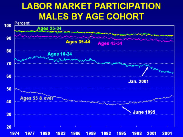
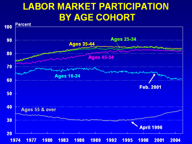
Something pretty dramatic is happening recently for the age groups 16-24 and 55 & up for both men and women.

What do you see?


What I liked about these charts:

A. The five individual series on each chart are clearly separatable and easy to understand

B. The trends for for 16-24 and 55 & up stand out clearly and provide a spur for further thought and investigation

C. The multi-dimensionality of the three charts presented all at the same time in close proximity to each other in the original post. This is an excellent example of the possible explanatory power that can be achieved through disaggregation.

D. The use of a long 32 year interval helps to give a full sweep to the trends at work for these factors

E. Dave Altig's discussion in his post of what he was seeing and his links to other sources and opinions stimulates further conversation and discussion.

What else would I like to do with this same data

If the 15 data series used to generate these three charts had been readily and directly available as a single, easy to use data set linked to the blog entry, here are some things I might have wanted to do with that data and actually had the chance to do given available time constraints.

F. Zoomed in on the interval from 1995 to 2005, or 2000 to 2005 for a closer look at the patterns at work. While the oldest and youngest age cohorts show clear patterns in the original chart, there may be forces at work in the other age groups that would become visible when we zoom in.

G. For the same reason, I would want to sequence through all 15 metrics one at a time for these shorter but still substantial intervals so that further subtle patterns could be coaxed to the surface. I would use a Y Axis scaling from the Minimum to the Maximum for that particular age and gender group to make this as easy to see as possible.

H. As I zoomed in and adjusted the Y Axis, I might also want to apply some form of smoothing if the data patterns became more erratic. I might want to replace the labor force percentage by the year over year change in labor force percentage for each factor and then possibly smooth the result again with a moving average.

I. I would want to add in some more factors and look at these individually
---1 Labor Force Participation Percentage for everyone
---2 Labor Force Participation for all Male and for all Female
---3 Labor Force Participation for 25-54 (all, male, female)
---4 Labor Force Participation for 55-64
---5 Labor Force Participation for 65 & up

J. Some further metrics showing how the population demographics of these groups are shifting year by year would also be helpful for further analysis.

K. For the group from 16-24, some further metrics showing school attendance at the high school and college level would likely help add some explanatory value. Some poverty metrics for this group would add further to the picture.

L. For the 55 & up group, factors showing participation in drawing Social Security benefits, poverty data, and data showing 401K withdrawals would add even more to the mix.

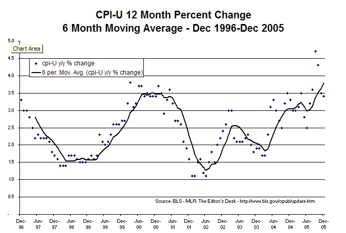
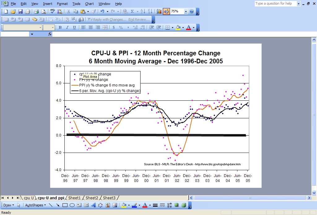
I recognize that all the Labor Force Participation metrics are in fact available from the BLS and I will be grabbing some of these as I work out the promised multi-dimensional, multi-time-interval example of Employment Situation over the next few weeks. My comments here are simply meant to indicate that if I could have grabbed the full 15 metric data set, I might have done some of that kind of work as part of this post today, much as I did with the BLS MLR Editor's desk data in a post earlier today on CPI and PPI.

"Share Me the Data"

Here's the Comma separated Value text for CPI-U and PPI as promised in our earlier post.

It's not formatted in columns so it's hard to read. Try copying and pasting it into Excel and converting text to columns and see what new views of this important data you can come up with.

Let me know if you think this is helpful to you.

Date, cpi-U y/y % change, PPI y/y % change
1-Dec-96, 3.3 ,2.8
1-Jan-97, 3.0 ,2.5
1-Feb-97, 3.0 ,2.2
1-Mar-97, 2.8 ,1.5
1-Apr-97, 2.5 ,0.8
1-May-97, 2.2 ,0.4
1-Jun-97, 2.3 ,-0.1
1-Jul-97, 2.2 ,-0.2
1-Aug-97, 2.2 ,-0.2
1-Sep-97, 2.2 ,0
1-Oct-97, 2.1 ,-0.3
1-Nov-97, 1.8 ,-0.7
1-Dec-97, 1.7 ,-1.2
1-Jan-98, 1.6 ,-1.7
1-Feb-98, 1.4 ,-1.5
1-Mar-98, 1.4 ,-1.5
1-Apr-98, 1.4 ,-0.9
1-May-98, 1.7 ,-0.8
1-Jun-98, 1.7 ,-0.7
1-Jul-98, 1.7 ,-0.2
1-Aug-98, 1.6 ,-0.8
1-Sep-98, 1.5 ,-0.9
1-Oct-98, 1.5 ,-0.7
1-Nov-98, 1.5 ,-0.6
1-Dec-98, 1.6 ,0
1-Jan-99, 1.7 ,0.8
1-Feb-99, 1.6 ,0.5
1-Mar-99, 1.7 ,0.8
1-Apr-99, 2.3 ,1.2
1-May-99, 2.1 ,1.4
1-Jun-99, 2.0 ,1.5
1-Jul-99, 2.1 ,1.5
1-Aug-99, 2.3 ,2.3
1-Sep-99, 2.6 ,3.1
1-Oct-99, 2.6 ,2.8
1-Nov-99, 2.6 ,3.1
1-Dec-99, 2.7 ,2.9
1-Jan-00, 2.7 ,2.5
1-Feb-00, 3.2 ,4
1-Mar-00, 3.8 ,4.3
1-Apr-00, 3.1 ,3.6
1-May-00, 3.2 ,3.7
1-Jun-00, 3.7 ,4.4
1-Jul-00, 3.7 ,4.3
1-Aug-00, 3.4 ,3.4
1-Sep-00, 3.5 ,3.5
1-Oct-00, 3.4 ,3.7
1-Nov-00, 3.4 ,3.8
1-Dec-00, 3.4 ,3.6
1-Jan-01, 3.7 ,4.8
1-Feb-01, 3.5 ,4
1-Mar-01, 2.9 ,3
1-Apr-01, 3.3 ,3.7
1-May-01, 3.6 ,3.9
1-Jun-01, 3.2 ,2.6
1-Jul-01, 2.7 ,1.4
1-Aug-01, 2.7 ,2
1-Sep-01, 2.6 ,1.6
1-Oct-01, 2.1 ,-0.3
1-Nov-01, 1.9 ,-1.2
1-Dec-01, 1.6 ,-1.6
1-Jan-02, 1.1 ,-2.7
1-Feb-02, 1.1 ,-2.6
1-Mar-02, 1.5 ,-1.6
1-Apr-02, 1.6 ,-2.1
1-May-02, 1.2 ,-2.9
1-Jun-02, 1.1 ,-2.3
1-Jul-02, 1.5 ,-1.2
1-Aug-02, 1.8 ,-1.5
1-Sep-02, 1.5 ,-1.8
1-Oct-02, 2.0 ,0.7
1-Nov-02, 2.2 ,1
1-Dec-02, 2.4 ,1.2
1-Jan-03, 2.6 ,2.5
1-Feb-03, 3.0 ,3.3
1-Mar-03, 3.0 ,4
1-Apr-03, 2.2 ,2.4
1-May-03, 2.1 ,2.5
1-Jun-03, 2.1 ,2.9
1-Jul-03, 2.1 ,3
1-Aug-03, 2.2 ,3.5
1-Sep-03, 2.3 ,3.5
1-Oct-03, 2.0 ,3.4
1-Nov-03, 1.8 ,3.4
1-Dec-03, 1.9 ,4
1-Jan-04, 1.9 ,3.3
1-Feb-04, 1.7 ,2.1
1-Mar-04, 1.7 ,1.5
1-Apr-04, 2.3 ,3.7
1-May-04, 3.1 ,4.9
1-Jun-04, 3.3 ,4
1-Jul-04, 3.0 ,3.8
1-Aug-04, 2.7 ,3.3
1-Sep-04, 2.5 ,3.3
1-Oct-04, 3.2 ,4.5
1-Nov-04, 3.5 ,5
1-Dec-04, 3.3 ,4.2
1-Jan-05, 3.0 ,4.1
1-Feb-05, 3.0 ,4.7
1-Mar-05, 3.1 ,5
1-Apr-05, 3.5 ,4.8
1-May-05, 2.8 ,3.6
1-Jun-05, 2.5 ,3.7
1-Jul-05, 3.2 ,4.7
1-Aug-05, 3.6 ,5.3
1-Sep-05, 4.7 ,6.9
1-Oct-05, 4.3 ,5.9
1-Nov-05, 3.5 ,4.4
1-Dec-05, 3.4 ,5.4


LEGEND FOR KEY FACTORS
cpi-U y/y % change +++ Year over Year change in percentage for CPI-U
PPI y/y % change +++ Year over Year change in percentage for PPI"

NOTE: data is not seasonally adjusted

SOURCE
"MLR Editor's Desk Update - Week of January 16-20, 2006",,
http://www.bls.gov/opub/ted/2006/jan/wk3/art03.htm,,
http://www.bls.gov/opub/ted/2006/jan/wk3/art01.htm,,
Percent change over preceding 12 months,,
Consumer Price Index for all urban consumers cpi-U,,
Produce Price Index ,,
not seasonally adjusted,,
December 1996-December 2005,,

Crude Oil Production By Country


Here's a great chart from Chart of the Day showing Crude Oil Production By Country over the past 45 years.

I like the long sweep of time and the way that 5 key factors are presented on a single chart in a fashion that each individual factor is readable.

What questions does this chart raise for you? What else can you already see here that is not included in the text of the Chart of the Day posting?

If they had shared the underlying data for these time series,

a. I would have liked to add all 5 countries together to see what their aggregate production looked like and

b. compared that as a percentage of the total world wide production figures ( a key factor not included in the data they presented).

c. I would have also liked to look at the patterns for just the past 10 years in more close-up detail.

Since they did not share their data, what I have in mind is theoretically possible, but effectively impractical due to the order of magnitude time requirements to dig up this data myself in an area that I have not worked on previously.

Sharing the data: Why is this so important?

In the previous post, we showed some nice Bureau of Labor Statistics (BLS) trend charts for the Consumer Price Index and the Producer Price Index covering the the past 10 years and showing year over year changes on a monthly basis.

The BLS kindly provided each of these charts with its own "pedigree papers" - the underlying data set for the factor in question over the time period shown. This is rarely done today for reporting on the internet or in print.

When someone shares their data as in this case, it opens up the possibility for further fruitful conversations. Here's an example of what I am talking about.

Using the BLS data, I was able to create the charts below in a relatively small number of minutes. I liked what the BLS had done, yet I also had a theory that perhaps some further smoothing might make the patterns easier to read or understand. With the 6 month moving average of these year over year percent changes in CPU-U, the upward thrust of this key factor over the past year stands out more clearly.


----------------NOT SEASONALLY ADJUSTED-------------


Looking at the BLS charts for CPI and PPI, I wondered how these two key factors were related. Again, because BLS provided the data for both factors, I was able to create this second chart that shows both of these key factors together. From this new chart, one might theorize that the rapidly rising PPI over the past 2+ years has been a factor in dragging the CPI higher over the same period.

What do you see? What do you think?

----------------NOT SEASONALLY ADJUSTED-------------


Sharing the data: This is important because the same data can be presented in many different ways and used to test many different theories. If an analyst or reporter pulls together a data set and then shares a small number of charts (quite commonly only one chart) and does not share his or her data, then further analysis is made more complicated and more expensive by a factor of 10 or more.

Ready Reusability: The BLS data made the work above possible within the time constraints that I am operating under today. However, my job could have been even easier if these two related metrics - cpi and ppi - had been placed together in a single, easy to use data set.

See the next post for your copy of the data set I constructed just in case you want to continue the analysis and discussion.


Some Recent BLS Trends Charts

Here are some recent trend charts and links that are worth some study.

1. BLS - Consumer Price Index - this is one of 5 charts from the BLS MLR Editor's Desk posted on Friday January 20th. These show up in the weekly BLS Update. The next two charts come that source as well. This uses the year over year percent change which produces some smoothing of the raw data.

I like the longer time period. I also like the fact that the BLS also provides a link to the data for this one factor that is moderately easy to use for further analysis and reporting for those who might be interested. In my experience, including the data is pretty rare with charts on the internet these days, so my hat is off to the folks at BLS for this nice feature.

I also like the fact that they used the unadjusted data. When doing the year over year calculation, the seasonal adjustment often just adds complication and possible confusion.

What do you see when you look at this graph? What recent trends stand out?


2. BLS Produce Price Index - Here is a second chart from the BLS MLR Editor's Desk for the past week. It has the same good features as the previous one - long time interval, year over year percentage change for smooth, not seasonally adjusted, and a link to the data in a moderately easy to use format.

What trends to you see at work? How does this chart complement the previous one for CPI?


3. Real average weekly earnings, December 2004 – December 2005 - here is a third chart from this week's BLS MLR Editor's desk. This one tells a pretty clear story, but it's not nearly as good as the previous two charts.


Some things I liked:

3.a. the use of a full year of data for each data point rather than focusing on change of the most recent month as is so often the case in reporting on these metrics.

3.b the inclusion of the data set (albeit only 5 data points)

Here are some things I find weaker on this chart than on the previous two charts:

3.c. The shorter time period only covering 2001-2005 rather than 1996-2005 - this would double the number of data points. For showing only yearly data, an even longer period and more data points might well be a useful thing to consider.

3.d the use of yearly data rather showing the 12 month change on a month by month basis as the other two charts do. If a longer period of 1996-2005 had been shown and monthly data used, we would have had 120 data points in the series rather than just the 5 that were used.

3.e the use of seasonally adjusted data rather then using year over year for smoothing. With monthly data showing year over year change, there is likely no need to invoke the complicating step of seasonally adjustment.

3.f the lack of mention on the chart itself that tells the viewer it is seasonally adjusted data. The information is in the text of the brief article at the link address, but could easily be overlooked.

BLS publishes their update every week. I find it worth taking a regular look. Looking at these three charts together gives some degree of multi-dimensionality but far less than I think is called for if we wish to understand CPI, PPI, or real average weekly earnings. Each of these could use a treatment that included the top 10 related factors - all shown on the same time scale.

Friday, January 20, 2006

There Must Be a Better Way: Targets to Aim At.

In the previous post, Employment Metrics: There Must be A Better Way we noted some of the weaknesses with the press and blog coverage of the BLS Employment Report for Dec 2005.

Here are some suggested steps we might consider taking to improve the coverage. I recognize that these are easy to say and likely hard to do. Over the next few weeks, we will take a cut at following these principles ourselves (practicing what we preach) to see where they lead us.

Steps towards a better way of reporting on Employment trends

1. Multiple Metrics. Select a substantial number (at least 10) of different measures of the employment situation and report in one place on all of them at the same time.

The BLS collects and archives literally hundreds of different time series so there is plenty from which to chose the best ones. There are also other potential sources of time series (other than the BLS) that might supply some missing piece of the puzzle. Figuring out which measures are likely to be the most important and most revealing is a crucial first step towards our target of greater clarity.

Multiple, complementary measures provide vital checks and balances on the interpretation.

2. Use the Same Time Scale for each Trend Graph. Once you have the 10 or more of what we feel are the most important metrics, it's essential to use the same time scale to show the trend for each. It will also be helpful to those who will see your creation to understand why you selected that particular interval for review.

Even better, since no single time scale will give the complete picture, make each of the 10 plus time series charts available in at least two different time scale windows - e.g. 2000-2005 and 1990-2005.

3. Smooth the data to reveal the underlying patterns. Much of the BLS employment data is erratic. To figure out what's going on and present it in a visual fashion that others can understand normally involves invoking some sort of smoothing.

There is no simple formula for the analyst on how to do this. My suggestion and preference here is that rather than using the Seasonally Adjusted BLS numbers, that we start our analysis with the Unadjusted raw trend data for each month in the series.

From this is it then possible to calculate the Year over Year Change and Year over Year Percentage Change.

Using one of these 12 month change viewpoints will often provide some useful smoothing all by itself.

If the trends are still erratic and hard to read, then use some moving average period (e.g. 3 months or 6 months) to achieve further smoothing. Some trial and error may be required before you get an understandable picture.

Regarding smoothing, my experience tells me that you will know it when you see it.

4. Use at least 2 significant digits. Some data like the month to month percentage change in unemployment rate has for what seem to be historical reasons been presented with only a single significant digit. If something is changing by 0.0% or 0.1% in a month, important patterns may easily be overlooked.

5. Avoid monotonically increasing charts such as the picture of total number of non-farm workers. Compute the year over year change in these counts instead.

6. Share your data set. In order to carry out the steps above, you will have effectively created a new data set that never existed previously.

It will have your 10 or more metrics that you have decided are most important to understanding the situation.

You will have the values of these factors for 2 or more time intervals.

You may have carried out some calculations on your original source data to make it more willing to reveal its secrets (e.g. calculating year over year or moving average values), thereby creating additional factors.

And from this data set you will have created graphs that you feel best represent the underlying processes at work.

While your format for the data set may differ radically, what you will have is an object that is logically equivalent to a simple two-dimensional table where each row represents one time periods and each column represents one of the factors you have selected or calculated.

It's likely taken you a fair amount of work to create this data set. You have used it for your own analysis and reporting. This step is vital, because by sharing the same data with others, they may be able to discover patterns and insights that add to the ones you have already provided.

7. Make the Data Set "READILY REUSABLE". As best as you can, share you data in a format that makes it easy for the next person to begin where you left off with the minimum of time and effort. Time is almost everyone's most precious and scarce resource. When you do this step well, you enable the conversation and collaboration about the meaning of the data to continue.

One of the approaches that works brilliantly for this principle is to put your simple two-dimensional data set into a text file structured as a Comma Separated Value (CSV) file. CSV files satisfy the "readily reusable" requirement. Many existing personal computer applications (e.g. Microsoft Excel) can open such a file and make it ready for further analysis and charting.

In the examples that follow in the next few weeks, we will be aiming at applying as many of these principles as we can so you can see how it all works in practice.

Thursday, January 19, 2006

Employment Metrics: There Must Be A Better Way.

In the previous post, we listed 51 employment related metrics that we had unearthed by briefly digging into a short list of press and blog coverage of the most recent Bureau of Labor Statistics Employment Report (for December 2005).

Observations:

A. Amazingly, many factors are offered and used in the logical arguments of the story or blog entry without providing any data at all to back up whatever claims are made

B. Some authors relied on emotional language instead of numeric quantification to make their points

C. Only a small percentage of the commentators that I have read used any graphs at all. The graphs that were used covered widely different time periods, 3 years, 7 years, 11 years, 65 years with no explanation of why a particular interval was chosen.

D. A large percentage of the factors that came with some associated data looked only at the single data point showing the value for the most recent month. E.g. the number of jobs of particular type added in December 2005.

E. Some factors came with two data points - the values for the two most recent months

F. One case used a single data point that was the average of the two most recent months

G. Several cases gave average values for the full years 2004 and 2005.

H. Some factors indicated whether they represented seasonally adjusted values or not. Many other factors were offered with any such indication.

I. Some factors were raw counts, others involved year over year differences in the counts, still others showed year over year percentage change or month over month percentage change, or month over month change in the counts, and with or without the moving average.

J. Few commentaries gave you the data itself.

K. Many of the commentaries seemed to be in a terrific hurry to publish within a short time after the BLS monthly release on Friday, January 6th. We are now almost two weeks out and it will be another two weeks till the next release. All the BLS data showing the trends for the past 65 years is already posted and waiting our actions aimed at understanding the most recent month in light of what has happened over the years. The plan of this blog is to try to use that time wisely and see if we can bring some further clarity to what's going on.

How can we make sense of all this?

Conclusion: There must be a better way.

In the next post, we will entertain a few suggestions that may help lead us out of this inhospitable wilderness.

Employment Metrics in the News: What factors to select?

To understand the most recent Bureau of Labor Statistics (BLS) Employment Report covering December 2005 , it’s useful to consider which metrics show up in the post publication coverage.

What factors do those most knowledgeable select to make their case? How do they use them? What comparisons do they make or suggest? What time periods?

Of course we find the headline numbers like unemployment percentage appearing in most articles. What you may find somewhat surprising if you sample the coverage (e.g. by using the list compiled by Brad Delong), is how each commentator selects their own favorite factors to tell their story and how different these turn out to be from each other.

Collectively, combining all metrics gives a breadth of coverage that seems to go well beyond any of the individual articles. You will also see a hodge-podge that may make you wonder whether there might not be a better way. We will have more to say about this in future posts. How do the factors listed here compare with the ones used in the coverage that you may have read.

M01 Monthly non farm payroll job growth for the previous month, seasonally adjusted in thousands

M02 The unemployment rate (percentage) for the previous month, seasonally adjusted with two significant digits precision. Also, graphs showing the unemployment rate for the past 3 years, 7 years, and for other time periods

M03 The Employment Population Ratio since 1948 (graph)

M04 The seasonally adjusted percentage of unemployed plus marginally attached plus discouraged works since 1995 (graph).

M05 The seasonally adjusted percentage of those unemployed for 15 weeks or longer since 1995 (graph)

M06 Seasonally adjusted Labor Force Participation Rate

M07 Hours worked per week

M08 Dollars per hour

M09 Dollars per week

M10 Number of jobs created in previous month in Manufacturing

M11 Number of jobs created in previous month in Construction

M12 Percentage marginally attached

M13 Percentage part time for economic reasons

M14 Average unemployment percentage for the full year 2005

M15 Average unemployment percentage for the full year 2004

M16 New unemployment claims for previous month

M17 Lowest number of new unemployment claims in the past 5 years

M18 Number of jobs created in previous month in Retail

M19 Productivity

M20 Number of discouraged workers

M21 Household Survey total jobs created for the month

M22 Payroll survey total number of jobs created for the full year 2005

M23 Household survey total number of jobs created for the full year 2005

M24 Number of jobs created in previous month in Food Services

M25 Number of jobs created in previous month in Professional Services

M26 Number of jobs created in previous month in Business Services

M27 Number of jobs created in previous month in Health Care

M28 Job outsourcing

M29 Percentage of jobs created for the month that were in the Services sector

M30 Percentage of all current jobs that are in the Services sector

M31 Number of jobs created in past year in Health and Education

M32 Number of jobs created in past year in Leisure and Hospitality

M33 Number of jobs created in past year in Trade and Transport

M34 Number of jobs created in past year Finance

M35 Number of jobs created in past year in Local Teaching

M36 The number of people who have dropped out of the workforce

M37 Percentage of “McJobs”

M38 Percentage of “good jobs”

M39 Percentage of full time jobs

M40 Aggregate income growth for all employees

M41 The BLS U-6 unemployment rate

M42 The BLS U-3 unemployment rate

M43 Long term discouraged workers

M44 Number of people with at least one job (household survey)

M45 Total number of payroll jobs created in the month as a result of the "birth/death" rate

M46 Percentage of total payroll jobs created during the month that resulted from "birth/death" calculation.

M47 Gross domestic income (GDI)

M48 Tax revenue from employment

M49 Help wanted advertising index (print + internet)

M50 Monster employment index

M51 Conference Board Help Wanted Index

What other factors did you see?

Which do you think are most important?

What important ones are missing from this list?

What time frame(s) do you like most?

BLS Employment Situation Report


Here are the two charts that were published with this month's BLS Employment Situation Report for December 2005. This was one of the references given by Brad DeLong in his survey of the differing reports on these numbers but he did not include these charts in his chart examples.

From literally hundreds of possibilities, the BLS selects these two factors to visualize: chart 1) the headline unemployment rate (seasonally adjusted) and chart 2) the total number of non-farm jobs also seasonally adjusted.

Comments on Chart 1: The three year view gives more perspective than just mentioning the current value as seems to be the case in so many articles and blog entries reporting on the release from BLS of these numbers.

For fuller understanding of the unemployment rate metric, my recommendation is that would be best to look at other time intervals such as 1 year, 5 years, 10 years and 20 years. Alternatively, you could look at periods beginning 1980, 1990, and 2000.

When you do that, you will likely be able to notice that there is more nuance than can be gleaned form the 3 year view alone.

Comments on Chart 2: Charts with mostly monotonically increasing data such as the metric of total jobs shown in chart 2 are almost always difficult to read. They provide little useful new insight or understanding. They say "things" are going up but don't tell you how fast, and don't tell whether the rate of increase is changing or staying the same.

The chart shown in the previous post from the BLS Editor's Desk was based on the same source data of the total number of jobs, but computing the new measure of total jobs created in the past year proved far preferable.

The rest of the BLS Employment Situation Report is dense with trend information delivered as text messages or complex tables. Because of formatting limitations of using a medium designed around 8 by 11 paper, the tables published in this print version are also seriously incomplete. The BLS does indeed have an approach to measure and report on many vital measures of employment, but the report itself just cannot be useful for anyone who wants to understand these trends without investing huge amounts of personal time.

In my opinion, this kind of approach falls far short on the key human engineering metric of readily reusability.

A major goal of this blog is to figure out a way to unlock the valuable data collected by sources such as the BLS and make it available to both expert economists AND ordinary citizens in a format they can understand and with a time-demand-footprint that is in keeping with the idea that Time is our Scarcest Resource.

The BLS is already doing things that take us part way towards this idealized goal. We'll be discussing this in more detail later as well as looking for ways to further increase usability of this vital data.

Friday, January 13, 2006

Payroll employment up by 2 million in 2005, MLR: The Editor's Desk


Here's the some more news and one more chart about U.S. employment from the BLS from about 10 days ago. The Editor's Desk at BLS puts out one new chart each weekday.

This entry and the accompanying chart show the seasonally adjusted annual change in non-farm employment for the past 7 years from 1999 to 2005. This is a longer time period than normally used in these published BLS Editor Desk reports. I would have liked this better if it had showed the year over year behavior every month over the same period (possibly with some moving average to smooth the data a bit). Since it showing a whole year's total results, I would also have preferred to see not seasonally adjusted data used.

In our previous posts this week, it's clear that there is a lot more to understanding employment than a single headline number chart -even one with a memorable total number like 2 million. Even though the headline number gets a lot of play, the chart even for a single metric surely adds some further perspective when it covers a period of this length.

The articles also discusses yearly gains in specific industries such as construction, finance, and mining but offers no charts for these.

Hat Tip to The Big Picture

One of my favorite sources that points me to interesting charts these days is Barry Ritholtz's blog, The Big Picture.

In a couple of recent posts, I got my initial heads up about interesting time series charts and related articles from Barry's site but neglected to thank him and link back to him for the leads. These included the post on Dealing with Aggregate Data that showed the Dow for the last five years along with the behavior of the individual stocks included in the Dow, and the post Normalizing Headline Numbers that showed the Standard and Poor Index expressed in ounces of gold.

Thank you Barry.

You can follow these links to see his posts on the Dow and on the S&P. Scroll down through his blog on any given day and you will invariably find some excellent and interesting charts and discussion for your consideration.

For example, in recent days, he has had some good finds with employment charts from Northern Trust Economic Research that you can view at: Employment Recovery Continues to be Sub-par. These include the one shown below


Shadow Government Statistics.

Here's an alternative view of the consumer price index (in blue) based on calculations using the same methodology that was used for this metric back in the 1970s for CPI. The results are dramatically different as you can see.


Source: John William's Shadow Government Statistics.

What if the key factors we consider when evaluating how our world is going are biased? The answer is easy: the charts we look at will also be biased no matter how perfect we make them or how many different views we examine.

With this in mind, check out John William's site Shadow Government Statistics where he tackles the question of the accuracy of some of the key headline numbers (GDP, CPI, Unemployment, Deficit) that impact so many things in our economy and our lives.

John raises some tough questions and puts us on warning that we always need some good checks and balances to any metrics we use in our analyses. He says:

Have you ever wondered why the CPI, GDP and employment numbers run counter to
your personal and business experiences? The problem lies in biased and
often-manipulated government reporting. We offer an exposé of the problems
within the reporting system, and an assessment of underlying economic
reality

John offers a series of free reports that go into the details (see links below). These are controversial, to say the least.

08/24/04 Series Master Introduction
08/24/04 Employment and Unemployment Reporting
09/07/04 Federal Deficit Reality
09/22/04 The Consumer Price Index
10/06/04 Gross Domestic Product

Thursday, January 12, 2006

Formatting for Previous Entry and Window Size

My apologies if you ran into formatting difficulties with the previous post. You may need to shrink your window so that there is only one graph per row to make the text line up appropriately with the picture.

I clearly need to find a better way to publish a series of graphs all in one blog entry. I'll be working on this and sharing what I find in future posts.

Saving Viewer Time with Multiple Charts


Net New Jobs in the Private Sector - three month moving average - 1994-2005

Long Term %

The Want Work Percentage. This number includes those who want a job but who are not classified as "unemployed" by the BLS. It also includes those working part time who want full-time employment.


Thirty five years of the unemployment percentage.
Comparing Seasonally Adjusted numbers to raw numbers for the unemployment percentage.


The Employment Population Ratio


The last three years of the unemployment rate


This is a continuation of the previous two posts.

The earliest post, How A Journalist Should Cover The Economy ... made a series of six graphs available through 6 separate links. This coverage gave a lot more perspective to the employment situation than many writers on the subject who only discussed the trends at work with words - a poor substitute in the world of trends.

The previous post, The Scarcest Resource: Our Time helped you to navigate to the middle of a single web page where a series of 7 graphs were physically near each other and viewable by paging up and down or scrolling rather than by linking.

In this post, we continue our experiment by placing these seven into a single post - giving each one a very brief commentary.

Please let us know which method works best for you.

Please compare the ease of use and time required to get the full picture from this approach.

What obvious deficiency jumps right out when you see these all so close to each other? Hint: what would Tufte say?

Wednesday, January 11, 2006

The Scarcest Resource: Our Time

In the previous post, we complimented Brad DeLong for pulling together a variety of verbal viewpoints and graphical viewpoints to form a fuller picture of the meaning of the most recent Bureau of Labor Statistics (BLS) report on employment.

Having six pictures of different view of the employment situation definitely adds to understanding.

One of the things that often interferes with our ability to understand a complex mix of information is TIME - the time we have to look at what someone is presenting. In this case, even though Brad did a lot of work for us in advance, for us to actually see the trend pictures that he has assembled requires many mouse clicks or key strokes and a lot of our precious time. I would bet that there will be many people who get to Brad's blog entry, find it interesting, but never follow the links. What a shame.

For those who do, my guess is that they will find the experience disjointed. There is an interruption between each graph viewing that disrupts the processes at work within our heads. If there are any network delays as we navigate from one web page to another, that would make it even worse and more of a jumble.

In this post, I am going ask you to join me in an experiment. I recognize that your time is precious and I appreciate any time you chose to spend checking this out.

I would like to know whether being able to scroll down through all the graphs without having to jump from web page to web page makes it easier or harder for you to understand Brad's selected charts.

So rather than following the links from the previous post, please follow the steps below to jump into Brad's BLOG where a series of employment related graphs has been posted to multiple blog entries that are physically near each other on the page.

Let me know if you think the scrolling approach makes cutting through data easier.

First step) In Brad DeLong's Journal archive for January 2006 , please scroll down or SEARCH till you find the entry titled: "Unemployment: The Importance of "Seasonal Adjustment" dated on January 8th at 1:49 PM.

Step two) Starting at that point, scroll down, and one by one check out the series of graphs that appear in the series of posts stretching backwards in time.

You will see the following graphs, some with nearby commentaries.

1) Unemployment: The Importance of "Seasonal Adjustment" - the graph with this entry shows both the trend for the seasonally adjusted unemployment percentage (blue line), and for the more erratic red line showing the unadjusted unemployment percentage month by month. The period covered is 2000 to 2006. The seasonally adjusted rate is notably smoother.

2) Thirty Years of the Unemployment Rate - This next chart shows the unemployment percentage for a period from 1970 to 2006. It is not stated, but this and the charts that follow are likely seasonally adjusted charts.

3) Scrolling past a few other posts, you come to: Three Years of the Unemployment Rate - which shows the most recent history for the period from the beginning of 2003 through the end of 2005. The rate shown is seasonally adjusted.

4) Employment-to-Population Ratio - this chart shows the period from 1948 to the present. This is the percentage of the adult working age population that were employed during the month.

5) Unemployment and Underemployment - This next post shows what I believe to be a particularly important metric that is normally ignored or overlooked when evaluating the BLS' monthly employment reports. It doesn't have a catchy name at this time and the explanation of how it is calculated leaves most people breathless and rolling their eyes.

For now, I will call this the WANT WORK PERCENTAGE. This is the percentage of people of working age who fit one of the following three categories.

a) classified as unemployed by the BLS (people who have looked for work in the last 4 weeks)

b) want a job but are not considered unemployed by the BLS (the so called "marginally attached")

c) people who are working part time but not through their own choice - they would prefer to be working full time.

All these people WANT WORK - either a job or more hours to make their job full time.

The period for this chart is from 1995 through the end of 2005 or 11 years.

6) Long-Term Unemployed - the percentage of the labor force that has been unemployed for 15 weeks or longer. The period of this chart is also 1995-the end of 205.

7) Payroll Survey Employment Growth since 1994 - This shows the month to month net gain in payroll jobs. The period goes back to January 1994 through the end of 2005 or 12 years.

Was this easier than linking?

Was this better for you to scroll rather than link back and forth?

Was this faster?

What else did you learn?

What could have made your viewing even more pleasant?

What might have saved even more time?

In the next post, I will propose a third approach to these charts that I think you will find even easier and better.

How a Journalist Should Cover the Economy...

Check out Brad DeLong's January 11th post about his upcoming course - "How a Journalist Should Cover the Economy..." and follow his link to the readings. Here you will find a road map that gets you to a dozen different views about what the most recent Bureau of Labor Statistics (BLS) employment report means.

Of special note are the 6 pointers (duplicated below) to a set of trend graphs that add depth beyond the headline unemployment percentage and job total numbers.
Payroll Survey Employment Growth since 1994
Long-Term Unemployment Unemployment and Underemployment
The Employment-to-Population Ratio
Thirty Years of the Unemployment Rate
Three Years of the Unemployment Rate
Unemployment: The Importance of Seasonal Adjustment

If you want to understand what the latest numbers mean, and the direction we are heading, and how that compares to the past, Brad's quick tour will add a lot to your understanding.

The many different readings are also perspective widening. I liked the Tim Duys article the best. I thought it was the most balanced, dug the deepest, and included the best trend information in graphic form.

It was remarkable to note how many of the commentators provided their thoughts with nary a graph. One of these with zero charts was the Tim Kane article that to my mind was also the most slanted.

I'll have some more to say on the employment situation and how one might best comment on it in the next post.

Tuesday, January 10, 2006

Normalizing Headline Numbers


www.chartoftheday.com offers a free weekly chart. Their offering for December 30th, 2005 is a particularly nice example of the concept of using normalization to reveal otherwise hidden details. In this case, reproduced here, they have taken the Headline Standard & Poor index and divided it by the price of an ounce of gold.

The picture is a lot different than if you look at the S & P behavior by itself.

Other possible normalizations that might reveal more of what is going on include dividing the S & P by the price of a barrel of oil, or by the number of dollars it takes to purcahse one euro. Similar graphs can be drawn for the DOW and the NASDAQ.

Sea Ice Decline Intensifies


This is a little late for posting, but the referenced article (Sea Ice Decline Intensifies) from NSDIC (the National Snow and Ice Data Center) is well worth checking out for their excellent use of trend graphs (two of which are reproduced here) to make their point.

They have taken some complex map data that I find somewhat difficult to read, and transformed it into simple time series graphs that pack a wallop and that just about anyone can underestand.

Dealing with Aggregate Data

In the recent New York Times article,
Dow Tops 11,000; First Time Since '01 - New York Times, they show the progress of the DOW over the past 5 years while superimposing the behavior of its component parts.

It's a nice example, of why it is some important to look beneath the covers of Headline Indicators like the Dow and disaggregate its behavior into its component parts.

It would be nice to have an easy way to change the time frame or to select just the 3 or 4 top stocks for the period, or the 3 or 4 worst performing stocks.

Thursday, January 5, 2006

Housing Affordability

Twenty Years Later, Buying a House Is Less of a Bite - New York Times - Dec 29th, 2005 This NY Times article attracted a lot of attention in the last week by talking about trends in housing affordability.

See for example these posts by Elizabeth Warren and Brad DeLong. The authors of the NY Times article, David Leonhardt and Motoko Rich, kindly supply some interactive graphics and tables as well as a detailed Excel spread sheet of data from 1979 to the present, covering literally hundreds of cities, metro areas, and rural areas.

This is a good thing since their article while it is long on examples, is short on actually showing the pictures that make the trends. The graphs they do make available prove dfficult to see what is going on. Here for example is their graph showing the affordability pattern for the US as whole for the entire period.

The scale goes to 100% and makes it difficult to see what's going on. The interactive graphics allow you to see graphs for other cities or areas, but these are also scaled to 100% severely limiting understanding.


Contrast the original graphic to the one below scaled with a Y axis from 10 to 25. The patterns are a lot easier to read off the graph.

My reading is that using the metric of affordability suggested by the article (percentage of median income required for the mortgage on the median priced home) it is pretty clear that for the US as a whole, housing is becoming less affordable which is not the impression you will get when you read the article.

What do you think?


Now look at the the same graph from 1996 to the present time. It appears to me that using this metric, housing is getting less and less affordable.


Bottom line: if what you want to understand are the trends that matter most in our lives, there is no substitute for atually providing easy to read graphs that show the key indicators. Talking about trends in text is simply not even a close contender for explanatory power.

Footnote: I believe the metric they use for affordability actually distorts the affordability story, but that is a topic for another post.