Wednesday, August 17, 2005

A sampling of interest trends


Following up on the previous post, here are a few examples of the timeline graphics from the HSBC Report on key metrics related to Interest Rates and Debt.

I find these two charts particularly eye opening and informative. Check out the whole report for a more complete picture of the trends at work with consumer debt.

"Interest Sting" - A Visual Approach to a Complex Problem

Check out yesterday's post over at New Economist on US consumers feeling the squeeze from higher rates and then take a look at the excellent HSBC report: Interest Sting: US household interest payments are surging despite low long rates

This 10 page report contains 25 easy to read graphs and tables looking at the impact of interest rates from many different and complementary angles. This report is a model of behavior for how to approach a complex subject area in a way that promotes understanding and opens the door to further dialogue.

Here's what I found most attractive about the HSBC approach:

1. Most of the graphs are time series graphs that cover at least the last 7 years and many charts stretch back in time 25 years or more. The long time sweeps allows current behavior to be observed in context of past history.

2. Almost all of the graphs show only a single metric at a time making it possible to quicly digest and understand the behavior of that factor. The uncluttered look, clear lableing of the axes, easy to understand naming of the metric and suggestive title all combine to create a trend graph that can stand on its own without any other supporting text.

3. A smaller number show a pair of related variables to highlight relationships between the pair. These are also easy to read and digest and understand without supporting text.

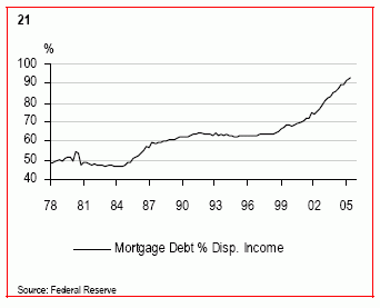
4. Many of the factors plotted in this way are calculated values derrived from combining the raw numbers and these bring important and non obvious patterns out from hiding and into plain view. For example, check out chart 21, page 9 (mortgage debt as a % of disposable income) and chart 25, 10 (Consumer debt ex-mortgages as a % of disposable income)

5. While I am not a big fan of tables, even the tables in this report are easy to use and effective in conjunction with the extra text of the article.

6. The trend graphics are placed in close proximity to the explanatory text for easier reading.

The only thing missing is the click through link to the data set used to create these tables. For example, I would have loved to combine charts 21 and 25 to obtain a total interest chart as a percentage of disposable income. This metric was discussed in the report, but no chart provided.

While the authors of the report have their own views of what all these charts mean, the work they have done to lay out all the charts makes it possible for other observers to develop their own notions of what this complex situation means and compare their thoughts to those of the authors. All in all, an excellent example of how to use trend graphics to think deeply about an important topic.

Tuesday, August 16, 2005

Show Me The Data

Max Sewicky over at Max Speaks. You Listen! offers a brief example of a share-the-data approach to dealing with the important time series in our lives that I would like to see more widely emulated.

He begins with a number-free sound bite statistical statement that "MORE PEOPLE ARE WORKING NOW THAN EVER BEFORE". He proceeds to analyze the underlying time series going back as far as 1939, and reports out a simplified and easily digestible time series table (covering the last 30 years) that represents his view of what seems most important. This step certainly adds to the reader's understanding of this single aspect of the U.S. employment scene and helps put the number-free sound bite into better persepctive.

So far this all pretty standard. What sets this particular blog entry apart from many others on the web these days is that Max wraps up his presentation with BOTH a pointer to his data source AND an easily downloadable, readily reusable copy of the working spreadsheet he used for analysis.

For the person interested in persuing this paticular employment metric any further, this sharing the data approach delivers a dramatic, order of magnitude time saving which could make all the difference in the world. Easy access to the data opens the door to further insights, conversation, discussion, checks and balances, and collaboration between interested parties.

This Change Over Time blog hopes that more and more analysts and commentators on the time series that most affect our lives will follow in Max Sewicky's footsteps and share their data in similar easily downloadable and readily reusable form.

P.S. Of course doing time series analysis on an important topic with just a single variable is severely sub-optimal on the face of it, but that is a topic for future blog entries.

Thursday, August 4, 2005

Timelines on the Web - Part VII - Examples to Study


In the previous post, Timelines on the Web - Part VI - A Treasure Trove of Graphs, I promised to comment on some of the 300+ graphs (8 MB) on the web assembled by Professor Mark Thoma over at Economist's View.

If you are interested in the idea of using time series data presented in a visual format to help make better sense of complex topics, to encourage deeper thinking, and to foster communication and collaboration, your time will be well spent in taking a look at the entire collection.

For performance reasons, I recommend that you download the whole 8 MB web page to your PC as a complete web page. Once I did this on my system, I was then able to use graphic image slide show software (e.g. IRFANVIEW or MIcrosoft Office Picture Manager) to walk through the individual images in their own sub-directory, enlarge them, sort them, and so on.

Professor Thoma's collection includes reference to a series of charts posted by Angry Bear between April 11th and April 25th, 2005 on the subject of health care. You can find the first Angry Bear post here, or the month of April 2005 Angry Bear archives here, or you can find the series of seven posts under the left hand column TOPIC heading for The U.S. Health Care System on Angry Bear's home page.

The four samples at the beginning this post give you a flavor of what's in store for you when you link back to Angry Bear's original posts and graphs. These are clear graphs that quickly deliver information that you may have heard about (e.g. U.S. infant mortality is high) but are not likely to have seen in such a visually powerful format.

Here's what I like about these posts individually and collectively.

1. The long and consistent time frame used for each chart stretching back to 1970.

2. The unusual readability given that Angry Bear is showing 10 different time series in each chart. The behavior of the U.S. series in red is especially easy to see in relation to the other countries' trends

3. The range of different metrics presented by the composite set of charts - in addition to the ones shown hear, there are charts for

+ Doctors per 1000 people,
+ Hospital Beds per 1000 people,
+ Life Expectancy at Birth,
+ Percent of Population over 65,
+ Percentage of Health Care spending for pharmaceuticals.

There are 10 separate interdependent metrics covering 35 years for 10 different countries.

4. The way that even a single chart such as the infant mortality trends could tell a story all by itself without any accompanying text (and having done so trigger the viewer to begin thinking more deeply about the meaning and underlying causes). This is not to say that a single metric is ever likely to be sufficient, but a good chart is sure a good way to start.

5. The nice integration of textual explanation in relatively close physical proximity with the related graphics.

In my opinion, Angry Bear's approach is a model to follow when addressing any important topic. The clear graphics covering multiple metrics and the accompanying text make excellent use of time series data to help make better sense of the complex topics of health care. At the same time this series encourages deeper thinking, and fosters further communication.

Angry Bear consistently produces excellent time series graphics and text dialogue on a range of interesting and important subjects. Repeating what I said earlier about Professor Thoma, it's definitely true that a careful study of Angry Bear's archives will provide many other examples of how best to harness the potential of time series graphics.

Check it out for yourself.

Note: this post was updated August 4th, 2005 at 5:28 PM with some corrections and additional material detail.