Saturday, November 13, 2004

The Power of Simple Timeline Graphics

Here's a simple timeline graph showing only a single variable, the value of home equity as percentage of total home value. It clearly shows the declining trend in this factor over the past 50+ years

Contrast the clarity of this picture to the graphics in the previous post.

The trend since 1985 makes me wish I could see the past 20 years view. A 10 year view and a 5 year view might provide even more insights.

If you were interested in home ownership, what else would you want to look at? If you find this picture useful, you would likely want to see such things as the trends for:

  • Average Home Equity in Today's Dollars
  • Average Home Value in Today's Dollars
  • Home ownership percentage (but dislayed showing labels on the axes)
  • Mortgage rates


Home Equity Compared to Home Value Posted by Hello

Incomplete Graphics

This pair of graphs is an example of timeline use that could benefit from the addition of numeric values for the Y axis. Simply commenting a few data points with their values makes this harder to interpret.

I apologize for not having the reference to the source of this pair of charts. It's unclear why the average mortgage rate for the second chart is missing for the first half of the time period.

It would be great to see this data with labelled Y axes for the past 15 years when there have been dramatic changes in both of these important factors.

One other point these two graphs raise is the choice of minimum and maximum values for the Y axis. Two common alternatives are a) to chose the minimum and maximum values show in the covered time period, and b) to use a minimum value of zero. These charts will have a much different feel if the second choice had been selected.


Home Ownership & Mortgage Rates Posted by Hello

Friday, November 12, 2004

Alternative View of Unemployment


EPI Long Term Unemployment Past 15 Years Posted by Hello


This is a common example of timeline use - charting two time series together using different scales (Y Axes) for each series. The Economic Policy Institute (EPI http://www.epinet.org/) often makes use of time series graphics to illustrate the points they are making.

For more information about this particular graphic, check out: http://www.epinet.org/content.cfm/webfeatures_snapshots_11102004 .

Joining a relatively simple graphic as the one above, and a detailed text explanation is a powerful combination that lets the reader/viewer evaluate the claims against the easily visible data in the chart. Contrast this verbal/graphic/numeric combination of evidence with claims that are made only in words. You may or may not agree with what EPI has to say, but at least for the data presented, you don't have to take their word for it. You can see for yourself.

For example, with the data above, if someone had said: "over the past year of economic recovery as measure by growth in GDP, the percentage of the unemployed who have been out of work for more than 39 weeks has stayed close to its 15 year high and is about twice as high as it was four years ago", you could visually inspect the chart and validate or invalidate the claim yourself by eye and by rough approximation. If you had the actual data series numerically (e.g. in an Excel spreadsheet), you could check out these claims precisely.

Without the graphical representation, you would be dependent on your source. Not only that, the whole pattern of change of unemployment over the past 15 year (such as the long period of steady reduction from 1992 to 2000) and the way that these two factors roughly track with each other would be lost.

What do you think after reviewing this graph and the accompanying EPI text? What did they miss? What other factors should be considered? Do their statements extract the essence from the graphics and help viewers understand the situation better? How would you have described this situation?

Contrast the EPI approach in their posting with the recent Bureau of Labor Statistics (BLS) report on unemployment: http://www.bls.gov/news.release/pdf/empsit.pdf which contains a pair of graphs covering trends over the past 3 years.

Or consider the BLS text and table only report of this same information at: http://www.bls.gov/news.release/empsit.nr0.htm . Consider in particular the opening text paragraphs:

THE EMPLOYMENT SITUATION: OCTOBER 2004
Nonfarm payroll employment increased by 337,000 in October, and the unemployment rate was about unchanged at 5.5 percent, the Bureau of Labor Statistics of the U.S. Department of Labor reported today. Construction employment rose sharply over the month, and several service-providing industries also added jobs.

Unemployment (Household Survey Data) Both the number of unemployed persons, 8.1 million, and the unemployment rate, 5.5 percent, were essentially unchanged from September to October. The jobless rate has held fairly steady thus far this year and remains below its most recent high of 6.3 percent in June 2003.

How much would you really understand about unemployment if this was all you were given - text only with no numbers and no graphs and the choice of emphasis and comparison left in the hands of the presenter?

Time scale is very important. The view of unemployment in a 3 year graph (BLS) looks a lot different from the 15 year EPI graph. Neither one of them is "right". Each of them reveals some details and hides others. Understanding trends in full depends on being able to look at a range of time scales and a range of factors. We will be returning to this theme in later posts.

Finally consider one more way that unemployment data could be presented by checking out this entry at The Heritage Foundation which includes many time series graphs and much textual explanation. http://www.heritage.org/Research/Economy/wm582.cfm

You may or may not agree with the conclusions of this document but each statement can be checked against the graphics shown. There are many graphs including both a 25 year and a 15 year view of the unemployment rate which adds further perspective to the charts discussed above.

Putting EPI, BLS and The Heritage Foundation together, what do you think? What else do you need to know? What other factors? What other timescales?


Thursday, November 11, 2004

Hidden Time Series Data - A Basic Example

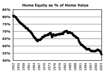
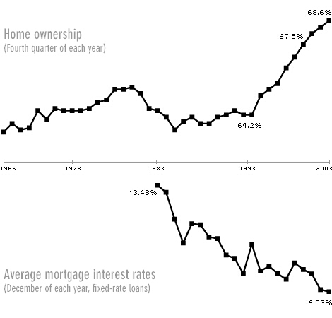
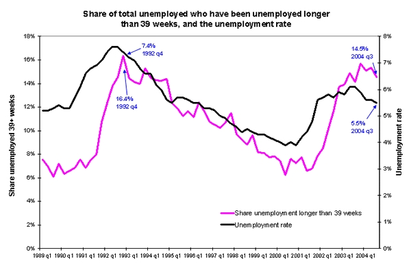
In every area of our lives, there will be factors whose changing behavior over time directly influences what we experience.

For a simple example, let's consider someone who invests in the stock market. Every day on the car ride home, the evening news will report on the progress of the Dow Jones Industrial Average (DJIA) and the Nasdaq Average. Possible statements might be:

  • the Dow was up by 84.36 points (or 0.81%) today to 10,469.84
  • the Nasdaq rose today by 26.71 points (or 1.31%) to 2,061.27

The statements might also be simplified or abbreviated to statements such as:

  • the Dow was up by over 84 points today
  • the Dow rose today to 10,469
  • the Nasdaq was up 1.3% today
  • the market rose today for the 3rd day in a row for a net gain so far this week of 1.7%

Anyone who has gone to a stock market charting web page such as Big Charts

http://bigcharts.marketwatch.com/default.asp?siteid=&avatar=seen&dist=ctbc

will of course find a lot more interesting information about how these two indices changed over the course of the day in small side by side time series graphics. Clicking on the DJIA graphic reveals the one year roller coaster history of this average as it has varied between approximately 9,600 and 10,800 (as of 2004 November 11).

The net effect of the most common media reports is to hide most of the potentially important information about how these indices have changed over time. If any patterns are visible in the data, you certainly won't be able to see them if all you know is that the Dow was up 84 points for the day.

If you care about what's happening in the markets, and you think that the Dow or Nasdaq can provide helpful insights for your investing decisions, radically limited data presentations such as the ones that are common on the evening news and that restrict themselves to what happened in the last day, are no help at all and can be dangerously misleading.

Lucky for our hypothetical investor, when it comes to markets, all the time series are all dutifully collected, archived, and available (often for free) to the interested investor who is willing to invest some time. Our investor could look at the detail of today's behavior of the Dow (rising steadily during the day on November 11), or use the various on-line tools to view the past week, month, year, or even 10 year period for this index.

In other important areas of our lives, the same approach turns out to be just as important, but may prove to be a lot more difficult to achieve - a topic we will delve into with future posts.

Even in the stock market case where the time series are widely available, the over emphasis and focus on the Dow and Nasdaq may steer our investor away from paying sufficient attention to other important factors such as the value of the dollar vs the euro, the trends shown by the leading economic indicators, changes in treasury bond rates, and so on.

A question we will tackle in future posts will be too consider:

How many factors do you have to examine before you have enough?


Tuesday, November 9, 2004

Those Who Can Remember The Past

When we display time series data, the visualization process helps us "remember" a small portion of the past and detect previously unseen patterns.

Twenty first century technology simplifies capturing time series values for the most important factors that rule our lives. We can now capture hundreds of important factors at frequent intervals and save months or years of time series results all at a minimal cost. Similarly, today's technology makes viewing these series on our desktop or laptop computers available with the most modest effort.

Despite the low cost and ease of viewing and reviewing the most important time series in our lives, we still appear wedded to using traditional approaches that render the visual patterns inaccessible and invisible and make it dramatically more difficult for us to remember the past. We are so used to doing things the old way, that we don't even notice what and how much we are missing. Indeed, if we cannot see it, these changes over time act as if they simply do not exist.

As George Santayana noted,
Those who cannot remember the past are condemned to repeat it.
The underlying thesis of the CHANGE OVER TIME blog is the converse of Santayana's powerful insight, namely:

Those who can remember the past, are best able to shape the future to match their fondest hopes and dreams.