- The post identifies a key metric (Household Net Worth) that has not received a lot of attention and really looks at that metric all by itself using several alternative views to aid in understanding.
- It includes a long time perspective as well as zoomed in views thereby revealing patterns that would have remained invisible if only a single time span had been chosen.
- The post provides a clear storyline -- sharing with us what Doug was thinking while he looked at these charts and selected them for our edification.
Tuesday, September 20, 2011
Doug Short has an excellent post up today Household Net Worth: The "Real" Story. Check it out. It provides an easy to follow example of some of the principles that we hold most strongly:
Sunday, September 18, 2011
Providing some Context for looking at CPI charts
We have posted many charts this past week looking at CPI behavior through a variety of angles and lenses. Our sources have been light on providing context and we have not filled in this area either.
So here is a first cut at the context that we were holding loosely in mind as we evaluated the incoming collection of charts and created a few of our own using the St. Louis Federal Reserves' FRED software.
To begin, CPI stands for Consumer Price Index. In our view, the emphasis is on the Consumer (real people living out their lives) and the ways in which changes in Prices (specifically price inflation) might impact the standard of living for those people.
Central Questions: The question we would like to be able to answer more fully is:
A second key principle for us is that CPI Inflation is like Compound Interest; and so longer term cumulative views of the data should predominate.
Weaknesses of Traditional Reporting: To us, the commonly used month over month results represent little more than noise since our focus is on cumulative results.
Even the very widely used year over year reporting is not particularly useful in this regard and is usually distracting at best (1 year effects are interesting but surely not the whole story) and misleading at worst as to the important long term inflation changes that are underway and the implications of those changes on real people's standards of living and quality of life.
A long standing general purpose admonition of ours is to Look at All the Data. The traditional reporting on CPI violates this rule in spades with the focus on only headline CPI and core CPI . CPI is an aggregate of aggregates of aggregates which averages out a huge degree of variation that is present in its sub-components. To begin to understand the impact that cumulative price inflation has on Consumers (real people) we surely need to disaggregate the average CPI values and look individually at a good number of the key sub-components (e.g. Food, Energy, Health Care, Rent, Transportation, Tuition) to see their cumulative price inflation over longer periods of time. With few exceptions such as the excellent chart we posted earlier (A Unique View of CPI from Doug Short), almost all reportage we have found on CPI focuses on headline or core cpi.
Now it is true that the official report from the BLS (BLS August 2011 CPI news release) does provide an exceptionally high degree of disaggregation in its tables by sub-categories and sub-sub-categories. But there are no sub-component charts accompanying the BLS report, so looking at sub-component increases in cpi is left as a time-consuming exercise for the reader - an option that few have likely taken. Furthermore, the data presented only covers the most recent 1 year period, so if you want to explore sub-category cumulative changes over periods of 2 to 20 years, you have to look somewhere else (e.g FRED or the BLS data base).
There is a lot of fruitful potential in this disaggregation, but I have not been able to find anyone so far other than Doug Short and our recent post (Drilling down into CPI 20 year trends) tapping into this for more insights into understanding the cumulative impact of inflation on real people. We will keep on looking and would love to hear about other work in progress studying the sub-components.
Core CPI interferes with clear thinking. Finally, looking at widely discussed Core CPI and its many variants, we see Core CPI as a serious impediment keeping us from thinking more clearly about the cumulative impact of price inflation on real people who all must eat and consume energy. Rather than stripping food and energy out of the totals to create so-called CORE CPI, it would be much more useful in our estimation to include Food and include Energy as individual sub-categories - to look at the cumulative impact of Food price inflation and the cumulative impact of Energy price inflation as we have started to in our Drilling down into CPI 20 year trends post. And rather than lump all the rest of the categories together to create the "core", we would prefer to disaggregate these as well and look at them individually so we can discover patterns currently hidden..
A lot has been made about why Energy and Food are so volatile as the reason for going with Core CPI. Our investigation shows that the mostly irrelevant month to month variations smooth out incredibly well for FOOD once we look at cumulative totals. For ENERGY, there is clear volatility, but rather than hiding it, it's better to bring it out into the open. And when we look at energy using a cumulative long term 5, 10, 15, 20 year approach, there is a lot less volatility than you might expect. We'll have more on this later.
And the headline CPI number shows very low variability in trend when plotted using a long term cumulative view as we have shown in our early post ( Drilling down into CPI 20 year trends ).
There are further weaknesses we see in traditional CPI reporting regarding the limited number of different classes of consumers currently available) but we will save these for another day.
Now that we have some context on why we want to look at CPI, our plan is to revisit the CPI posts from earlier this past week. We plan to update them by showing our thinking regarding what we see as the story that might be told for each chart in the context of the ideas we have explored in this post - real people, cumulative impact over longer time spans, disaggregation. .
So here is a first cut at the context that we were holding loosely in mind as we evaluated the incoming collection of charts and created a few of our own using the St. Louis Federal Reserves' FRED software.
To begin, CPI stands for Consumer Price Index. In our view, the emphasis is on the Consumer (real people living out their lives) and the ways in which changes in Prices (specifically price inflation) might impact the standard of living for those people.
Central Questions: The question we would like to be able to answer more fully is:
How does the cumulative change in prices affect the buying power of a range of different classes of consumers over time?
In particular, we want to be able to figure out to what degree the Cumulative Impact of Price Inflation changes each different class of consumer's standard of living over time.Principles. The underlying principle that we believe to be at work here is that: if cumulative CPI goes up relative to the wage trend for households representing a given class of consumers, then the Standard of Living for that class would go down in proportion. We are interested in looking at the cumulative change over a variety of longer periods: 2 years, 3 years, 5 years, 10 years, 15 years, 20 years
A second key principle for us is that CPI Inflation is like Compound Interest; and so longer term cumulative views of the data should predominate.
Weaknesses of Traditional Reporting: To us, the commonly used month over month results represent little more than noise since our focus is on cumulative results.
Even the very widely used year over year reporting is not particularly useful in this regard and is usually distracting at best (1 year effects are interesting but surely not the whole story) and misleading at worst as to the important long term inflation changes that are underway and the implications of those changes on real people's standards of living and quality of life.
A long standing general purpose admonition of ours is to Look at All the Data. The traditional reporting on CPI violates this rule in spades with the focus on only headline CPI and core CPI . CPI is an aggregate of aggregates of aggregates which averages out a huge degree of variation that is present in its sub-components. To begin to understand the impact that cumulative price inflation has on Consumers (real people) we surely need to disaggregate the average CPI values and look individually at a good number of the key sub-components (e.g. Food, Energy, Health Care, Rent, Transportation, Tuition) to see their cumulative price inflation over longer periods of time. With few exceptions such as the excellent chart we posted earlier (A Unique View of CPI from Doug Short), almost all reportage we have found on CPI focuses on headline or core cpi.
Now it is true that the official report from the BLS (BLS August 2011 CPI news release) does provide an exceptionally high degree of disaggregation in its tables by sub-categories and sub-sub-categories. But there are no sub-component charts accompanying the BLS report, so looking at sub-component increases in cpi is left as a time-consuming exercise for the reader - an option that few have likely taken. Furthermore, the data presented only covers the most recent 1 year period, so if you want to explore sub-category cumulative changes over periods of 2 to 20 years, you have to look somewhere else (e.g FRED or the BLS data base).
There is a lot of fruitful potential in this disaggregation, but I have not been able to find anyone so far other than Doug Short and our recent post (Drilling down into CPI 20 year trends) tapping into this for more insights into understanding the cumulative impact of inflation on real people. We will keep on looking and would love to hear about other work in progress studying the sub-components.
Core CPI interferes with clear thinking. Finally, looking at widely discussed Core CPI and its many variants, we see Core CPI as a serious impediment keeping us from thinking more clearly about the cumulative impact of price inflation on real people who all must eat and consume energy. Rather than stripping food and energy out of the totals to create so-called CORE CPI, it would be much more useful in our estimation to include Food and include Energy as individual sub-categories - to look at the cumulative impact of Food price inflation and the cumulative impact of Energy price inflation as we have started to in our Drilling down into CPI 20 year trends post. And rather than lump all the rest of the categories together to create the "core", we would prefer to disaggregate these as well and look at them individually so we can discover patterns currently hidden..
A lot has been made about why Energy and Food are so volatile as the reason for going with Core CPI. Our investigation shows that the mostly irrelevant month to month variations smooth out incredibly well for FOOD once we look at cumulative totals. For ENERGY, there is clear volatility, but rather than hiding it, it's better to bring it out into the open. And when we look at energy using a cumulative long term 5, 10, 15, 20 year approach, there is a lot less volatility than you might expect. We'll have more on this later.
And the headline CPI number shows very low variability in trend when plotted using a long term cumulative view as we have shown in our early post ( Drilling down into CPI 20 year trends ).
There are further weaknesses we see in traditional CPI reporting regarding the limited number of different classes of consumers currently available) but we will save these for another day.
Now that we have some context on why we want to look at CPI, our plan is to revisit the CPI posts from earlier this past week. We plan to update them by showing our thinking regarding what we see as the story that might be told for each chart in the context of the ideas we have explored in this post - real people, cumulative impact over longer time spans, disaggregation. .
Update 20 September 2011: We have now updated all previous CPI posts with our further thoughts on what each chart is telling us. Please check them out.
Saturday, September 17, 2011
Drilling down into CPI 20 year trends
Continuing with our 20 year trend analysis, the charts below show inflation behavior for some of the most interesting major sub-categories of CPI data. For each view, the first URL is the PNG chart and the second allows you to continue the analysis and access the underlying data. All of these metrics are Not Seasonally Adjusted since when taking these long 5, 10, 15, 20 year views, seasonal adjustment is not really needed.
Each chart shows 4 trends, 1 for the past 5 years, 1 for the past 10, one for 15 and one for 20 years. It's possible to read off the approximate end value of percentage increase. It's also possible to get a feel for the overall trends by observing the slopes of each trend line.
Note that the Y axis scale max value changes with each chart based on the 20 year curve so the slopes are not directly comparable in this view. .
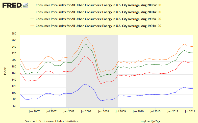
Energy
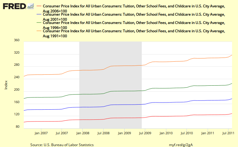
Tuition
Rent

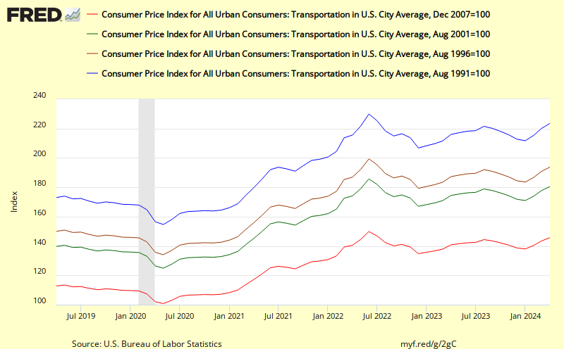
Transportation
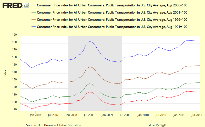
It is interesting to see how different public transportation is from Transportation as a whole. Public Transportation shows a smooth upward trend line despite high month to month volatility with a version to trend line slope following the recent recession. Overall, its cumulative effects are slightly higher than headline cpi
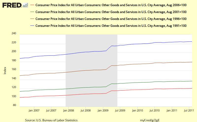
Other Goods and Services
Each chart shows 4 trends, 1 for the past 5 years, 1 for the past 10, one for 15 and one for 20 years. It's possible to read off the approximate end value of percentage increase. It's also possible to get a feel for the overall trends by observing the slopes of each trend line.
Note that the Y axis scale max value changes with each chart based on the 20 year curve so the slopes are not directly comparable in this view. .
Update 20 September 2011
Note other updates in this post are highlighted using this same brownish orange text color
Below, we have added some comments regarding what we see as important in each chart. The key takeaways for us are:
- Combining the two ideas of taking a cumulative view and drilling down on sub-components proves itself ot be most useful in helping us discover patterns previously not visible.
- Food inflation turned out much smoother than expected
- Energy was volatile but the cumulative approach still provided meaningful insights not otherwise available
- The wide variation in cumulative effects that we witnessed in Doug Shorts's 12 year chart also showed up in the series of charts below with some factors showing inflation rates far above the average value
- Many new questions were raised by the behavior we saw in the charts such as why are Medical and Tuition rising so relentlessly and smoothly and so fast while other categories show more variability?
Food
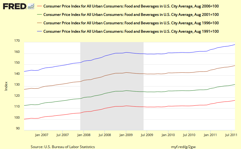 |
| With this long view Food does that seem all that volatile or variable |
In the Food chart, note the steady slope of the trend lines and the quick reversion to trend for the 10,15, 20 year cumulative lines following the most recent recession. If anything it looks as if cumulative food price inflation may be increasing faster than trend (greater slope).
Despite the stated volatility in food prices, when we take a cumulative view, the volatility virtually disappears so in our opinion it is perfectly fine to include Food price inflation in with a composite such as Headline CPI whenever we are using cumulative inflation thinking. .
Energy
Energy prices undoubtedly have been volatile, especially since 2001. But the cumulative view of this key subcomponent is still the best way to understand energy price inflation and to spot trends when they appear as in the very sharp upswing from 2001 to 2008. It also looks as if following the recent recession, that energy inflation may be trying to revert to the slope of the earlier trend line.
Key take away for me in this chart is the red line which shows doubling in energy prices over the past 10 years.
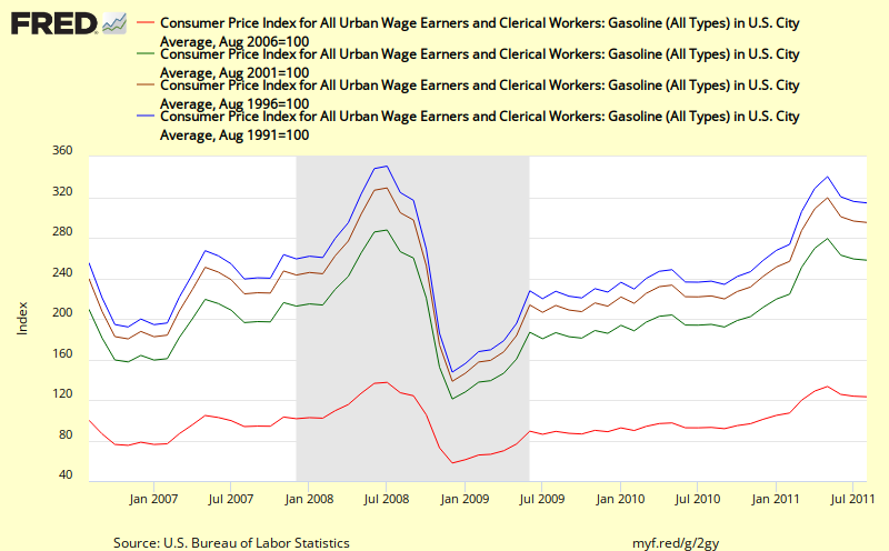
Gasoline
Key take away for me in this chart is the red line which shows doubling in energy prices over the past 10 years.
Gasoline
Gasoline inflation shows a pattern quite similar to overall energy but with even higher inflation rates of over 20% or the past 5 years and about by 160% over the past 10 years.
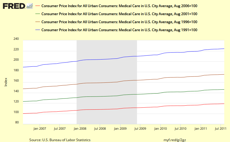
Medical
Medical
What's striking about this picture of Medical inflation is the absolute smoothness of the lines and the steady slope of each chart and the degree to which medical inflation far exceeds the average Headline CPI inflation.
Why is this so steady and relentless? If we can figure that out, we might be able to do something slow inflation in this category. .
Tuition
Tuition also shows a relentless upward pattern that looks like it is accelerating and runs far above the average headline cpi values. Why is this so? What is driving it?
Rent
Until 2008, rent also showed a relentless smooth upswing at just slightly above Headline CPI inflation. Following the most recent recession, it now looks like it might be reverting to its old trendline.
Transportation
Transportation looks very much like energy and gasoline charts, with more volatility but still some quite claer visible trends and what looks like a reversion to trend following the recent recession.No doubt this is due to the fact that the Transportation cpi includes energy components in a major way.
Public Transportation
It is interesting to see how different public transportation is from Transportation as a whole. Public Transportation shows a smooth upward trend line despite high month to month volatility with a version to trend line slope following the recent recession. Overall, its cumulative effects are slightly higher than headline cpi
Other Goods and Services
This chart for Other Goods and Services shows some interesting square wave patterns that may be a result of some change in the way this metric is calculated. Overall, the slope of the trend lines are smooth and this sub-category shows substantially higher inflation values than headline cpi
What new insights can we gain by drilling down/disaggregating?
Friday, September 16, 2011
The impact of cpi changes
Calculated risk has an interesting post this morning that shows how CPI inflation values impact Social Security cost of living adjustments (COLA). This is worth checking out as it adds some important context to why we might be interested cpi inflation in the first place. The post includes lots of explanatory text regarding how all the pieces fit together to determine COLA changes.
Early Look: 2012 Social Security Cost-Of-Living Adjustment on track for 3.5% increase
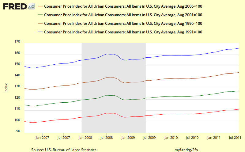
A 20 year cumulative view of headline cpi from FRED
Here's another view of the headline CPI number created using some advanced features of FRED (the wonderful St Louis Federal Reserve Economic Data charting program).
The shortest red line shows 11.0 % total inflation over the past 5 years;
the green line shows a total of 27.5% total cpi inflation over the past 10 years;
the brownish line shows 43.9% increase in total inflation over the past 15 years; and
the longest blue lines shows a total increase of inflation of 65.6% over the past 20 years.
If you want to play further with variations to this chart over at FRED or if you want to download the data that was used to create this chart you can use the following link: FRED 20 year cumulative view of cpi
Key take away - except for a little hiccup in 2001 and for a dramatic drop in 2009, headline cpi inflation has increased at a rather steady and substantial rate as can be seen by the readily visible even slope of these trend lines. It also looks like the latest rise over the past year has been bring the cumulative number back previous trend line..
 | ||||
| This chart shows the cumulative effect of cpi inflation over the past 5, 10, 15, and 20 years http://research.stlouisfed.org/fredgraph.png?g=2fo |
Update: 20 September 2011
The first key thing that I see in this chart is the relatively steady slopes of the 10, 15, and 20 year cumulative changes in inflation. For example, the blue line (20 year) shows a sharp dip during the most recent recession, but then quickly ramps back to close to the same trend line. Similary for the 15 year (brown line). Even though it is claimed that headline cpi is too volatile, when we deal with cumulative change as shown above, that by itself smooths out almost all the volatility.
What this means is that if we use cumulative data, we do not need to resort to thinking we need to use Core Cpi or other less volatile measures of inflation. We can include energy and food and still get a clear, smooth picture of what's going on and how it might impact real citizen households.
The second thing that is important to note in these charts is the considerable magnitude of the cumulative change for each for these periods (e.g. 27.5% for the past 10 years) as listed below. These changes can be compared with changes in nominal income achieved over similar periods - e.g. for households that fall in different income percentile categories as shown in the recent Census Bureau report: Income, Poverty, and Health Insurance Coverage: 2010 which includes an adjustment for CPI. What we learn from that report is that cumulative changes in income over time are different for different groupings of citizen (e.g. by income level or by race). This in turn leads to differential impacts of changes in cumulative inflation on each groups. In the most recent 20 year periods, some groups have been advancing their standard of living while other groups have seen their standard of living reduced.
We plan to discuss the Census Bureau report and work up some of these figures in more detail in future posts.
The shortest red line shows 11.0 % total inflation over the past 5 years;
the green line shows a total of 27.5% total cpi inflation over the past 10 years;
the brownish line shows 43.9% increase in total inflation over the past 15 years; and
the longest blue lines shows a total increase of inflation of 65.6% over the past 20 years.
If you want to play further with variations to this chart over at FRED or if you want to download the data that was used to create this chart you can use the following link: FRED 20 year cumulative view of cpi
Key take away - except for a little hiccup in 2001 and for a dramatic drop in 2009, headline cpi inflation has increased at a rather steady and substantial rate as can be seen by the readily visible even slope of these trend lines. It also looks like the latest rise over the past year has been bring the cumulative number back previous trend line..
Thursday, September 15, 2011
Calculated Risk's view of CPI
Bill McBride of the always excellent Calculated Risk blog has now weighed in with his approach to the latest CPI figures with his post on Key Measures of Inflation increase in August
Bill includes both the BLS CPI number and the Cleveland Fed's median cpi and trimmed mean cpi (alternative measures of core inflation). Key take away is
Adding new variation to the preceding CPI charts, the Calculated Risk cpi chart covers the almost 22 year period from January 1990. All three representations of core inflation are tracking close to each other over the past year but have shown larger differences in the past.
From today's series of CPI posts, we now have 5 different views of CPI
What do you see?
What else do we need to look at?
How else must we transform the underlying CPI metrics to reveal even more important insights?
And recalling a recent post (Creating the context for successful analyses), what's the context for looking at this data in the first place. One place to start might be to take a look at the interesting link to the Cleveland Fed that Bill McBride provided in his post: Measuring Inflation.
Bill includes both the BLS CPI number and the Cleveland Fed's median cpi and trimmed mean cpi (alternative measures of core inflation). Key take away is
"On a year-over-year basis, these measures of inflation are increasing, and are near the Fed's target."
Adding new variation to the preceding CPI charts, the Calculated Risk cpi chart covers the almost 22 year period from January 1990. All three representations of core inflation are tracking close to each other over the past year but have shown larger differences in the past.
 |
| http://cr4re.com/charts/charts.html?CPI#category=CPI&chart=InflationAugust2011.jpg
Update: 20 September 2011
From this chart, the uptick over the past year for all three measures looks quite sharp and of course we cannot tell what it will do next.
On the other hand, this 21+ year view also shows a clear downtrend in all three measures.which doesn't add up with my personal feelings about actual changes in inflation over that period of time. Remember from one of our previous charts, when we look at Headline CPI, we do not see a similar downward slope.
Of course, none of these measures directly shows the longer term cumulative impacts inflation and all three rule out aspects of inflation that actually impact ordinary citizens to end up with values that surely seem to be less than what American households really experiencing. My view is that these specialized metrics are at best a distraction from the main event: the cumulative inflation impact on each separate interesting sub-component of cpi. .
|
- A year over year view from the BLS news release showing just the past 12 months for just headline CPI
- An almost 12 year view of year over year inflation from Doug Short showing both headline and core cpi
- An almost 22 year view of year over year inflation from Calculated Risk showing three different metrics that reflect core inflation
- A 54+ year view of year over year inflation from Doug Short showing both headline and core cpi metrics
- The cumulative effect of inflation since the year 2000 broken down by categories such as energy, health care, and college tuition.
What do you see?
What else do we need to look at?
How else must we transform the underlying CPI metrics to reveal even more important insights?
And recalling a recent post (Creating the context for successful analyses), what's the context for looking at this data in the first place. One place to start might be to take a look at the interesting link to the Cleveland Fed that Bill McBride provided in his post: Measuring Inflation.
A Unique View of CPI from Doug Short
If you want to look at charts that help you understand what's going on in our economy, Doug Short's Updates is a great place to start. His charts are crisp, clear, concise and easy to understand and he provides a wide multidimensional view of many potentially inter-related metrics all launching from his Update landing page.
Here is one of his charts that gives a unique view to the CPI data that I have not seen expressed elsewhere and is worthy of emulation and further extension..
In the previous two posts, we showed year over year data which is a traditional and well respected method for smoothing out the month to month variability. But as we all know, inflation is cumulative and so it makes sense to look at year over 2 years, year over 5 years, or year over 10 years changes and compare those to how our earning power has changed over that time period. E.g. for those on fixed income in retirement, the longer view translates more directly to the degree to which inflation will impact their lives. A 4 percent difference over the year will have a small effect. A 35% change over 10 years will have a huge impact for anyone whose income is not keeping up.
Doug's breakdown of the component changes is also highly revealing.
Here is one of his charts that gives a unique view to the CPI data that I have not seen expressed elsewhere and is worthy of emulation and further extension..
 |
| http://advisorperspectives.com/dshort/charts/inflation/headline-core-comps.html?inflation-since-2000.gif |
Doug's breakdown of the component changes is also highly revealing.
UPDATE 20 September 2011 at 3:00 PM
Of all the published charts I found online covering the latest release of CPI for August 2011, I found this chart from Doug Short to be by far the most valuable & useful by itself, while inspiring further questions encouraging the viewer to dig deeper. The big advantages of this chart compared to the others are that
- it shows the cumulative impact of inflation over an almost 12 year period
- it breaks down the overall cpi effects into a series of selected and interesting sub-components which show a wide range of cumulative change during this time period.
- it reveals Doug's thinking about which of the subcomponents he things might be the most important to pay closer attention to (Energy, Medical Care, and Tuition)
- And with a little thought it lets us get a hint about how the average headline cpi cumulative increase of 34.2% came about from a weighted average of the three (left most) componentss: a core cpi reading of 26.3% an energy reading of 124% and a food reading of 37.7%. To me this showed up the weakness of focusing on either the headline cpi number or the core cpi number whether by themselves or even when combined becasue doing so leaves the cumulative impact of energy and food invisible to the viewer.
For me, this chart inspired me to dig deeper because it was crystal clear that headline cpi value cannot be understood unless you get a feel for its key components while looking at the cumulative change. This letter eventually to the series of cumulative cpi charts we created in our subsequent posts:
A 20 year cumulative view of headline cpi from FRED - showing cumulative readings of headline CPI by itself for 5, 10, 15, and 20 years periods
Drilling down into CPI 20 year trends - showing a set of interesting sub-components and their 5-20 year cumulative history
Taking a longer view of CPI trends
Doug Short has now posted some longer views of the Consumer Price Index CPI to complement those published by the Bureau of Labor Statistics (BLS). This provides additional context to help us think about what the latest numbers mean.
Here's his view of the data since 2000 with the shaded area from 1.75% to 2.00% representing the Core (CPI less food and energy) target rate for the Federal Reserve.
And here's Doug's really long view since 1957.
Here's his view of the data since 2000 with the shaded area from 1.75% to 2.00% representing the Core (CPI less food and energy) target rate for the Federal Reserve.
 |
| http://advisorperspectives.com/dshort/charts/inflation/headline-core-comps.html?CPI-headline-core-since-2000.gif |
UPDATE 20 September 2011
With the benefit of this 12 year view, we can now put the 1 year view from BLS into better perspective. For example, we can see the headline value of 3.7% (in red) is now back up into it's 2004-2007 range following a 2 step process which looks like a reversion to mean process. Will it overshoot? we can't tell? We also see that the CORE CPI (in blue) looks like it is reverting to the mean of the past 12 years. And here's Doug's really long view since 1957.
 |
| http://advisorperspectives.com/dshort/charts/inflation/headline-core-comps.html?CPI-headline-core.gif |
UPDATE 20 September 2011
In this much longer view, some further nuances come into view including the obvious 3 peaks of inflation in 1970, 1975, and 1980, the much lower inflation rates from 1960 to 1965. We can also see how the Headline CPI and the Core CPI are more likely to diverge from each other after 1985. We also see the CORE rate showing a steady decline since 1990 that was not matched by the Headline CPI.
Doug also has some charts showing the PCE (Personal Consumption Expenditure) Index and the Core PCE Index as shown below since 2000.:
 |
| http://advisorperspectives.com/dshort/updates/CPI-Headline-and-Core.php |
Check out Doug's original post for additional details.
We will keep our eyes open for other alternatives view of these metrics that get posted today.
CPI - year over year; not looking pretty
The latest Bureau of Labor Statistics (BLS) CPI numbers are out this morning and they don't look pretty.
BLS August 2011 CPI news release

But with such a short window, it's really hard to interpret what this chart is trying to tell us. Is this a significant inflation trend taking off and something of real concern, or is it more a matter of these metrics undergoing reversion to their mean values. We will be posting comments in chronological sequence for our other recent CPI posts that include charts over the next few days and perhaps we can better understand what this chart means once we have looked at the others.
The all items index has increased by more than 3x over the past year
Excluding food and energy, the increase is more than 2x.
While this is a nice crisp clean easily understood chart, this view shows only the past 12 months and is way too short a window all by itself. Longer views would help put the latest numbers in better context and allow the development of a supportable storyline. But the BLS tradition is to go with their template approach using short 1 month and 1 year durations for most of their findings. For example, see the story lines shown below in the lead paragraph (emphasis added showing the small number of instances of longer views)
BLS August 2011 CPI news release

UPDATE 19 September 2011
With the benefit of the context we established in Providing some Context for looking at CPI charts we can now revisit this month's collection of CPI charts and see what stories they might have to tell. We can see there are some striking changes underway the past 9 months for both the headline CPI figure (blue line) and the Core CPI (red line). But with such a short window, it's really hard to interpret what this chart is trying to tell us. Is this a significant inflation trend taking off and something of real concern, or is it more a matter of these metrics undergoing reversion to their mean values. We will be posting comments in chronological sequence for our other recent CPI posts that include charts over the next few days and perhaps we can better understand what this chart means once we have looked at the others.
We will be color coding our updates to distinguish them from the original post.
End Update
The all items index has increased by more than 3x over the past year
Excluding food and energy, the increase is more than 2x.
While this is a nice crisp clean easily understood chart, this view shows only the past 12 months and is way too short a window all by itself. Longer views would help put the latest numbers in better context and allow the development of a supportable storyline. But the BLS tradition is to go with their template approach using short 1 month and 1 year durations for most of their findings. For example, see the story lines shown below in the lead paragraph (emphasis added showing the small number of instances of longer views)
CONSUMER PRICE INDEX – AUGUST 2011
The Consumer Price Index for All Urban Consumers (CPI-U) increased 0.4 percent in August on a seasonally adjusted basis, the U.S. Bureau of Labor Statistics reported today.
Over the last 12 months, the all items index increased 3.8 percent before seasonal adjustment.
The seasonally adjusted increase in the all items index was broad-based, with continuing increases in the indexes for gasoline, food, shelter, and apparel.
The gasoline index rose for the 12th time in the last 14 months and led to a 1.2 percent increase in the energy index, while the food index rose 0.5 percent, its largest increase since March.
The index for all items less food and energy increased 0.2 percent in August, the same increase as the previous month. Shelter and apparel were the biggest contributors, though the indexes for most of its major components posted increases, including used cars and trucks, medical care, household furnishings and operations, recreation, tobacco, and personal care. The new vehicles index, unchanged for the second month in a row, was an exception.
The 12-month change in the all items index edged up to 3.8 percent after holding at 3.6 percent for three months, while the 12-month change for all items less food and energy reached 2.0 percent for the first time since November 2008. The energy index has risen 18.4 percent over the last year, while the food index has increased 4.6 percent.We'll keep our eye out for other postings this morning with longer time line views which should help clarify the picture and help us evaluate just how serious the most recent 12 month behavior of CPI is likely to be.
Subscribe to:
Posts (Atom)