Tuesday, December 27, 2005

US Treasury Cherry Picking


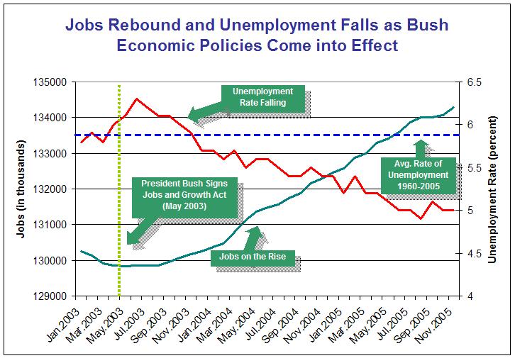
This is a nice example of cherry picking from a recent US Treasury Department press release. (Click for larger image) . In this case, the selection of the starting date, the scaling for the Y axes, and a pair of cooperating factors creates a strong impression of an economy that is going gangbusters and directly helping the ordinary working person.

Contrast this with the EPI talking points that we mentioned in our previous post that highlight a fairly lengthy list of the less than rosy things happening in the lives of American workers.

Picking a starting date near the peak for unemployment percent and near the low point for total jobs creates a different impression than if these same two factors had been viewed since 2000 or 1995 or 1990 or 1980. If you want to understand what's is happening with these two important metrics and to think about what it might mean, these other starting times will surely be instructive to your deliberations.

There is more going on here than just cherry picking. There is a strong push in this graphic to imply that there is powerful cause and effect relationship at work that is driving these numbers. Notice the vertical dotted yellow line for May 2003, the Green Text Box telling us "President Bush Signs Jobs and Growth Act (May 2003)", and the title linking the changes in these two factors to this specific President Bush action. Perhaps there is some relationship between that action and the visible results, but there is nothing in the graph or in the accompanying text of this press release that sheds light on how these two are in fact linked. The text box could equally well have said "Mission Accomplished (May 2003)".

Finally, the dotted blue line showing the average unemployment percentage from 1960-2005 is a great example of inappropriate use of averages and involves cherry picking of the starting and ending date. A very different blue line would have resulted from using the average unemployment from 1995-2000.

How can you protect yourself from Extremes of Cherry Picking? Here is how I would appraoch it.
a) look at the entire data time series yourself for each important factor - going back to at least 1980 in this case
b) zoom in and out on different time periods to grasp a fuller sense of the trends at work - include 1980-2005, 1990 through 2005, 1995 through 2005, 2000 through 2005
c) look at all the important factors - not just the ones that support your theory - in this case, the EPI datazone referenced in the previous post could be a good place to start. Once you have looked at this rather large set of factors, take a step back and think if there are any other factors that may have been left out.
d) adjust scaling as needed
e) look at different combinations of variables together
f) if you want to link the timing of specific events (e.g. the impact of Hurricane Katrina) or actions to what you see in the trends, create a list of the ones you think are most relevant.
g) try comparing different time periods - e.g. 1995 to 2000 compared to 2000-2005 with the factors that you consider the most important.

Economic Policy Institute Datazone

Another way to get a sense of the key factors that are at work and determine how well our economy is doing is to take a look at National Data from the EPI Datazone. Many more factors are available for review either by subcategory such as unemployment rates, or by downloading a spreadsheet with all the time series data for all the factors.

There are many more factors presented on the reference web page than were included in the article noted in our previous post - How is Our Economy Doing?

The one key thing that is missing is some way to make it easy for the lay person to quickly view all the the key factors, one at at a time, in an easy to ready trend graphic display .

A key goal of this blog is to help us move in the direction of ready reusability and we will be returning to this them in future posts.

How is Our Economy Doing?

How is Our Economy Doing? What are the Key Factors?

"What's wrong with the economy?" by Economic Policy Instute (EPI) President Lawrence Mishel and Policy Director Ross Eisenbrey addresses these very questions. Hat tip to Brad DeLong via Max Sawicky.

Mishel and Eisenbrey sketch the highlights of a range of key factors. Taken collectively, these can help us formulate a picture in our mind -- one that lets us gauge just how well our economy is doing.

These factors include:

Inflation-adjusted hourly wages
Inflation-adjusted weekly wages
Corporate profits
Productivity
Median household income (inflation-adjusted)
Indebtedness of U.S. households, after adjusting for inflation
The level of mortgage & consumer debt as a percent of after-tax income
The debt-service ratio (% of after-tax income that goes to pay off debts)
The personal savings rate
Number of private sector jobs
The number of manufacturing jobs
The unemployment rate
The percent of the population that has a job (employment rate)
The poverty rate and the number of people living in poverty
The child poverty rate and the number of children living in poverty
Family health care costs ($ per year)
The percent of people with employer-provided health insurance
The number of people with employer-provided health insurance

This is a wide-ranging list and the recent behavior of these factors (as spelled out in text form in the referenced article) is none too encouraging overall and some seem to indicate clearly disturbing trends.

This article is well on its way to meeting the multi-dimensionality principle espoused by this blog. It's actually quite unusual in text articles to have so many factors presented in such a brief space. The potential power of the Mishel-Eisenbrey message, however, suffers substantially from the lack of graphics.

Text messages (especially in paragraph form) simply are not an efficient method for transmitting an understanding of trend. This text approach almost invariably leads to some degree of cherry picking. Different factors use different time periods.

This type of detailed text discussion is close to impenetrable for all but the most dedicated readers and even those who "get it" will come away with an understanding of only a fragment of the trends at work.

EPI certainly knows how to put together trend graphics as evidenced by other work at their site. And they follow another key principle that guides this blog in making their data series available in their DataZone.

If they had included a downloadable slide show with at least one trend graph for each of their key factors, that would have increased the power of their mesage ten fold.

Saturday, December 17, 2005

Time flies when you are having fun

For those interested in understanding how the important variables that impact our lives change over time and what that means, Barry Ritholtz' The Big Picture blog consistently provides a sharp, careful and on target advice about what economic data is important and how to look at it carefully and fully.

Here are some recent examples from earlier this week.

NOTE: The permalinks are broken on the site right now, so just scan down from the blog home page to find these. excellent pieces of work.

The ideas apply to the case in hand and easily extend to thinking about any time series data you may be interested in.

YTD versus other time periods - posted on Dec 12th. A brief essay on detecting cherry picking and applying appopriate antidotes to avoid being misled by cheerleaders. We can all take to heart his comment regarding how the SEC stepped in to rein in the way mutual fund companies were cherry picking what they told prospective customers.

"Performance measures are often a quirk of time periods. The abuse of these stats is why the SEC standardized the way Mutual Funds report them in their marketing materials -- they no longer get to cherry pick the best data, and instead have to report several different time periods (e.g., 1,3 5 years) . . . "

How Strong is this Jobs Recovery? - posted on Dec 12th. This post shows 4 different ways how one might look at the recent job creation claims (4.4 million new jobs created since May 2003) from the White House and dramatically sheds some light on this important subject.

"Let's start with my question: How legitimate is that 4.4M number?

"The answer is, it depends upon how you look at it: Its either 1) Very Legitimate; 2) Legit, but Misleading; 3)About a Third Fabricated Projected; 4) Not nearly as legitimate as it appears."


Read the whole article. The answers are quite revealing and Barry once again uses the SEC anti-cherry picking principle to help think about the data we are seeing.

The general antidote endorsed by this blog is to make sure you have the whole time series of behavior of the factors in question and that you actually visually examine them prior to discussing what you think they mean with other interested parties. Check out the Time Line Collaboration principles on the right hand side of this blog for more ideas related to assessing statistical claims such as the one for 4.4 million jobs created.