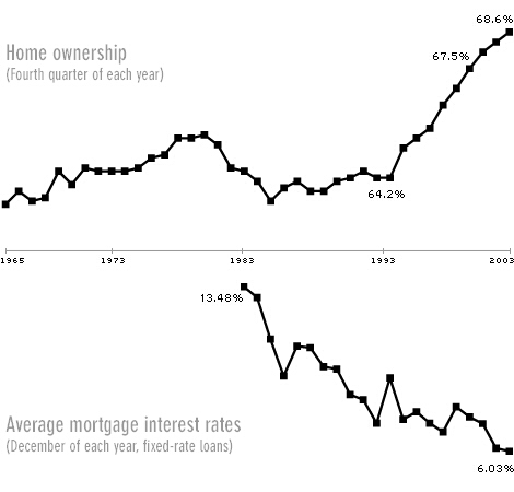
I apologize for not having the reference to the source of this pair of charts. It's unclear why the average mortgage rate for the second chart is missing for the first half of the time period.
It would be great to see this data with labelled Y axes for the past 15 years when there have been dramatic changes in both of these important factors.
One other point these two graphs raise is the choice of minimum and maximum values for the Y axis. Two common alternatives are a) to chose the minimum and maximum values show in the covered time period, and b) to use a minimum value of zero. These charts will have a much different feel if the second choice had been selected.
Home Ownership & Mortgage Rates

No comments:
Post a Comment