EPI Long Term Unemployment Past 15 Years

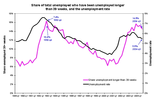
This is a common example of timeline use - charting two time series together using different scales (Y Axes) for each series. The Economic Policy Institute (EPI http://www.epinet.org/) often makes use of time series graphics to illustrate the points they are making.
For more information about this particular graphic, check out: http://www.epinet.org/content.cfm/webfeatures_snapshots_11102004 .
Joining a relatively simple graphic as the one above, and a detailed text explanation is a powerful combination that lets the reader/viewer evaluate the claims against the easily visible data in the chart. Contrast this verbal/graphic/numeric combination of evidence with claims that are made only in words. You may or may not agree with what EPI has to say, but at least for the data presented, you don't have to take their word for it. You can see for yourself.
For example, with the data above, if someone had said: "over the past year of economic recovery as measure by growth in GDP, the percentage of the unemployed who have been out of work for more than 39 weeks has stayed close to its 15 year high and is about twice as high as it was four years ago", you could visually inspect the chart and validate or invalidate the claim yourself by eye and by rough approximation. If you had the actual data series numerically (e.g. in an Excel spreadsheet), you could check out these claims precisely.
Without the graphical representation, you would be dependent on your source. Not only that, the whole pattern of change of unemployment over the past 15 year (such as the long period of steady reduction from 1992 to 2000) and the way that these two factors roughly track with each other would be lost.
What do you think after reviewing this graph and the accompanying EPI text? What did they miss? What other factors should be considered? Do their statements extract the essence from the graphics and help viewers understand the situation better? How would you have described this situation?
Contrast the EPI approach in their posting with the recent Bureau of Labor Statistics (BLS) report on unemployment: http://www.bls.gov/news.release/pdf/empsit.pdf which contains a pair of graphs covering trends over the past 3 years.
Or consider the BLS text and table only report of this same information at: http://www.bls.gov/news.release/empsit.nr0.htm . Consider in particular the opening text paragraphs:
THE EMPLOYMENT SITUATION: OCTOBER 2004
Nonfarm payroll employment increased by 337,000 in October, and the unemployment rate was about unchanged at 5.5 percent, the Bureau of Labor Statistics of the U.S. Department of Labor reported today. Construction employment rose sharply over the month, and several service-providing industries also added jobs.
Unemployment (Household Survey Data) Both the number of unemployed persons, 8.1 million, and the unemployment rate, 5.5 percent, were essentially unchanged from September to October. The jobless rate has held fairly steady thus far this year and remains below its most recent high of 6.3 percent in June 2003.
How much would you really understand about unemployment if this was all you were given - text only with no numbers and no graphs and the choice of emphasis and comparison left in the hands of the presenter?
Time scale is very important. The view of unemployment in a 3 year graph (BLS) looks a lot different from the 15 year EPI graph. Neither one of them is "right". Each of them reveals some details and hides others. Understanding trends in full depends on being able to look at a range of time scales and a range of factors. We will be returning to this theme in later posts.
Finally consider one more way that unemployment data could be presented by checking out this entry at The Heritage Foundation which includes many time series graphs and much textual explanation. http://www.heritage.org/Research/Economy/wm582.cfm
You may or may not agree with the conclusions of this document but each statement can be checked against the graphics shown. There are many graphs including both a 25 year and a 15 year view of the unemployment rate which adds further perspective to the charts discussed above.
Putting EPI, BLS and The Heritage Foundation together, what do you think? What else do you need to know? What other factors? What other timescales?
No comments:
Post a Comment