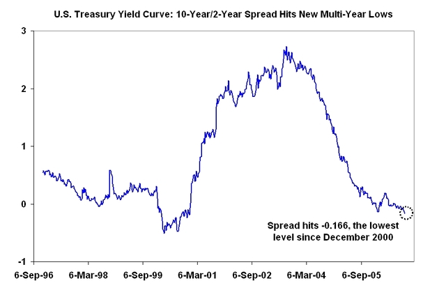
The Big Picture: U.S. Treasury Yield Curve
This is a nice example of how new and important metrics can be created by recombining the values of other metrics. In this case, the 10 year US Treasury yield and the 2 year Treasury yield metrics provide the raw ingredients. The recombination is to simply subtract the 2 year yield from the 10 year yield to get the new variable or "SPREAD" which is then plotted.
This seemingly simple approach brings some trend patterns into clear view where they otherwise might have remained invisible.
My own reading of this chart is that drop off in 2000 was much sharper (almost straight down) whereas the current drop represents a much longer, slower slide into the negative yield curve territories.
To fully understand what's going on, it would be useful to check out some other spreads such the 10 year - 3 months spread. It would also be useful to easily reference the original metrics to see what their trend looks like.
1 comment:
Just about every other measure of the US yield curve -- pick your spreads -- are inverted . . .
Post a Comment