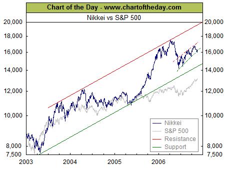
The free weekly posting at Chart of the Day - www.chartoftheday.com is often worth a look. This week's chart is a good example of how artful, carefully selected comparisons can reveal previously hidden meanings. In this case, the performance of the S & P 500 over the last 3 years (shown in grey) is compared to the performance of the Japanese Nikkei large stock index (shown in blue).
The divergence around mid year 2005 is sharp and striking. Also, the same chart makes it easy to see that the mid year 2006 correction was much steeper for the Nikkei and that both the Nikkei and the S & P 500 seem to be driving upward now at about the same rate.
If we zoomed in and looked at just the last year, or just the last 6 months and did the same comparison, different hidden meanings might come to the surface.
Bottom Line: all performance is relative so it's important to have a useful benchmark for making comparisons.
No comments:
Post a Comment