Professor James D. Hamilton's Econbrowser blog often provides excellent examples of the use of timelines to add to explanatory power and to promote conversation and collaboration around issues in our lives that affect us greatly.
His post a week ago on the recent scene regarding the employment situation in the U.S. is an excellent example of the ways that skillful use of time series graphics can add to the conversation and encourage further constructive conversation. [By the way, I call this TimeLine Collaboration (TLC) and one of the primary goals of this blog is encourage wider use of time series data in exactly this way.]
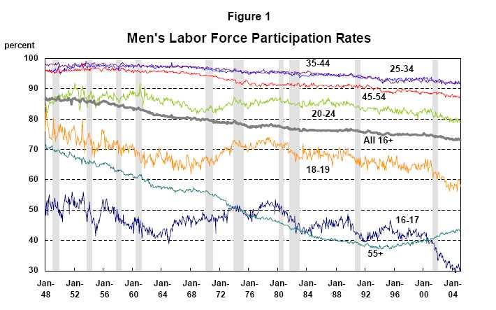
The trigger for the Econbrowser post was a Policy Brief written by Katherine Bradbury of The Federal Reserve Bank of Boston. Ms. Bradbury's brief is itself an excellent example of how best to make use of time series graphics to provide depth, breadth and insight to a complex topic.
Here's an example of one of her excellent and easily readable charts.
I plan to discuss her full document in more detail in a later post.
For now, I would like to focus on why I find Professor Hamilton's post on this subject so useful and helpful.
First, the post leads off with 9 links to others who have been commenting on the policy brief. This is really helpful for someone new joining the conversation.
"When Brad DeLong, Paul Krugman, Angry Bear, Economist's View, William Polley, VodkaPundit, The Big Picture, Lifelike Pundits, and Reading the World (among others)
all tell me to look at this policy brief by Katharine Bradbury, then, ok, I'll have a look at it."
Second, complementing the many excellent graphics in the policy brief, Professor Hamilton teases out three new time series graphs to dig deeper into the more subtle aspects of the question at hand. The graphs punctuate and support the arguments he makes with words. And the graphs themselves are easily readable and clear and quickly tell their story.
Here's one example where he draws out a single series from the policy brief figure 1 to help bring it more to our attention:
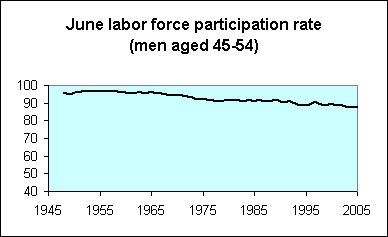
Note: I would have preferred to see this graph scaling from about 80 to 100 (rather than 40 to 100) on the Y axis to help visualize the trend more clearly. With a different Y axis scaling, the eye would be able to zoom in and detect trending over interesting sub-periods (e.g. the past 5 years). Right now, that kind of information is rather hard to read directly from this chart.
Professor Hamilton's blog directly includes timeline graphics with much greater frequency than many of the other popular economics blogs on the web. For example in following the 9 links for those who commented on the policy brief (and following further links from these 9) , embedded time series graphics were few and far between.
The text at these links was commenting on important metric after important metric and on their relationship, but it was the norm that there was nary a picture to clarify and reinforce the words. What a pity.
My view is that the inclusion of more pictures like those in the original policy brief and like those in Professor Hamilton's post will promote more and better conversations and understanding.
My open question to those who comment so regularly on matters economic is
I cannot imagine these economic experts coming to their conclusions or formulating the gist of their analyses in words without actually having looked at the time series that best inform the question at hand. When they show us their conclusions without at least showing us a few key pieces of the data upon which these conclusions were made, how does an impartial observer evaluate their work?WHY SO FEW GRAPHS?
In fact, how can evaluation of any theories or hypotheses or explanations offered by these economics experts even be possible without looking at some of the data?
Since our own time is often the scarcest resource that determines what gets done and what doesn't, the lack of supporting charts in these posts (where the chief content is interpretation in the trends) effectively rules out proper evaluation in most cases.
What's left is whether we TRUST the writer or not. Not a good recipe for communication, collaboration and learning together about the things that matter most.
We will return to questions such as these in future posts.
No comments:
Post a Comment