
In the previous post, Timelines on the Web - Part VI - A Treasure Trove of Graphs, I promised to comment on some of the 300+ graphs (8 MB) on the web assembled by Professor Mark Thoma over at Economist's View.
If you are interested in the idea of using time series data presented in a visual format to help make better sense of complex topics, to encourage deeper thinking, and to foster communication and collaboration, your time will be well spent in taking a look at the entire collection.
For performance reasons, I recommend that you download the whole 8 MB web page to your PC as a complete web page. Once I did this on my system, I was then able to use graphic image slide show software (e.g. IRFANVIEW or MIcrosoft Office Picture Manager) to walk through the individual images in their own sub-directory, enlarge them, sort them, and so on.
Professor Thoma's collection includes reference to a series of charts posted by Angry Bear between April 11th and April 25th, 2005 on the subject of health care. You can find the first Angry Bear post here, or the month of April 2005 Angry Bear archives here, or you can find the series of seven posts under the left hand column TOPIC heading for The U.S. Health Care System on Angry Bear's home page.
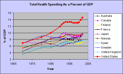
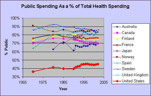
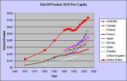
The four samples at the beginning this post give you a flavor of what's in store for you when you link back to Angry Bear's original posts and graphs. These are clear graphs that quickly deliver information that you may have heard about (e.g. U.S. infant mortality is high) but are not likely to have seen in such a visually powerful format.
Here's what I like about these posts individually and collectively.
1. The long and consistent time frame used for each chart stretching back to 1970.
2. The unusual readability given that Angry Bear is showing 10 different time series in each chart. The behavior of the U.S. series in red is especially easy to see in relation to the other countries' trends
3. The range of different metrics presented by the composite set of charts - in addition to the ones shown hear, there are charts for
+ Doctors per 1000 people,
+ Hospital Beds per 1000 people,
+ Life Expectancy at Birth,
+ Percent of Population over 65,
+ Percentage of Health Care spending for pharmaceuticals.
There are 10 separate interdependent metrics covering 35 years for 10 different countries.
4. The way that even a single chart such as the infant mortality trends could tell a story all by itself without any accompanying text (and having done so trigger the viewer to begin thinking more deeply about the meaning and underlying causes). This is not to say that a single metric is ever likely to be sufficient, but a good chart is sure a good way to start.
5. The nice integration of textual explanation in relatively close physical proximity with the related graphics.
In my opinion, Angry Bear's approach is a model to follow when addressing any important topic. The clear graphics covering multiple metrics and the accompanying text make excellent use of time series data to help make better sense of the complex topics of health care. At the same time this series encourages deeper thinking, and fosters further communication.
Angry Bear consistently produces excellent time series graphics and text dialogue on a range of interesting and important subjects. Repeating what I said earlier about Professor Thoma, it's definitely true that a careful study of Angry Bear's archives will provide many other examples of how best to harness the potential of time series graphics.
Check it out for yourself.
Note: this post was updated August 4th, 2005 at 5:28 PM with some corrections and additional material detail.
No comments:
Post a Comment