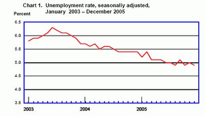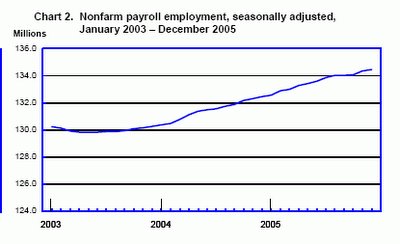

Here are the two charts that were published with this month's BLS Employment Situation Report for December 2005. This was one of the references given by Brad DeLong in his survey of the differing reports on these numbers but he did not include these charts in his chart examples.
From literally hundreds of possibilities, the BLS selects these two factors to visualize: chart 1) the headline unemployment rate (seasonally adjusted) and chart 2) the total number of non-farm jobs also seasonally adjusted.
Comments on Chart 1: The three year view gives more perspective than just mentioning the current value as seems to be the case in so many articles and blog entries reporting on the release from BLS of these numbers.
For fuller understanding of the unemployment rate metric, my recommendation is that would be best to look at other time intervals such as 1 year, 5 years, 10 years and 20 years. Alternatively, you could look at periods beginning 1980, 1990, and 2000.
When you do that, you will likely be able to notice that there is more nuance than can be gleaned form the 3 year view alone.
Comments on Chart 2: Charts with mostly monotonically increasing data such as the metric of total jobs shown in chart 2 are almost always difficult to read. They provide little useful new insight or understanding. They say "things" are going up but don't tell you how fast, and don't tell whether the rate of increase is changing or staying the same.
The chart shown in the previous post from the BLS Editor's Desk was based on the same source data of the total number of jobs, but computing the new measure of total jobs created in the past year proved far preferable.
The rest of the BLS Employment Situation Report is dense with trend information delivered as text messages or complex tables. Because of formatting limitations of using a medium designed around 8 by 11 paper, the tables published in this print version are also seriously incomplete. The BLS does indeed have an approach to measure and report on many vital measures of employment, but the report itself just cannot be useful for anyone who wants to understand these trends without investing huge amounts of personal time.
In my opinion, this kind of approach falls far short on the key human engineering metric of readily reusability.
A major goal of this blog is to figure out a way to unlock the valuable data collected by sources such as the BLS and make it available to both expert economists AND ordinary citizens in a format they can understand and with a time-demand-footprint that is in keeping with the idea that Time is our Scarcest Resource.
The BLS is already doing things that take us part way towards this idealized goal. We'll be discussing this in more detail later as well as looking for ways to further increase usability of this vital data.
No comments:
Post a Comment