Here's a recent Michael O'Hanlon New York Times article which includes year over year table showing some 17 trend metrics from Feb 2004, year by year through Feb 2007.
The State of Iraq: An Update:
We plan to graph some of the more interesting of these trends in a future post to see what patterns we can discover that may be hiding in the data once we have transformed the posted table into a more readily reusable format for further investigation and discussion.
Showing posts with label reusability. Show all posts
Showing posts with label reusability. Show all posts
Saturday, March 24, 2007


Tuesday, March 20, 2007
timelines in motion
A nice example of timelines in motion accompanied by an audio track from Brad Delong.
The combination of a timeline change in motion and a guided audio track is powerful.
To make this even better, I would have liked it to zip along at a faster pace and it would be great to have a higher resolution graphic quality so that the X and Y axes could be more readily examined and understood.
You won't be surprised to hear me saying that making the data available in a readily re-usable format would sweeten things even further.
Providing a mechanism similar to gapminder to be able to watch this change over time with the viewer in control of the speed would be even better.
What do you think?
The combination of a timeline change in motion and a guided audio track is powerful.
To make this even better, I would have liked it to zip along at a faster pace and it would be great to have a higher resolution graphic quality so that the X and Y axes could be more readily examined and understood.
You won't be surprised to hear me saying that making the data available in a readily re-usable format would sweeten things even further.
Providing a mechanism similar to gapminder to be able to watch this change over time with the viewer in control of the speed would be even better.
What do you think?
Monday, February 12, 2007
Many Eyes - A New Doorway for Graphical Collaboration
From our previous post we noted that:
Once you register, you can upload interesting data sets and create visualizations that you feel are meaningful. Others can view your visualization and comment. They can also create their own variant visualizations using the data you uploaded and publish these for others to view and comment. Many different visualization formats including time series graphs, bar charts, scatter charts as well as some very creative new chart types are available in an interactive fashion. Creating new charts is similar to the kinds of interactions you might experience with one of the many stock quote charting web sites such as the java charts on prophet.net
Even better, once a data set is uploaded by anyone, it is possible someone else to download that data set for further analysis on their system using their favorite tools. For example, you might want to take a set of raw time line data series and compute some additional columns of data as we did in one of our previous Iraq posts. You could then take your new data set with added columns and upload it to Many Eyes for others to work with directly.
To test out these capabilities, I uploaded the O'Hanlon indicators that we have recently posted about. You can find a visualization that shows a single indicator that I created at: Percent of Coalition Troops Appears to be Shrinking. Once you get to that page, you can select other indicators from the list box on the left side to view the other trends at work. You can also download the entire table to your computer or leave a comment or create at publish your own chart. [Unfortunately, at present the long indicator names cannot be fully seen during the selectino process. So if you want to know what they are, you can find out by clicking on the table like icon element to look at and scroll through the top row of the data set where the indicator names appear]
I see Many Eyes (what a great name) as a big step forward in thinking about, discussing, understanding, and collaborating about the most important factors in our lives. I expect I will be uploading additional data sets and creating new visualizations there in the future. I would love to hear what you think about his newly available capability.
We believe in many eyes, many hands, many voices working together on the path of mutual discovery (rather than the idea of a single expert figuring it all out and presenting it to us in final form).To help foster exactly this kind of process, I am excited to note a new web site, Many Eyes that is now available for exactly this purpose. As they describe it on their home page: Many Eyes is a place to: view your data, ask questions, share your discoveries, and harness the collective intelligence of the net for insight and analysis.
Once you register, you can upload interesting data sets and create visualizations that you feel are meaningful. Others can view your visualization and comment. They can also create their own variant visualizations using the data you uploaded and publish these for others to view and comment. Many different visualization formats including time series graphs, bar charts, scatter charts as well as some very creative new chart types are available in an interactive fashion. Creating new charts is similar to the kinds of interactions you might experience with one of the many stock quote charting web sites such as the java charts on prophet.net
Even better, once a data set is uploaded by anyone, it is possible someone else to download that data set for further analysis on their system using their favorite tools. For example, you might want to take a set of raw time line data series and compute some additional columns of data as we did in one of our previous Iraq posts. You could then take your new data set with added columns and upload it to Many Eyes for others to work with directly.
To test out these capabilities, I uploaded the O'Hanlon indicators that we have recently posted about. You can find a visualization that shows a single indicator that I created at: Percent of Coalition Troops Appears to be Shrinking. Once you get to that page, you can select other indicators from the list box on the left side to view the other trends at work. You can also download the entire table to your computer or leave a comment or create at publish your own chart. [Unfortunately, at present the long indicator names cannot be fully seen during the selectino process. So if you want to know what they are, you can find out by clicking on the table like icon element to look at and scroll through the top row of the data set where the indicator names appear]
I see Many Eyes (what a great name) as a big step forward in thinking about, discussing, understanding, and collaborating about the most important factors in our lives. I expect I will be uploading additional data sets and creating new visualizations there in the future. I would love to hear what you think about his newly available capability.
Change Over Time: First Principles Revisted
I am enjoying reading Edward Tufte's new book: Beautiful Evidence. It's the fourth in a series of wonderful Tufte volumes that exemplify the power of visual display and it certainly lives up to its title. Beautiful Evidence, like its predecessors, is simply a beautiful and inspiring work - blending art and science and philosophy and the linkages between numeric data and their visual representations into a unifying whole.
Tufte is powerfully interested in the underlying principles. For example, here's a brief passage from his introduction to Beautiful Evidence:
"Beauty" on the other hand, plays a much smaller role in our efforts. It is always a delight when it makes one of its rare appearances for us, but is not a primary or even a secondary goal. In fact, many of the approaches we recommend in order to meet our primary mission by their very nature tend to lead away from beauty.
Reading Tufte always encourages me to take a step back and think about the first principles that are the foundation of the work of this blog. I want to think through and examine all that his approach has in common with the work shown in this blog and all the ways we might differ.
Here are some further thoughts about the first principles that are the basis of my continuing work with the visualization of time series data (with special emphasis today on the principles that might mitigate against "beauty").
To sum up, in our approach, if we have to chose, we will chose timeliness, usefulness, ready re-usability, accessibility to the ordinary citizen, tools that are available here and now, and the ability to collaborate over beauty every time.
Tufte is powerfully interested in the underlying principles. For example, here's a brief passage from his introduction to Beautiful Evidence:
Evidence is evidence, whether words, numbers, images, diagrams, still or moving. The intellectual tasks remain constant regardless of the mode of evidence: to understand and to reason about the materials at hand, and to appraise their quality, relevance, and integrity.This blog is especially concerned with a particular kind of evidence: multi-dimensional time series. We are surely interested in the underlying intellectual and analytical tasks including understanding causality, making comparisons, and cross checking conclusions.
... The point of evidence displays is to assist the thinking of the producer and consumer alike. Evidence presentations should be created in accord with the common analytical tasks at hand, which usually involve understanding causality, making multivariate comparisons, examining relevant evidence, and assessing the credibility of evidence and conclusions.
"Beauty" on the other hand, plays a much smaller role in our efforts. It is always a delight when it makes one of its rare appearances for us, but is not a primary or even a secondary goal. In fact, many of the approaches we recommend in order to meet our primary mission by their very nature tend to lead away from beauty.
Reading Tufte always encourages me to take a step back and think about the first principles that are the foundation of the work of this blog. I want to think through and examine all that his approach has in common with the work shown in this blog and all the ways we might differ.
Here are some further thoughts about the first principles that are the basis of my continuing work with the visualization of time series data (with special emphasis today on the principles that might mitigate against "beauty").
- Time is of the essence - both analyst time and viewer time. While making comparisons and searching for understanding and seeking out properties of the data that have never before been seen, we will give preference to those approaches that help speed up the work of the analyst, even if some or a lot of beauty must be sacrificed.
- Following Covey, we seek first to understand the data and then to present our findings in ways that make it easiest and quickest for others to understand.
- Sharing the data in a readily accessible and readily reusable form along with the presentation of any findings is perhaps the core principle of our work. It's the one that allows for collaboration and for a rapid and multi-step search for meaning.
- We aim to make both the data and whatever graphical representations we create accessible to experts and non-experts alike.
- We care deeply about practical tools that allow ordinary citizens to participate in this work of comparison and understanding.
- We believe in many eyes, many hands, many voices working together on the path of mutual discovery (rather than the idea of a single expert figuring it all out and presenting it to us in final form).
- We want to apply this approach to the most important, practical, everyday problems that we face. We want this approach to help dramatically improve decision making. And we want this to happen in near real time.
To sum up, in our approach, if we have to chose, we will chose timeliness, usefulness, ready re-usability, accessibility to the ordinary citizen, tools that are available here and now, and the ability to collaborate over beauty every time.
Thursday, January 18, 2007
Creating Readily Reusable Data from Online Tables of Trends in Iraq: a quick example
Here's a quick example of how relatively inaccessible tabular data from a web site can be converted into a readily reusable format.
Starting Point: Tabular data from GlobalSecurity
Step 1. We went to Global Security's Iraq Casualties page and found a table that included one column of monthly data for US Named Dead and second column for US Wounded. The bottom of that page also includes one chart for each of these factors that are worth examining. Note that these charts were not included in the ones we selected from Global Security in our earlier post as we already had charts on US dead and wounded that we had selected from the Iraq Casualty Coalition that we felt were more revealing. We cut and pasted the table from Global Security into Microsoft Excel and played with the data to create two clean columns of CSV data and a time stamp column.
Step 2. We went to Global Security's Boots on the Ground page and cut and pasted the two columns of data showing troops in Iraq and and troops "in theatre" to create a CSV data file which now had 4 data columns.
Step 3. We now had the data in a readily-reusable (RR) form as 4 data column CSV file. We took advantage of this to compute some new data columns derived from the original four columns, namely:
You can take a look at the resulting RR file we have created which now has 11 data columns by downloading it from Iraq-RR-Example.csv. Check it out with Microsoft Excel, or even better this would be a great opportunity to try out TLViz (the TimeLine Visualizer) or the CSVPNG utility - both of which are expressly designed to work with RR data in this format.
You can learn more about these powerful tools in our previous posts: here and here and here and here for TLViz and here for CSVPNG and you can download the latest versions of these powerful utilities from the TrendsThatMatter Download page.
The first payoff of an RR approach is that when tabular data is converted to RR format, it puts you back in the driver seat. You are not dependent on only seeing the charts that some other analyst selected. You can look at every factor. You are not restricted to just the time period that someone else selected. You can zoom in on a period you are most interested in.
A second payoff is that you are not restricted to looking at only the combinations of data (if any) that someone else selected. You can also combine factors together with multiple trends on a single graph. Interactive tools like TLViz make it an order of magnitude easier to create different combinations of key factors and help reveal patterns hiding in the data.
A thrid payoff is that you are not restricted to only looking at the raw data. You can add moving averages and look at the moving average by itself or create a trend graph that shows both the initial raw data and the moving average together as shown in the example below:
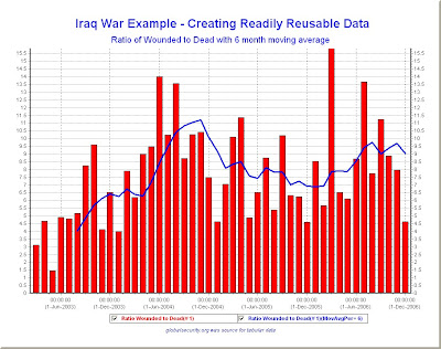
A fourth payoff is that you can now create new computed or derived values such as the 7 new metrics we added on to our starting point of four Global Security factors. This facility to compute or derive new trend data by calculation involving the current set of factors is extremely important at revealing the full value that the data might hold.
The final payoff is that as you gather data from other sources, you can turn this into RR format and then add new columns to extend the your existing RR file.
The example we showed in this post is pretty elementary, starting as it does with only a handful of factors. As we have seen from our work with the Iraq war data so far, there are literally dozens of important factors. If we could put them all into a single RR data set, our ability to understand what is going on would be markedly enhanced and many opportunities for discovery would open up.
We are still a long way from that goal. In our next post, we will give you a little more complex example of RR data for Iraq that involves substantially more of the relevant factors.
In the meantime, I suggest you download and take a look at the Iraq-RR-Example.csv and see what else you can discover from the 11 reported factors that we have assembled for you.
Starting Point: Tabular data from GlobalSecurity
Step 1. We went to Global Security's Iraq Casualties page and found a table that included one column of monthly data for US Named Dead and second column for US Wounded. The bottom of that page also includes one chart for each of these factors that are worth examining. Note that these charts were not included in the ones we selected from Global Security in our earlier post as we already had charts on US dead and wounded that we had selected from the Iraq Casualty Coalition that we felt were more revealing. We cut and pasted the table from Global Security into Microsoft Excel and played with the data to create two clean columns of CSV data and a time stamp column.
Step 2. We went to Global Security's Boots on the Ground page and cut and pasted the two columns of data showing troops in Iraq and and troops "in theatre" to create a CSV data file which now had 4 data columns.
Step 3. We now had the data in a readily-reusable (RR) form as 4 data column CSV file. We took advantage of this to compute some new data columns derived from the original four columns, namely:
- the monthly ratio of wounded to dead
- the monthly change in troop level in Iraq
- the monthly change in troop level in Iraq as a percent of the previous month's level
- the three month trailing moving average of fatalities
- the six month trailing moving average of fatalities
- the 9 month trailing moving average of fatalities
- the monthly total of wounded and dead combined
You can take a look at the resulting RR file we have created which now has 11 data columns by downloading it from Iraq-RR-Example.csv. Check it out with Microsoft Excel, or even better this would be a great opportunity to try out TLViz (the TimeLine Visualizer) or the CSVPNG utility - both of which are expressly designed to work with RR data in this format.
You can learn more about these powerful tools in our previous posts: here and here and here and here for TLViz and here for CSVPNG and you can download the latest versions of these powerful utilities from the TrendsThatMatter Download page.
The first payoff of an RR approach is that when tabular data is converted to RR format, it puts you back in the driver seat. You are not dependent on only seeing the charts that some other analyst selected. You can look at every factor. You are not restricted to just the time period that someone else selected. You can zoom in on a period you are most interested in.
A second payoff is that you are not restricted to looking at only the combinations of data (if any) that someone else selected. You can also combine factors together with multiple trends on a single graph. Interactive tools like TLViz make it an order of magnitude easier to create different combinations of key factors and help reveal patterns hiding in the data.
A thrid payoff is that you are not restricted to only looking at the raw data. You can add moving averages and look at the moving average by itself or create a trend graph that shows both the initial raw data and the moving average together as shown in the example below:

A fourth payoff is that you can now create new computed or derived values such as the 7 new metrics we added on to our starting point of four Global Security factors. This facility to compute or derive new trend data by calculation involving the current set of factors is extremely important at revealing the full value that the data might hold.
The final payoff is that as you gather data from other sources, you can turn this into RR format and then add new columns to extend the your existing RR file.
The example we showed in this post is pretty elementary, starting as it does with only a handful of factors. As we have seen from our work with the Iraq war data so far, there are literally dozens of important factors. If we could put them all into a single RR data set, our ability to understand what is going on would be markedly enhanced and many opportunities for discovery would open up.
We are still a long way from that goal. In our next post, we will give you a little more complex example of RR data for Iraq that involves substantially more of the relevant factors.
In the meantime, I suggest you download and take a look at the Iraq-RR-Example.csv and see what else you can discover from the 11 reported factors that we have assembled for you.
Wednesday, January 17, 2007
The Iraq Situation and Readily-Reusable Data
One of the difficulties I have encountered so far is that the data I would really like to examine first hand is not readily reusable and in some cases is completely unavailable in any form.
The first timeline collaboration principle that you will find on the right hand column of our blog template is:
Admittedly some of these sources have shared their trend data series, but the method they selected means that they are not easy or ready for reuse without investing a lot of time and effort.
For example,
Most people (both decision makers and ordinary citizens) are not particularly good or particularly thrilled by the idea of trying to make sense of trend data contained in a printed or online table.
My experience indicates that almost all adults (I would estimate the number at 90% or more) can make good sense of trend data presented in line graphs or bar graphs). On the other hand, I estimate that fewer than 10% of the people have the skills, interest or time to extract basic information from a trend table like the one on page 5 of the Brookings Iraq Index, or the many tables you can find at GlobalSecurity or at the Iraq Casualty Coalition.
What impact does this lack -- this lack of data / lack of readily reusable data / lack of easily viewable trend data for all key factors -- have on our ability to understand what's going on?
The way this plays out is that for 99% of the population, they will get their understanding of the trends from their most trusted source.
For a small percentage of people (I am guessing under 5% of the population), that trusted source might be one of the ones we have mentioned so far in this series on Iraq Trends or a similar detailed view of the situation that provides some depth and breadth and doesn't rely on just one or two metrics.
For this small group, if their source is Brookings, and they spend the time wading through the 30 page report, they will have a good chance of making good sense of the charts that Brookings selected. Similarly if their source is the State Department and if they wade through the Weekly Status report they will get a picture of the trends that the State Department selected but not the ones that Brookings was paying attention to. If their source is GlobalSecurity or the Iraq Casualty Coalition, they will get a good grasp of the charts presented at those sites.
Even in this small group that goes and gets their trend understanding from one of these useful and detailed sources (or other similar venues) a small percentage will dig any further into the tabular data that is available. The reason: primarily lack of time and secondarily lack of experience possibly combined with self conceived notions that reading tables is hard.
My reading is that few in this small group will consult and combine the trends from multiple sources like those mentioned above to get a broader perspective. Of course, if you have been reading this series of posts, we have done some of that lifting work for you and made it easier (still not easy in my opinion) to become more widely informed of the composite set of trends that are considered important drawn from a mix of analysts who may have vastly different axes to grind.
For a good portion of the rest of the population beyond this small group, the trusted source for trend data will turn out to be television and other mainstream media. Based on what I have seen from the MSM, this group of individuals will likely be exposed to quite limited trend information in any form and will often end up only being exposed to non-specific, non-numerical statements about the situation on the ground.
What to do? What to do?
Glad you asked. The answer for me is straightforward: ready reusability.
Ready reusability for the Iraq Trend data is easy to say and hard (time consuming, error prone) to do right now. In the next couple of posts, I will give you an example of what I mean by transforming some of the tabular data from expert sources into a readaily reusable form. Once the data is ready to go, I will provide some examples of why I think this is so important.
The first timeline collaboration principle that you will find on the right hand column of our blog template is:
1. Share the data series with the chart. Make sure it is readily reausableTo the best of my knowledge, not one of the 4 sources we have consulted so far (Brookings Iraq Index, The State Dept's Iraq Weekly Status, GlobalSeccurity, or the Iraq Casualty Coalition) has made the data that they used for their own analysis and charting both available and readily reusable as a spreadsheet or CSV file.
Admittedly some of these sources have shared their trend data series, but the method they selected means that they are not easy or ready for reuse without investing a lot of time and effort.
For example,
- Brookings Iraq Index does include some trend data tables with important metrics and frequently labels the data values on their charts. Not all of the interesting trend data that appears in the tables is translated into a chart in the report. For example, see the table on page 5 of the January 8th report that shows details of the trends in cause of death for US Troops.
- The Iraq Weekly Status Report from the State Department does not include any trend data at all beyond what they show in their charts. And the time period covered by the charts they have selected is rather short in most cases. For example the crude oil production chart only covers the last 10 weeks and other charts cover less than a year. Only the electricity chart stretches back to the beginning of 2004
- Global Security includes a lot of detailed trend data in tabular form in addition to and complementing the charts they provide. The range of the data presented tabularly tends to cover the entire period from the start of the war until the present.
- The Iraq Casualty Coalition also provides substantial amounts of tabular trend data in addition to their charts and their data covers the entire period from the beginning of the war.
Most people (both decision makers and ordinary citizens) are not particularly good or particularly thrilled by the idea of trying to make sense of trend data contained in a printed or online table.
My experience indicates that almost all adults (I would estimate the number at 90% or more) can make good sense of trend data presented in line graphs or bar graphs). On the other hand, I estimate that fewer than 10% of the people have the skills, interest or time to extract basic information from a trend table like the one on page 5 of the Brookings Iraq Index, or the many tables you can find at GlobalSecurity or at the Iraq Casualty Coalition.
What impact does this lack -- this lack of data / lack of readily reusable data / lack of easily viewable trend data for all key factors -- have on our ability to understand what's going on?
The way this plays out is that for 99% of the population, they will get their understanding of the trends from their most trusted source.
For a small percentage of people (I am guessing under 5% of the population), that trusted source might be one of the ones we have mentioned so far in this series on Iraq Trends or a similar detailed view of the situation that provides some depth and breadth and doesn't rely on just one or two metrics.
For this small group, if their source is Brookings, and they spend the time wading through the 30 page report, they will have a good chance of making good sense of the charts that Brookings selected. Similarly if their source is the State Department and if they wade through the Weekly Status report they will get a picture of the trends that the State Department selected but not the ones that Brookings was paying attention to. If their source is GlobalSecurity or the Iraq Casualty Coalition, they will get a good grasp of the charts presented at those sites.
Even in this small group that goes and gets their trend understanding from one of these useful and detailed sources (or other similar venues) a small percentage will dig any further into the tabular data that is available. The reason: primarily lack of time and secondarily lack of experience possibly combined with self conceived notions that reading tables is hard.
My reading is that few in this small group will consult and combine the trends from multiple sources like those mentioned above to get a broader perspective. Of course, if you have been reading this series of posts, we have done some of that lifting work for you and made it easier (still not easy in my opinion) to become more widely informed of the composite set of trends that are considered important drawn from a mix of analysts who may have vastly different axes to grind.
For a good portion of the rest of the population beyond this small group, the trusted source for trend data will turn out to be television and other mainstream media. Based on what I have seen from the MSM, this group of individuals will likely be exposed to quite limited trend information in any form and will often end up only being exposed to non-specific, non-numerical statements about the situation on the ground.
What to do? What to do?
Glad you asked. The answer for me is straightforward: ready reusability.
Ready reusability for the Iraq Trend data is easy to say and hard (time consuming, error prone) to do right now. In the next couple of posts, I will give you an example of what I mean by transforming some of the tabular data from expert sources into a readaily reusable form. Once the data is ready to go, I will provide some examples of why I think this is so important.
Thursday, January 11, 2007
Some Background on the T4 & Friends Project
In several previous posts we have mentioned the T4 & Friends project. If you want to learn more about this project, you can check out the HP T4 & Friends web site where you can download the general purpose TLViz and CSVPNG software. Additional valuable information can be found on the T4 FAQ page where at the bottom you will also discover some links to valuable related documents.
Initially and on the surface T4 was a project that was intended to make things better for OpenVMS Engineering as it carried out various performance analysis duties. Converting proprietary format performance trend data to readily reusable (R-R) format turned out to be both easy and amazingly powerful. This step alone was a huge win as we were able to use the powerful features of tools such as Excel to help us do our jobs better.
Then, suddenly, tools such as TLViz the timeline visualizer and the versatile CSVPNG utility came on the scene and added at least another order of magnitude productivity benefit to our work. With better downstream tools, more and more people were able to see the value of converting proprietary data formats to the readily-reusable T4-style format so that they could benefit form the downstream tools such as TLViz and CSVPNG, not to mention Excel or MySQL.
As the number of converters and extractors came on the scene to create R-R data, it became clear that the T4 & Friends project provided value well beyond VMS and even well beyond situations where trend data was needed for system performance analysis. The more collectors that were built, the more it was clear that Readily-Reusable data in CSV format combined with tools such as TLViz and CSVPNG were truly universal in scope and available as helpers on any project involving trend data.
Tying things together: This blog sets out as a fundamental assumption that as we learn together how to better harness trend data our ability to create the future that we want for ourselves on this planet will be enhanced.
In upcoming posts, we will be looking into how we might use Ready-Reusability combined with the T4 downstream tools TLViz and CSVPNG to look at the trend data that is most important to us in our lives.
We are also going to be looking at how we might make our downstream tool capabilities even better as well as looking to how we can automate the creation of R-R data from an ever growing set of collectors and extractors reporting on the most important factors controlling the most important aspect of our lives.
Wednesday, January 10, 2007
Why Is TLViz important and different from what you have seen before?
Quite quickly TLViz proved it was an excellent tool for all sorts of trend data, not just OpenVMS system performance trends. I have personally used it for example with environmental data gleaned from World Watch and with employment data from the Bureau of Labor Statistics (BLS) once these data streams were converted to readily reusable format. Once we had made this data transformation, we realized that TLViz made it possible to discover previously invisible patterns that would have been more difficult to find if we had limited ourselves to the World Watch or the BLS tools that came with the original data.
TLViz is not the end all or be all for graphical trend analysis. It has undergone a series of enhancements and improvements over the past 6 years and yet in some ways it is really only at the beginning of what else might be accomplished.
The virtue of TLViz is that like MS Excel it is a generic tool. It works with any trend data, not just stock prices. Once you add a feature, it can then be available for everyone. And, you may be surprised to find that TLViz provides capabilities today that are radically more time efficient than even the best stock market tools for certain heavily used types of graphic representation. One example is the ease of combining metrics on a single chart. We will be delving into these advantages with specific examples in future posts.
Third: by using readily reusable data as its base, TLViz helps further promote the idea of ready reusability (R-R). What this means is that someone else can come along and build another generic utility that does something else magical and wonderful with trend data and that once that happens, these new capabilities will be available to everyone who has created or converted their data to the R-R form. For example, there is now a utility called CSVPNG (more about this in future posts) that takes R-R data and provides an additional set of capabilities that extend beyond what TLViz can do. And of course, if you use R-R data, you will still be able to use Excel, or Oracle, or MySQL on these data sets.
Wednesday, January 3, 2007
TLViz – A Little Historical Background
Originally, when we created these R-R files known as T4 files, we simply input them to Microsoft Excel. The R-R format allowed us to make full use of the trend visualization capabilities and other features already built into Excel. This immediately extended our ability to visualize the trend data beyond the limitations built into the tools that had originally collected the most important performance data that we had wanted to investigate. Conversion to R-R format by itself gave us an order of magnitude time-saving and productivity improvement compared to previous methods for looking at this trend data.
We also discovered that TLViz was helpful in multiple ways - it dramatically cut analyst time AND it also made it easier and faster to present the results of analysis to others (both expert and non-expert) AND it greatly increased the possibilities for collaboration.
These additional productivity improvements alone made TLViz a worthwhile tool to add to our repertoire for the OpenVMS performance work we were doing. TLViz at its conception was designed for the very specific purpose of looking at OpenVMS System Performance Data. TLVIZ not intended as a general purpose trend visualization mechanism. However, experience with TLViz in the past 5 years has shown that it can be mapped over to the general case and by doing so it can offer some of the same time-saving and productivity and collaboration advantages.
While there are certainly areas for improvement for the general case, TLViz today provides a demonstration of what might be possible to do in the general case of making trend data more accessible to a wider audience with the intention of radically improving productivity, promoting collaboration and encouraging mutual learning.
In the next post, we will outline some other key reasons why we think TLViz is such an important demonstration of what is possible for the general case of trend collaboration that we are advocating in this blog..
In the meantime, to give this a quick try yourself, we recommend you DOWNLOAD TLViz from HP's T4 & Friends page, then DOWNLOAD http://trendsthatmatter.com
Download Readily Reusable File Example
Following up our posts from yesterday. It was our intention to make it easy for you to download a readily reusable trend data file that you could try out with the TLViz (TimeLine Visualizer) software or read into your favorite tool such as Microsoft Excel.
Yesterday's method was too complex, took too many keystrokes and sometimes ran afoul of overly smart browser software that changed the format of the file upon downloading.
We now have arranged a workable method that uses a minimum of keystrokes and that preserves the file in its original format so that it will continue to work with TLViz.
Right click on the URL below and save the results to your desktop or designated folder.
http://trendsthatmatter.com/nbu/t4-data/rr-example.csv
Alternatively, you can open the CSV text file in your browser and then select File, Save as to save it to your desktop but the right click method takes fewer keystrokes.
Have fun trying out TLViz. We'll be posting more about this tool and why we think it represents an important demonstration of the potential of readily reusable trend data combined with timeline collaboration methods.
Yesterday's method was too complex, took too many keystrokes and sometimes ran afoul of overly smart browser software that changed the format of the file upon downloading.
We now have arranged a workable method that uses a minimum of keystrokes and that preserves the file in its original format so that it will continue to work with TLViz.
Right click on the URL below and save the results to your desktop or designated folder.
http://trendsthatmatter.com
Alternatively, you can open the CSV text file in your browser and then select File, Save as to save it to your desktop but the right click method takes fewer keystrokes.
Have fun trying out TLViz. We'll be posting more about this tool and why we think it represents an important demonstration of the potential of readily reusable trend data combined with timeline collaboration methods.
Tuesday, January 2, 2007
Some Sample TLViz outputs
Here are some sample trend charts. They were created in minutes with a minimum of keystrokes using TLViz (the TimeLine Visualizer). The input to TLViz was a readily reusable (RR) data file (see previous post) crafted with considerable effort from the original source data produced by World Watch in their State of World 2002 report.
The RR file included approximately 50 separate metrics covering a range of areas of interest. I hope you will give TLViz a test run using his data set so you can get a feel for how TLViz saves substantial amounts of your time and lets you get a feel for this rather complex data set in very short order. For example, try using the keyboard Up and Down Arrow keys to quickly look at each factor's trend all by itself with a single key stroke moving you to the next trend chart.
To get this first chart, we held down the CONTROL key and selected the second factor to display, achieving this result with a single key stroke combination. It's probably not important, but it did seem kind of curious that the number of bikes built each year in China was approximately the same as the number of passenger cars built world wide that year.
This next chart is a good example of how a non-expert can become knowledgeable in short order, simply by clicking on a single factor and taking a look at the shape of the curve and the Y-axis numeric range.
The data on the number of existing nuclear weapons is sobering. For me at least, seeing the size of the existing nuclear arsenals numbered in the 10's of thousands helps me think more clearly about the challenge for any work on nuclear non-proliferation.
 I found this next chart kind of surprising. The world population is growing but at least in this 10 year period, the rate of growth was slowing down, even in absolute terms.
 This is another sobering chart showing the huge number of worldwide refugees. To get 4 metrics displayed, we simply selected the first metric and then held down the control key as we selected each additional factor.
The RR file included approximately 50 separate metrics covering a range of areas of interest. I hope you will give TLViz a test run using his data set so you can get a feel for how TLViz saves substantial amounts of your time and lets you get a feel for this rather complex data set in very short order. For example, try using the keyboard Up and Down Arrow keys to quickly look at each factor's trend all by itself with a single key stroke moving you to the next trend chart.
To get this first chart, we held down the CONTROL key and selected the second factor to display, achieving this result with a single key stroke combination. It's probably not important, but it did seem kind of curious that the number of bikes built each year in China was approximately the same as the number of passenger cars built world wide that year.

This next chart is a good example of how a non-expert can become knowledgeable in short order, simply by clicking on a single factor and taking a look at the shape of the curve and the Y-axis numeric range.

The data on the number of existing nuclear weapons is sobering. For me at least, seeing the size of the existing nuclear arsenals numbered in the 10's of thousands helps me think more clearly about the challenge for any work on nuclear non-proliferation.
 I found this next chart kind of surprising. The world population is growing but at least in this 10 year period, the rate of growth was slowing down, even in absolute terms.
 This is another sobering chart showing the huge number of worldwide refugees. To get 4 metrics displayed, we simply selected the first metric and then held down the control key as we selected each additional factor.

World Watch State of the World data in Readily Reusable form
Temporary Workaround
We are still working on finding a convenient way to share readily reusable data so that it will be as easy as possible for you to download. We're not there yet. So in the Meantime, I thought I would try an experiment of pasting the data into this blog entry. It will be clumsy but you should be able to select copy the text data (just the text in Orange) and paste it into the Notepad editor and then save the file with a CSV extension.
Once you have done that, you will be able to have fun playing with this interesting data set using TLViz.
War & Peace,Source: World Watch State of the World 2002,Composite of selected factors including ,transportation,fossil fuel use,nuclear weapons,world food supply,armed forces manpower ,population,,,,,,,,,,,,,,,,,,,,,,,,,,,,,,,,,,,,,,,,,,,,
Sample Time,Air Billions of Freight Ton Kilometers,Air billions of passenger kilometers,Autos Passenger Cars,Autos People Per Car,Autos total,Autos World Wide Total Fleet,Bike production in millions China,Bike production in millions US,coal million tons oil equiv china,coal million tons oil equiv former soviet union,coal million tons oil equiv USA,coal million tons oil equiv world wide,Employment World Arms Industry in millions,Food - per capital food production index,Food - Prices in Constant 1999 dollars,fossil fuel consumptions millions of tons OIL world wide,fossil fuel consumptions millions of tons oil equiv ALL world wide,fossil fuel consumptions millions of tons oil equiv NATURAL GAS world wide,Grain Carryover in Days of supply,Grain Carryover in Millions of Tons,Grain Corn Millions of Tons,Grain for Feed Use in Millions of Ton,Grain Per Person in Kilograms,Grain Percentage for Feed Use,Grain Rice Millions of Tons,Grain Total Production in Millions of Tons,Grain Wheat Millions of Tons,Grain Yield in Tons Per Hectare - ALL,Grain Yield in Tons Per Hectare - Corn,Grain Yield in Tons Per Hectare - Rice,Grain Yield in Tons Per Hectare - Wheat,Nukes China,Nukes France,Nukes Soviet Union/Russia Nukes,Nukes Total World wide,Nukes United Kingdom Nukes,Nukes United States Nukes,Population - annual addition in Millions,Population Annual Growth rate in Percent,Population World Wide in Billions,Refugees per UNHCR Africa in Millions,Refugees per UNHCR Europe in Millions,Refuges per UNHCR Asia in Millions,Refuges per UNHCR World Wide in millions,Soldiers China in Millions,Soldiers India in Millions,Soldiers North Korea in Millions,Soldiers US in millions,Soldiers USSR in Millions,Soldiers World Wide in millions,Travel International Tourist Arrivals in Millions,Travel International tourist receipts in Billions of 1999 dollars
1/1/1990 0:00,58.8,1894.2,36.3,11.9,0,444.9,31.9,5.6,533.6,308,482.3,2270.3,16.3,100.8,51.7,3135.5,7150,1773.8,104,490,482,665,335,39,352,1769,588,2.54,3.75,2.4,2.54,432,504,38000,60236,300,21000,83.2,1.6,5.3,4.6,0.8,6.8,14.9,3.5,1.3,1.2,2.2,3.7,28.2,457.2,319.1
1/1/1991 0:00,58.6,1845.4,35.1,11.8,0,456,36.8,7.6,534.9,277.7,478.5,2224.5,15.4,99.4,50.1,3134.3,7165.1,1806.3,102,479,491,654,318,38,355,1708,543,2.47,3.73,2.41,2.44,434,538,35000,55772,300,19500,82.7,1.5,5.4,5.6,0.9,7.9,17.2,3.2,1.3,1.2,2.1,3.6,26.5,462.7,323.4
1/1/1992 0:00,62.6,1928.9,35.5,11.6,0,469.9,40.3,8.9,549.5,265.5,482.7,2211.3,14,100.6,49.1,3165,7185.8,1809.5,107,513,539,663,328,38,356,1789,562,2.57,4.05,1.97,2.52,434,538,33500,52972,300,18200,81.3,1.5,5.4,5.3,1.2,8.6,17,3.2,1.3,1.2,1.9,3.6,25.9,500.9,359.7
1/1/1993 0:00,68.4,1949.4,34.2,11.8,0,469.5,41,7.7,570.3,238.7,498.1,2206.1,13,100,48.6,3135.1,7190.4,1849.2,98,471,476,654,310,37,355,1713,559,2.5,3.64,2.45,2.52,434,524,32000,50008,300,16750,80,1.4,5.5,5.4,3.8,7.2,19,3,1.3,1.2,1.8,3.2,25,515.7,358.4
1/1/1994 0:00,77.2,2099.9,34.8,11.7,47.6,479.9,42,7.3,606.4,211.5,502.3,2224.4,11.6,101.6,49.3,3192.1,7274,1857.5,94,459,560,670,314,38,365,1760,524,2.57,4.15,2.47,2.44,400,512,30000,46542,250,15380,79.9,1.4,5.6,7.5,6.1,8,23,2.9,1.3,1.2,1.7,2.8,24.1,550.3,387.1
1/1/1995 0:00,83.1,2248.2,35.5,11.9,48.5,477,41,8.5,635.7,192.7,504.6,2258.3,10.6,102.3,49.4,3235.4,7406.9,1913.2,85,409,517,638,301,36,371,1713,538,2.52,3.85,2.51,2.46,400,500,28000,43200,300,14000,77.7,1.4,5.7,11.8,6.5,7.9,27.4,2.9,1.2,1.1,1.6,2.5,23.5,565.4,433.2
1/1/1996 0:00,89.2,2431.7,36.9,11.9,50.3,486,38,7.4,676.9,178.7,528.1,2341.6,9.4,105.1,58.1,3315.5,7662.2,2005.1,90,450,592,673,324,37,380,1871,582,2.66,4.2,2.54,2.53,400,500,26000,40100,300,12900,78.2,1.4,5.8,9.1,7.7,7.7,26.1,2.9,1.2,1.1,1.6,2.2,22.6,597.4,457.2
1/1/1997 0:00,102.9,2573,39.1,11.7,53.2,498,30,6,652.8,175.2,540.9,2326.8,9,106.3,54.5,3387.7,7707,1992.5,98,494,575,686,322,37,387,1880,609,2.72,4.24,2.55,2.67,400,450,24000,37535,260,12425,77.8,1.3,5.8,8.1,5.7,7.9,22.7,2.9,1.2,1.1,1.5,2,21.9,618.2,451.8
1/1/1998 0:00,101.8,2628.1,38.4,11.6,51.9,510.3,23.1,2.5,621.2,166.6,543.2,2281.1,8.5,106.8,48.5,3398.2,7694.9,2015.6,104,523,606,679,316,37,394,1872,589,2.74,4.35,2.55,2.62,400,450,22000,34535,260,11425,77.9,1.3,5.9,7.4,6.1,7.5,22.4,2.7,1.2,1.1,1.5,1.9,21.9,636,448.4
1/1/1999 0:00,108.7,2797.8,39.9,11.5,54.8,520,42.7,1.7,516.6,170.7,546.4,2159.9,8.2,108.3,42.1,3469.1,7694.2,2065.2,102,523,607,683,312,36,409,1871,586,2.78,4.26,2.56,2.65,400,450,20000,31960,185,10925,77.6,1.3,6,6.3,6.2,7.5,21.5,2.5,1.2,1.1,1.5,1.8,21.7,650,455.5
1/1/2000 0:00,118.3,3010.2,41.1,11.1,56.7,545.6,52.2,1.1,483.8,175,564.1,2186,8.2,108.2,43,3503.6,7853.6,2164,95,489,586,688,303,37,397,1840,583,2.76,4.31,2.62,2.66,400,450,20000,31535,185,10500,77.3,1.3,6.1,6.3,7.3,7.3,22.3,2.5,1.2,1.1,1.5,1.8,21.7,698,468.6
We are still working on finding a convenient way to share readily reusable data so that it will be as easy as possible for you to download. We're not there yet. So in the Meantime, I thought I would try an experiment of pasting the data into this blog entry. It will be clumsy but you should be able to select copy the text data (just the text in Orange) and paste it into the Notepad editor and then save the file with a CSV extension.
Once you have done that, you will be able to have fun playing with this interesting data set using TLViz.
War & Peace,Source: World Watch State of the World 2002,Composite of selected factors including ,transportation,fossil fuel use,nuclear weapons,world food supply,armed forces manpower ,population,,,,,,,,,,,,,,,,,,,,,,,,,,,,,,,,,,,,,,,,,,,,
Sample Time,Air Billions of Freight Ton Kilometers,Air billions of passenger kilometers,Autos Passenger Cars,Autos People Per Car,Autos total,Autos World Wide Total Fleet,Bike production in millions China,Bike production in millions US,coal million tons oil equiv china,coal million tons oil equiv former soviet union,coal million tons oil equiv USA,coal million tons oil equiv world wide,Employment World Arms Industry in millions,Food - per capital food production index,Food - Prices in Constant 1999 dollars,fossil fuel consumptions millions of tons OIL world wide,fossil fuel consumptions millions of tons oil equiv ALL world wide,fossil fuel consumptions millions of tons oil equiv NATURAL GAS world wide,Grain Carryover in Days of supply,Grain Carryover in Millions of Tons,Grain Corn Millions of Tons,Grain for Feed Use in Millions of Ton,Grain Per Person in Kilograms,Grain Percentage for Feed Use,Grain Rice Millions of Tons,Grain Total Production in Millions of Tons,Grain Wheat Millions of Tons,Grain Yield in Tons Per Hectare - ALL,Grain Yield in Tons Per Hectare - Corn,Grain Yield in Tons Per Hectare - Rice,Grain Yield in Tons Per Hectare - Wheat,Nukes China,Nukes France,Nukes Soviet Union/Russia Nukes,Nukes Total World wide,Nukes United Kingdom Nukes,Nukes United States Nukes,Population - annual addition in Millions,Population Annual Growth rate in Percent,Population World Wide in Billions,Refugees per UNHCR Africa in Millions,Refugees per UNHCR Europe in Millions,Refuges per UNHCR Asia in Millions,Refuges per UNHCR World Wide in millions,Soldiers China in Millions,Soldiers India in Millions,Soldiers North Korea in Millions,Soldiers US in millions,Soldiers USSR in Millions,Soldiers World Wide in millions,Travel International Tourist Arrivals in Millions,Travel International tourist receipts in Billions of 1999 dollars
1/1/1990 0:00,58.8,1894.2,36.3,11.9,0,444.9,31.9,5.6,533.6,308,482.3,2270.3,16.3,100.8,51.7,3135.5,7150,1773.8,104,490,482,665,335,39,352,1769,588,2.54,3.75,2.4,2.54,432,504,38000,60236,300,21000,83.2,1.6,5.3,4.6,0.8,6.8,14.9,3.5,1.3,1.2,2.2,3.7,28.2,457.2,319.1
1/1/1991 0:00,58.6,1845.4,35.1,11.8,0,456,36.8,7.6,534.9,277.7,478.5,2224.5,15.4,99.4,50.1,3134.3,7165.1,1806.3,102,479,491,654,318,38,355,1708,543,2.47,3.73,2.41,2.44,434,538,35000,55772,300,19500,82.7,1.5,5.4,5.6,0.9,7.9,17.2,3.2,1.3,1.2,2.1,3.6,26.5,462.7,323.4
1/1/1992 0:00,62.6,1928.9,35.5,11.6,0,469.9,40.3,8.9,549.5,265.5,482.7,2211.3,14,100.6,49.1,3165,7185.8,1809.5,107,513,539,663,328,38,356,1789,562,2.57,4.05,1.97,2.52,434,538,33500,52972,300,18200,81.3,1.5,5.4,5.3,1.2,8.6,17,3.2,1.3,1.2,1.9,3.6,25.9,500.9,359.7
1/1/1993 0:00,68.4,1949.4,34.2,11.8,0,469.5,41,7.7,570.3,238.7,498.1,2206.1,13,100,48.6,3135.1,7190.4,1849.2,98,471,476,654,310,37,355,1713,559,2.5,3.64,2.45,2.52,434,524,32000,50008,300,16750,80,1.4,5.5,5.4,3.8,7.2,19,3,1.3,1.2,1.8,3.2,25,515.7,358.4
1/1/1994 0:00,77.2,2099.9,34.8,11.7,47.6,479.9,42,7.3,606.4,211.5,502.3,2224.4,11.6,101.6,49.3,3192.1,7274,1857.5,94,459,560,670,314,38,365,1760,524,2.57,4.15,2.47,2.44,400,512,30000,46542,250,15380,79.9,1.4,5.6,7.5,6.1,8,23,2.9,1.3,1.2,1.7,2.8,24.1,550.3,387.1
1/1/1995 0:00,83.1,2248.2,35.5,11.9,48.5,477,41,8.5,635.7,192.7,504.6,2258.3,10.6,102.3,49.4,3235.4,7406.9,1913.2,85,409,517,638,301,36,371,1713,538,2.52,3.85,2.51,2.46,400,500,28000,43200,300,14000,77.7,1.4,5.7,11.8,6.5,7.9,27.4,2.9,1.2,1.1,1.6,2.5,23.5,565.4,433.2
1/1/1996 0:00,89.2,2431.7,36.9,11.9,50.3,486,38,7.4,676.9,178.7,528.1,2341.6,9.4,105.1,58.1,3315.5,7662.2,2005.1,90,450,592,673,324,37,380,1871,582,2.66,4.2,2.54,2.53,400,500,26000,40100,300,12900,78.2,1.4,5.8,9.1,7.7,7.7,26.1,2.9,1.2,1.1,1.6,2.2,22.6,597.4,457.2
1/1/1997 0:00,102.9,2573,39.1,11.7,53.2,498,30,6,652.8,175.2,540.9,2326.8,9,106.3,54.5,3387.7,7707,1992.5,98,494,575,686,322,37,387,1880,609,2.72,4.24,2.55,2.67,400,450,24000,37535,260,12425,77.8,1.3,5.8,8.1,5.7,7.9,22.7,2.9,1.2,1.1,1.5,2,21.9,618.2,451.8
1/1/1998 0:00,101.8,2628.1,38.4,11.6,51.9,510.3,23.1,2.5,621.2,166.6,543.2,2281.1,8.5,106.8,48.5,3398.2,7694.9,2015.6,104,523,606,679,316,37,394,1872,589,2.74,4.35,2.55,2.62,400,450,22000,34535,260,11425,77.9,1.3,5.9,7.4,6.1,7.5,22.4,2.7,1.2,1.1,1.5,1.9,21.9,636,448.4
1/1/1999 0:00,108.7,2797.8,39.9,11.5,54.8,520,42.7,1.7,516.6,170.7,546.4,2159.9,8.2,108.3,42.1,3469.1,7694.2,2065.2,102,523,607,683,312,36,409,1871,586,2.78,4.26,2.56,2.65,400,450,20000,31960,185,10925,77.6,1.3,6,6.3,6.2,7.5,21.5,2.5,1.2,1.1,1.5,1.8,21.7,650,455.5
1/1/2000 0:00,118.3,3010.2,41.1,11.1,56.7,545.6,52.2,1.1,483.8,175,564.1,2186,8.2,108.2,43,3503.6,7853.6,2164,95,489,586,688,303,37,397,1840,583,2.76,4.31,2.62,2.66,400,450,20000,31535,185,10500,77.3,1.3,6.1,6.3,7.3,7.3,22.3,2.5,1.2,1.1,1.5,1.8,21.7,698,468.6
TLViz - A Trend Visualization Tool for Readily Reusable (R-R) Data
TLViz - A Trend Visualization Tool for Readily Reusable (R-R) Data
The TimeLine Visualizer (TLViz) is an easy to use Windows PC tool. TLViz was originally conceived and developed for OpenVMS Engineering by Ian Megarity at Hewlett Packard in 2001. It was part of what became known as the T4 & Friends project (more about T4 in future posts).
Right from the start, TLViz was expressly designed to work directly with readily-reusable computer system trend data stored in CSV (comma separated values) files. The TLViz format for CSV files obeyed the few simple R-R rules outlined in our previous post on readily reusable data.
Since TLViz is a tool intended to dramatically enhance productivity for dealing with trend data through visualization, the best way to understand its capabilities is for you to try it out on some sample trend data yourself.
A working copy of the TLViz software can be downloaded without charge from the HP's T4 & Friends web site. It will take you just a few minutes to install it on your Windows PC.
At the HP T4 & Friends web site you will find additional background material about TLViz and about the T4 project. You might want to check out the T4 FAQ page and take a look at the Technical Journal Article on TimeLine Collaboration that's also available at that site.
In future posts, we will work through some examples showing the highlights of TLViz' capabilities. In the meantime, once you have it up and running on your PC, you can try out TLViz yourself with the following sample readily-reusable CSV trend data file. The source for this data is World Watch State of the World 2002. Many independent factors from many different areas of interest were combined together in a single file with each covering the same 1990 to 2000 time frame. The areas combined together include
- world population
- travel
- nuclear weapons
- population
- agriculture
- armed forces manpower
- fossil fuel use.
In the next post, we will show some possible impressions you might create/discover by playing with this composite readily reusable data file using TLViz by generating a few sample output graphs.
Update: January 2nd, 2006, 4:15 PM - If you would like a copy of the RR file, please send mail to steve.lieman@trendsthatmatter.com and I will forward it to you. We are working out different possible ways to make it easy for you to download such files in the future but they are not quite ready for prime time yet. My apologies for any inconvenience this may have caused you.
Subscribe to:
Posts (Atom)