Showing posts with label Barry Ritholtz. Show all posts
Showing posts with label Barry Ritholtz. Show all posts
Sunday, October 9, 2011
Friday, July 20, 2007
S&P 500 - Comparing nominal vs inflation adjusted performance


Hat tip again to Barry Ritholtz for this nice chart.
It's kind of interesting that almost all other economic metrics get adjusted (normalized) for inflation (e.g. GDP and hourly wages) but that we don't apply the same scaling adjustment to our stock market indices.
The long time scale for this chart makes it even more interesting. Note the devastation of the 1970s and how the inflation adjusted value has not yet recovered to its year 2000 peak.
Wednesday, June 6, 2007
WSJ Housing Inventory Trends
Check out this Wall Street Journal Interactive graphic showing changes in housing inventory in the past two years. It has some useful and novel features that make exploring the 18 different cities and 3 different regions easier over the past 20 months.
Here's one of the more interesting charts that I created in just a few minutes of exploration.

For the six cities shown (Miami, Orlando, Chicago, Las Vegas, Los Angeles and Phoenix) the upward trends since October 2005 are plain to see.
Try it out yourself and see what you can discover.
Here are my thoughts on the pluses and minuses of these interactive chart features
On the plus side
1. A single click selects a new factor to add to the mix of factors already selected for the chart
2. When adding a new factor into the mix, it highlights that new factor on the chart and reduces the intensity of the other factors on the chart until you move the mouse over the chart again when all factors selected come into full view. This helps you lock in on the colors for the new factor before they become blended with the other factors.
3. When you move the mouse over the check box for a factor that has already been selected, that factor is highlighted against the other factors currently selected with a little pop up text box that tells you the current inventory value exactly.
4. A single click as all that's required to de-select a factor.
5. A single click for one of the three areas (East, Central, West) selects all the factors for that area. And once a whole area has been selected, a single click de-selects all factors currently checked.
6. All of the above pluses add to ease of use and time saving when exploring this data set for the most interesting and telling patterns.
On the minus side
A. Way too short a time range. To make full sense of these trends and put the recent behavior in perspective needs at least 5 years and preferably 10 to 25 years of history.
B. Some major cities that are in the top 10 in population are missing - New York, Philadelphia, and San Antonio.
C. No way to adjust Y axis scaling. This is a serious drawback. The scale runs from zero to 110 thousand which is fine for viewing the trend for Los Angeles which has a range between 45, 000 and 103,000, but it makes it difficult to grasp the trends for such cities as Minneapolis which varies from 25,000 to 31,000 or Baltimore which ranges from 5,000 to 10,000. Both of these cities look flat line during this period even though when you examine them closely they really aren't. Y axis scaling options such as the possibility of calculating the Min-Max scaling for the factors charted would help bring the trends for all cities into clear view.
D. No available view of the data using percentage change from a baseline value for determining the Y axis value. Such a normalizing option would simplify comparisons between cities.
E. No option for showing aggregate results for a region or for stacking the factors selected.
F. If you wish to look at each factor separately, it takes two clicks. One to de-select the previous factor, and one to select the new factor.
G. No option for smoothing with features such as moving averages
H. Missing trend data for other related factors for each city such as
Hat tip to Barry Ritholtz at The Big Picture
Here's one of the more interesting charts that I created in just a few minutes of exploration.

For the six cities shown (Miami, Orlando, Chicago, Las Vegas, Los Angeles and Phoenix) the upward trends since October 2005 are plain to see.
Try it out yourself and see what you can discover.
Here are my thoughts on the pluses and minuses of these interactive chart features
On the plus side
1. A single click selects a new factor to add to the mix of factors already selected for the chart
2. When adding a new factor into the mix, it highlights that new factor on the chart and reduces the intensity of the other factors on the chart until you move the mouse over the chart again when all factors selected come into full view. This helps you lock in on the colors for the new factor before they become blended with the other factors.
3. When you move the mouse over the check box for a factor that has already been selected, that factor is highlighted against the other factors currently selected with a little pop up text box that tells you the current inventory value exactly.
4. A single click as all that's required to de-select a factor.
5. A single click for one of the three areas (East, Central, West) selects all the factors for that area. And once a whole area has been selected, a single click de-selects all factors currently checked.
6. All of the above pluses add to ease of use and time saving when exploring this data set for the most interesting and telling patterns.
On the minus side
A. Way too short a time range. To make full sense of these trends and put the recent behavior in perspective needs at least 5 years and preferably 10 to 25 years of history.
B. Some major cities that are in the top 10 in population are missing - New York, Philadelphia, and San Antonio.
C. No way to adjust Y axis scaling. This is a serious drawback. The scale runs from zero to 110 thousand which is fine for viewing the trend for Los Angeles which has a range between 45, 000 and 103,000, but it makes it difficult to grasp the trends for such cities as Minneapolis which varies from 25,000 to 31,000 or Baltimore which ranges from 5,000 to 10,000. Both of these cities look flat line during this period even though when you examine them closely they really aren't. Y axis scaling options such as the possibility of calculating the Min-Max scaling for the factors charted would help bring the trends for all cities into clear view.
D. No available view of the data using percentage change from a baseline value for determining the Y axis value. Such a normalizing option would simplify comparisons between cities.
E. No option for showing aggregate results for a region or for stacking the factors selected.
F. If you wish to look at each factor separately, it takes two clicks. One to de-select the previous factor, and one to select the new factor.
G. No option for smoothing with features such as moving averages
H. Missing trend data for other related factors for each city such as
- Inventory breakdown by New and Existing housing
- Average number of months houses have been on the market (total, new, existing)
- Median selling price in that market (total, new, existing)
- Rate of sales per month in that market (total, new, existing)
- Number of months of inventory at current sales rate (total, new, existing)
Hat tip to Barry Ritholtz at The Big Picture
Saturday, June 2, 2007
The Big Picture | Some More Housing Charts
Barry Ritholtz does it again with this excellent post which contains 4 excellent and easily readable charts on the trends affecting the housing market.
This time, Barry tells the story using pictures without commentary. The charts he selected are excellent and speak for themselves without commentary. However, Barry always adds something to the mix when he adds in his thoughts and perspectives and experience on what he sees in the charts and what it is most likely to mean.
Barry does give us a money quote with these few words to wrap up his post:
This first chart is both interesting and scary. It would have been great to see what the Reset Amounts have been for the past 10 or 20 years rather than just the past 4 or 5 months. If I am reading this correctly, it sure looks like we are into a 12-18 month period with extremely high reset amounts, where a very small percent are for Prime ARM. Note that this chart is originally from Credite Suisse via Lamont Trading Advisers to At These Levels and then to The Big Picture.
Stacked bar charts are often difficult to use to interpret the behavior of the sub components such as Unsecuritized ARMs. Important trend information about these sub factors may be hiding in a chart such as this. My own preference in these cases is to use individual charts for each factor that I consider important so I can understand the individual behavior AND the composite behavior of all these factors.
 This 3 year chart originally from Northern Trust is plain as day. Having the 20 or 25 year chart for this same key factor would have made this even better and clearer and more useful. Some smoothing, maybe a 3 month average could also be helpful here. It's important to note that this chart is based on combining two other factors - the actual total inventory of homes, and the most recent rate of sales of existing homes. For reference, having charts for these other two factors to look at in parallel to this calculated metric would also be useful.

This next chart gives us a nice 20 year view. having a complementary 3 year view would let us look more closely and better understand the very sharp recent spike.

For this next chart, my own preference would be to look at these two factors separately on their own chart first using a 20 to 25 year view.

As a general comment, having a shifting time window for every chart makes things much more difficult on the viewer.
This time, Barry tells the story using pictures without commentary. The charts he selected are excellent and speak for themselves without commentary. However, Barry always adds something to the mix when he adds in his thoughts and perspectives and experience on what he sees in the charts and what it is most likely to mean.
Barry does give us a money quote with these few words to wrap up his post:
Funny thing: The charts tell pretty much the same story the words did: The housing story is only halfway done, going to get worse as time progresses. We are not anyway near a bottom in Residential Real Estate.I do miss the words, so here are copies of the charts accompanied with my ordinary citizen, non-housing-expert comments on what they might be telling us and focusing on the degree to which these charts make best use of best practices for conveying trend results graphically.
This first chart is both interesting and scary. It would have been great to see what the Reset Amounts have been for the past 10 or 20 years rather than just the past 4 or 5 months. If I am reading this correctly, it sure looks like we are into a 12-18 month period with extremely high reset amounts, where a very small percent are for Prime ARM. Note that this chart is originally from Credite Suisse via Lamont Trading Advisers to At These Levels and then to The Big Picture.
Stacked bar charts are often difficult to use to interpret the behavior of the sub components such as Unsecuritized ARMs. Important trend information about these sub factors may be hiding in a chart such as this. My own preference in these cases is to use individual charts for each factor that I consider important so I can understand the individual behavior AND the composite behavior of all these factors.
 This 3 year chart originally from Northern Trust is plain as day. Having the 20 or 25 year chart for this same key factor would have made this even better and clearer and more useful. Some smoothing, maybe a 3 month average could also be helpful here. It's important to note that this chart is based on combining two other factors - the actual total inventory of homes, and the most recent rate of sales of existing homes. For reference, having charts for these other two factors to look at in parallel to this calculated metric would also be useful.
This next chart gives us a nice 20 year view. having a complementary 3 year view would let us look more closely and better understand the very sharp recent spike.

For this next chart, my own preference would be to look at these two factors separately on their own chart first using a 20 to 25 year view.

As a general comment, having a shifting time window for every chart makes things much more difficult on the viewer.
Housing Freefall Continues Unabated
You can find some more good charts and commentary on Housing from Barry Ritholtz over at The Big Picture.
Here's the first chart. You won't be surprised to learn that I like the long time sweep. However, this also looks like a case where having a second, shorter term chart - maybe for the past 3 years would help us better understand the more recent behavior

In contrast, the second chart shows just the 3+ year view and presents that very well. Having a 20 year year to match the first one would have been even better.
The whole article is worth a read for the extra perspective it brings.

Here's the first chart. You won't be surprised to learn that I like the long time sweep. However, this also looks like a case where having a second, shorter term chart - maybe for the past 3 years would help us better understand the more recent behavior

In contrast, the second chart shows just the 3+ year view and presents that very well. Having a 20 year year to match the first one would have been even better.
The whole article is worth a read for the extra perspective it brings.

Sunday, April 22, 2007
Looking behind the headline number.
Here's a good example of the power that acrues the minute that we begin to look behind the headline number and see what other factors might bear on the meaning of what we are seeing.
The Big Picture Watching Trading Volume Fade . . .
In this case, insteaed of just looking at the S&P 500, Barry Ritholtz points us to a Michael Kahn Barron's article where he takes a look at the volume as well and discovers some interesting patterns.
What other factors might be worth adding into the mix and giving us even more depth of understanding of the basic workings of this important headline financial indicator?
For example, it would be interesting to see what percentage of the S & P volume was NEW short sales and what percentage of the volulme was Covering Purchases for previous short sales.
It might also be worthwhile to look at the average number of shares per trade which might give a clue into what percentage of the volulme was due to large financial instituions and what part was coming from the "little guy."
The Big Picture Watching Trading Volume Fade . . .
In this case, insteaed of just looking at the S&P 500, Barry Ritholtz points us to a Michael Kahn Barron's article where he takes a look at the volume as well and discovers some interesting patterns.
What other factors might be worth adding into the mix and giving us even more depth of understanding of the basic workings of this important headline financial indicator?
For example, it would be interesting to see what percentage of the S & P volume was NEW short sales and what percentage of the volulme was Covering Purchases for previous short sales.
It might also be worthwhile to look at the average number of shares per trade which might give a clue into what percentage of the volulme was due to large financial instituions and what part was coming from the "little guy."
Thursday, April 12, 2007
Historical Bear Market Contractions
 Barry Ritholtz continues his track record at finding and sharing interesting and useful charts that provide new perspectives at looking at important data. You can find the full post at:
The Big Picture Historical Bear Market Contractions
I liked the creative way that the width of the bars in this chart shows the second dimension of length of the contraction period.
Wednesday, April 11, 2007
The Importance of Mortgage Equity Withdrawal (MEW)

 Another hat tip to Barry Ritholtz in his post on The Big Picture The Capital Commerce Debate this time highlighting some eye opening and vital data about MEW (Mortgage Equity Withdrawal) using charts from courtesy of CalculatedRisk.
You can find a very recent Calculated Risk article here with comments on the debate between Barry Ritholtz and Don Luskin and a clarification of the meaning of the second chart here.
Business Capex - Another Nice Chart
Hat tip again to Barry Ritholtz who regularly posts some charts well worth looking at as with today's post on: The Big Picture Business Capex Rolling Over
 It sure does look like capital spending has turned a big corner.
The chart is courtesy of Bob Bronson. You can find some more of Bob's posts here.
For reference, here's is a similar chart from about 6 months ago.I found it interesting how well Bob's analysis back in October, before the raw data turned the corner, was able to predict the recent changes in Capex.
 I also like the way Bob has integrated textual explanations and graphical pointers right in with the charts themselves.
The only negative point I see with this presentation is that the dates are hard too read clearly.
 It sure does look like capital spending has turned a big corner.
The chart is courtesy of Bob Bronson. You can find some more of Bob's posts here.
For reference, here's is a similar chart from about 6 months ago.I found it interesting how well Bob's analysis back in October, before the raw data turned the corner, was able to predict the recent changes in Capex.
 I also like the way Bob has integrated textual explanations and graphical pointers right in with the charts themselves.
The only negative point I see with this presentation is that the dates are hard too read clearly.


Saturday, April 7, 2007
Selective Perception, Cognitive Bias, & the Recency Effect
Barry Ritholtz has an excellent post this morning commenting on NonFarm Payroll (NFP) increase of 180,000 from yesterday's Bureau of Labor Statistics Employment Situation Report.
His comments on selective perception, cognitive bias, the "recency effect" and the soft prejudice of low expectations apply well beyond the NFP example.
So, below I have posted a 15 year view showing year over year percentage change for the seasonally adjusted value of the growth in NonFarm Payroll. It's pretty clear from this longer term chart that our growth in non-farm employment during this latest expansion never got back to the steady, multi-year 2.5% growth rate of the late 1990's and appears to be declining again.
For example, the recent drop off shown above does not seem to square with the reported drop in the headline unemployment rate. Maybe some other factor of the thousands of factors recorded by Bureau of Labor Statistics (BLS) can help explain it.
Too often, really important factors aren't mentioned at all, and the ones that are mentioned are not accompanied by their corresponding trend charts.
Here's a link to a short list of the most popular BLS statistics which might be a useful starting point for a deeper analysis.
His comments on selective perception, cognitive bias, the "recency effect" and the soft prejudice of low expectations apply well beyond the NFP example.
Let's begin with a quick word on cognitive bias. Humans are guilty of this -- selectively perceiving and recalling what agrees with their world view. We are all guilty of this, and while we cannot escape it, being aware of it at least allows some measure of recognition, and perhaps, adaptation to the phenomena.Unfortunately, the two trend chart he shows only go back three years (suffering themselves from the recency effect) so we can't compare the relatively weak current numbers to the NFP increases of the 1990s. The two charts shown in the Bureau of Labor Statistics Employment Situation Report also only go back 3 years.Let's use the NFP data as an example: Consider another bias, the Human tendency to overemphasize more recent data versus the totality of information and the overall trend. This is a cognitive bias known as the recency effect. Despite the overwhelming evidence showing this to be a generally weak jobs recovery (the worst since WWII), our primate brains interpret a single good data point as proof of something better. ...
Regardless, we also see some of the soft prejudice of low expectations in yesterday's data: 180k is hardly a rockin' strong number, relative to population growth,. Put that into the context of recent expansions such as the 1990s. Oh, and in that more recent period, there was no BLS Birth/Death adjustment, responsible for nearly a million fictitious jobs in 2006.
So, below I have posted a 15 year view showing year over year percentage change for the seasonally adjusted value of the growth in NonFarm Payroll. It's pretty clear from this longer term chart that our growth in non-farm employment during this latest expansion never got back to the steady, multi-year 2.5% growth rate of the late 1990's and appears to be declining again.

For example, the recent drop off shown above does not seem to square with the reported drop in the headline unemployment rate. Maybe some other factor of the thousands of factors recorded by Bureau of Labor Statistics (BLS) can help explain it.
Too often, really important factors aren't mentioned at all, and the ones that are mentioned are not accompanied by their corresponding trend charts.
Here's a link to a short list of the most popular BLS statistics which might be a useful starting point for a deeper analysis.
Wednesday, January 24, 2007
Apprenticed Investor: Know Thyself
Apprenticed Investor: Know Thyself
Hat tip to Brad Delong for pointing out and reminding me of this excellent article by Barry Ritholtz in his Apprenticed Investor. While Barry is directing his comments at our all too human behaviors when we are investing in stocks, his discussion of pitfalls to watch out for is highly relevant to the analysis of any set of complex data (e.g. the 142 Iraq factors we have so far identified).
Take a look. It's a quick read and well worth the effort
Hat tip to Brad Delong for pointing out and reminding me of this excellent article by Barry Ritholtz in his Apprenticed Investor. While Barry is directing his comments at our all too human behaviors when we are investing in stocks, his discussion of pitfalls to watch out for is highly relevant to the analysis of any set of complex data (e.g. the 142 Iraq factors we have so far identified).
Take a look. It's a quick read and well worth the effort
Tuesday, January 9, 2007
Nice Chart of the impact of Apple's Launch
Nice Chart. simple, direct, powerful. The proverbial one that's worth a thousand words all on its own.

Hat tip again to Barry Ritholtz over at The Big Picture for an excellent chart ("via Andrew' via Yahoo charts) today showing the impact of Apple's Launch announcements today on the intra-day price of Apple's stock compared to some of its competitors (Palm & Rimm)

Hat tip again to Barry Ritholtz over at The Big Picture for an excellent chart ("via Andrew' via Yahoo charts) today showing the impact of Apple's Launch announcements today on the intra-day price of Apple's stock compared to some of its competitors (Palm & Rimm)
Tuesday, November 21, 2006
The Big Picture: The Return of M3
Nice post this morning from Barry Ritholtz over at the Big Picture with some more commentary about the return of M3 money supply trend information . Well worth reading.
The Big Picture: The Return of M3
The Big Picture: The Return of M3
Friday, November 17, 2006
The Return of M3
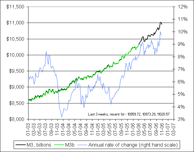 Hat tip to Barry Ritholtz over at The Big Picture for this link to NowAndFutures.Com where they have resurrected the important M3 money supply metric that was unceremoniously dropped by the Federal Reserve earlier this year. It looks like this site has lots of other timeline views of vital metrics that will be worth studying in more detail.
Friday, January 13, 2006
Hat Tip to The Big Picture
One of my favorite sources that points me to interesting charts these days is Barry Ritholtz's blog, The Big Picture.
In a couple of recent posts, I got my initial heads up about interesting time series charts and related articles from Barry's site but neglected to thank him and link back to him for the leads. These included the post on Dealing with Aggregate Data that showed the Dow for the last five years along with the behavior of the individual stocks included in the Dow, and the post Normalizing Headline Numbers that showed the Standard and Poor Index expressed in ounces of gold.
Thank you Barry.
You can follow these links to see his posts on the Dow and on the S&P. Scroll down through his blog on any given day and you will invariably find some excellent and interesting charts and discussion for your consideration.
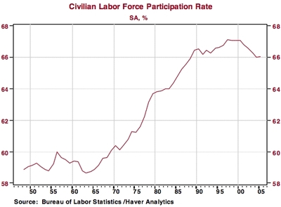
For example, in recent days, he has had some good finds with employment charts from Northern Trust Economic Research that you can view at: Employment Recovery Continues to be Sub-par. These include the one shown below
In a couple of recent posts, I got my initial heads up about interesting time series charts and related articles from Barry's site but neglected to thank him and link back to him for the leads. These included the post on Dealing with Aggregate Data that showed the Dow for the last five years along with the behavior of the individual stocks included in the Dow, and the post Normalizing Headline Numbers that showed the Standard and Poor Index expressed in ounces of gold.
Thank you Barry.
You can follow these links to see his posts on the Dow and on the S&P. Scroll down through his blog on any given day and you will invariably find some excellent and interesting charts and discussion for your consideration.
For example, in recent days, he has had some good finds with employment charts from Northern Trust Economic Research that you can view at: Employment Recovery Continues to be Sub-par. These include the one shown below

Subscribe to:
Posts (Atom)