| ||||
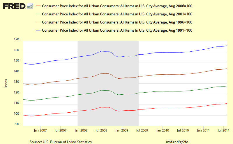
| This chart shows the cumulative effect of cpi inflation over the past 5, 10, 15, and 20 years http://research.stlouisfed.org/fredgraph.png?g=2fo |
Update: 20 September 2011
The first key thing that I see in this chart is the relatively steady slopes of the 10, 15, and 20 year cumulative changes in inflation. For example, the blue line (20 year) shows a sharp dip during the most recent recession, but then quickly ramps back to close to the same trend line. Similary for the 15 year (brown line). Even though it is claimed that headline cpi is too volatile, when we deal with cumulative change as shown above, that by itself smooths out almost all the volatility.
What this means is that if we use cumulative data, we do not need to resort to thinking we need to use Core Cpi or other less volatile measures of inflation. We can include energy and food and still get a clear, smooth picture of what's going on and how it might impact real citizen households.
The second thing that is important to note in these charts is the considerable magnitude of the cumulative change for each for these periods (e.g. 27.5% for the past 10 years) as listed below. These changes can be compared with changes in nominal income achieved over similar periods - e.g. for households that fall in different income percentile categories as shown in the recent Census Bureau report: Income, Poverty, and Health Insurance Coverage: 2010 which includes an adjustment for CPI. What we learn from that report is that cumulative changes in income over time are different for different groupings of citizen (e.g. by income level or by race). This in turn leads to differential impacts of changes in cumulative inflation on each groups. In the most recent 20 year periods, some groups have been advancing their standard of living while other groups have seen their standard of living reduced.
We plan to discuss the Census Bureau report and work up some of these figures in more detail in future posts.
The shortest red line shows 11.0 % total inflation over the past 5 years;
the green line shows a total of 27.5% total cpi inflation over the past 10 years;
the brownish line shows 43.9% increase in total inflation over the past 15 years; and
the longest blue lines shows a total increase of inflation of 65.6% over the past 20 years.
If you want to play further with variations to this chart over at FRED or if you want to download the data that was used to create this chart you can use the following link: FRED 20 year cumulative view of cpi
Key take away - except for a little hiccup in 2001 and for a dramatic drop in 2009, headline cpi inflation has increased at a rather steady and substantial rate as can be seen by the readily visible even slope of these trend lines. It also looks like the latest rise over the past year has been bring the cumulative number back previous trend line..