Thursday, November 23, 2006

Normalizing trend data to bring out hidden nuances

This week's free weekly chart from Chart of the Day is an excellent example of the power available through judicious normalization of trend data. In this case, the folks at Chart of the Day take the trend series for the Dow Jones Industrial Average and combine it with the trend series for inflation (CPI) to produce a new normalized metric: Dow (Inflation-Adjusted). This brings out some hidden nuances that would not be obvious to someone looking at just the Dow and just the CPI trends by themselves.


What do you see in the chart? How does recent behavior (since 2000) compare to your previous understanding of what was happening to the Dow Industrial Average?

In addition to the skillful use of normalization, other excellent features of this chart include the appropriate use of a log scale for the Y axis, the long sweep of time covered by the chart (1925 - 2006), and the drawn in resistance-support trend line ranges for two of the periods. The accompanying text for this Chart of the Day posting also helps direct the attention of the viewer to additional aspects that might not be obvious at first glance.

The key take-away for anyone who knows what the non inflation adjusted Dow chart looks like is how remarkably different a story each of these two views tells. Having both view, gives us a better chance to try to understand what is actually happening.

To make this even better, it would helpful to have several successive zoomed in views of this new normalized metric showing 1980 to 2006, 1990 to 2006, and 2000 to 2006.

Other normalized views of the Dow such as Dow in Euros, Dow in Ounces of Gold, Dow in Barrels of Oil might add even more insight.


Wednesday, November 22, 2006

John Maudlin's Thoughts from the Frontline

John Mauldin ( john@frontlinethoughts.com ) publishes a free weekly investment newsletter. In the latest newsletter for November 17th 2006 (which you can find by signing up at Thoughts from the Frontline ) John publishes a condensed version of a guest article written by Gary Shilling on the housing market. This article includes many excellent trend charts that shed light on the details of the trends at work and how they might play out in the future.

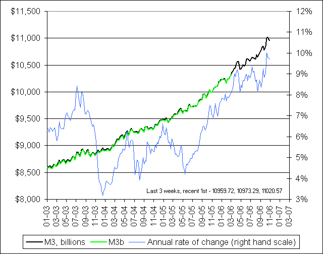
I've included a few that I liked best here for reference. The whole article is well worth reading. What I would love to see someone address is how the liquidity growth that we can see in the recently resurrected M3 charts (see previous posts) intersects with the housing market trends.

For example, will the extra liquidity in the system change (or soften) the outcome of these trends?

General Commentary on the Charts. I liked the long time sweep of these charts and how the chart title explicitly included the date of the most recent data point (which is not always obvious in many trend charts). I also liked the way that Gary skillfully used comparison of pairs of variables to bring important features of what is going on more to the surface.
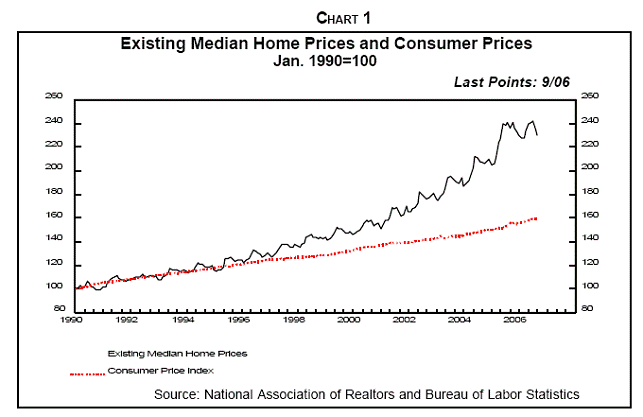
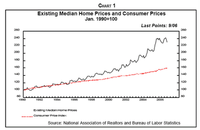


Chart 1. Note the long sweep of this chart plotting from 1990 to Sept 2006 and how these two metrics (median house price and cpi index) were initially parallel and then diverged at an accelerating rate.
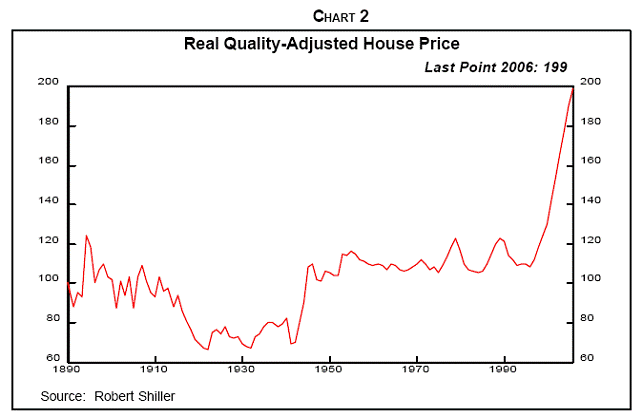


Chart 2. This chart has a sweep that goes all the way back to 1890! Note how relatively stable this metric (Real Quality Adjusted House Price) was from 1950 to about 1995 and the dramatic acceleration in the last 11 years.
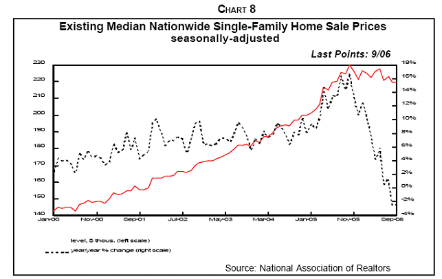


Chart 8. This chart plots from January 2000 through Sept 2006 and shows the Median Nationwide Single Family Home Sale Price in Red and the year over year percentage change in median home sale price in Black (right hand scale). Note the sharp spike up in the year over year percentage change in 2005 and the even sharper spike downward starting about November 2005.
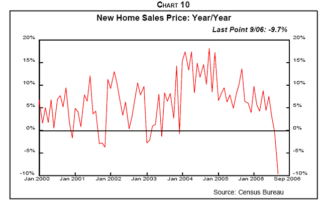

Chart 10. New Home Sales Price year over year percentage change. This chart would be even better if it showed a 3 month or 6 month moving average. Note the slow slope downward starting about January 2004 and the way in which this metric falls off the cliff beginning about June 2006.
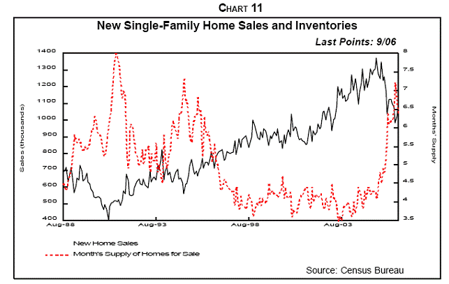

Chart 11. This chart shows the period from August 1988 to Sept 2006. This is a particularly powerful chart. It shows the relationship between total new single family home sales and Months Supply of Homes for sale. Note how the totals sales figure accelerates from about 400,000 per year in 1992 up to about 1.3 million per year in 2005 followed by a drop off to approximately 1 million per year in recent days.

Note also how stable the months supply of inventory is (ranging from 3.5 to 4.5 months) from about 1997 until 2005, and then how this metric skyrockets to over 7 months of inventory in Sept 2006.

Comment: using months of inventory has the effect of accentuating the visual impact of the curve when the sales figure is changing rapidly in either direction as the rate of sales is used in the calculation for months of inventory. A chart showing total inventory compared to total sales would show a similar pattern but with less exaggeration.

You can check out the full article at http://frontlinethoughts.com/ for more details.

Tuesday, November 21, 2006

The Big Picture: The Return of M3

Nice post this morning from Barry Ritholtz over at the Big Picture with some more commentary about the return of M3 money supply trend information . Well worth reading.

The Big Picture: The Return of M3

Friday, November 17, 2006

The Return of M3

Hat tip to Barry Ritholtz over at The Big Picture for this link to NowAndFutures.Com where they have resurrected the important M3 money supply metric that was unceremoniously dropped by the Federal Reserve earlier this year. It looks like this site has lots of other timeline views of vital metrics that will be worth studying in more detail.

Artful Comparisons Reveal Hidden Meanings


The free weekly posting at Chart of the Day - www.chartoftheday.com is often worth a look. This week's chart is a good example of how artful, carefully selected comparisons can reveal previously hidden meanings. In this case, the performance of the S & P 500 over the last 3 years (shown in grey) is compared to the performance of the Japanese Nikkei large stock index (shown in blue).

The divergence around mid year 2005 is sharp and striking. Also, the same chart makes it easy to see that the mid year 2006 correction was much steeper for the Nikkei and that both the Nikkei and the S & P 500 seem to be driving upward now at about the same rate.

If we zoomed in and looked at just the last year, or just the last 6 months and did the same comparison, different hidden meanings might come to the surface.

Bottom Line: all performance is relative so it's important to have a useful benchmark for making comparisons.

Wednesday, November 15, 2006

Creating new metrics out of thin air


The Big Picture: U.S. Treasury Yield Curve

This is a nice example of how new and important metrics can be created by recombining the values of other metrics. In this case, the 10 year US Treasury yield and the 2 year Treasury yield metrics provide the raw ingredients. The recombination is to simply subtract the 2 year yield from the 10 year yield to get the new variable or "SPREAD" which is then plotted.

This seemingly simple approach brings some trend patterns into clear view where they otherwise might have remained invisible.

My own reading of this chart is that drop off in 2000 was much sharper (almost straight down) whereas the current drop represents a much longer, slower slide into the negative yield curve territories.

To fully understand what's going on, it would be useful to check out some other spreads such the 10 year - 3 months spread. It would also be useful to easily reference the original metrics to see what their trend looks like.