Showing posts with label headline numbers. Show all posts

Sunday, September 18, 2011

Providing some Context for looking at CPI charts

We have posted many charts this past week looking at CPI behavior through a variety of angles and lenses.  Our sources have been light on providing context and we have not filled in this area either.

So here is a first cut at the context that we were holding loosely in mind as we evaluated the incoming collection of charts and created a few of our own using the St. Louis Federal Reserves' FRED software.

To begin, CPI stands for Consumer Price Index.  In our view, the emphasis is on the Consumer (real people living out their lives) and the ways in which changes in Prices (specifically price inflation) might impact the standard of living for those people.

Central Questions:  The question we would like to be able to answer more fully is:
How does the cumulative change in prices affect the buying power of a range of different classes of consumers over time?
In particular, we want to be able to figure out to what degree the Cumulative Impact of Price Inflation changes each different class of consumer's standard of living over time.
Principles.   The underlying principle that we believe to be at work here is that: if cumulative CPI goes up relative to the wage trend for households representing a given class of consumers, then the Standard of Living for that class would go down in proportion.  We are interested in looking at the cumulative change over a variety of longer periods: 2 years, 3 years, 5 years, 10 years, 15 years, 20 years

A second key principle for us is that CPI Inflation is like Compound Interest; and so longer term cumulative views of the data should predominate.


Weaknesses of Traditional Reporting:  To us, the commonly used month over month results represent little more than noise since our focus is on cumulative results.

Even the very widely used year over year reporting is not particularly useful in this regard and is usually distracting at best (1 year effects are interesting but surely not the whole story) and misleading at worst as to the important long term inflation changes that are underway and the implications of those changes on real people's standards of living and quality of life.

A long standing general purpose admonition of ours is to Look at All the Data.   The traditional reporting on CPI violates this rule in spades with the focus on only headline CPI and core CPI .  CPI is an aggregate of aggregates of aggregates which averages out a huge degree of variation that is present in its sub-components.  To begin to understand the impact that cumulative price inflation has on Consumers (real people) we surely need to disaggregate the average CPI values and look individually at a good number of the key sub-components (e.g.  Food, Energy, Health Care, Rent, Transportation, Tuition) to see their cumulative price inflation over longer periods of time.   With few exceptions such as the excellent chart we posted earlier (A Unique View of CPI from Doug Short), almost all reportage we have found on CPI focuses on headline or core cpi.

Now it is true that the official report from the BLS (BLS August 2011 CPI news release)  does provide an exceptionally high degree of disaggregation in its tables by sub-categories and sub-sub-categories.  But there are no sub-component charts accompanying the BLS report, so looking at sub-component increases in cpi is left as a time-consuming exercise for the reader - an option that few have likely taken.    Furthermore, the data presented only covers the most recent 1 year period, so if you want to explore sub-category cumulative changes over periods of 2 to 20 years, you have to look somewhere else (e.g FRED or the BLS data base).

There is a lot of fruitful potential in this disaggregation, but I have not been able to find anyone so far other than Doug Short and our recent post (Drilling down into CPI 20 year trends)  tapping into this for more insights into understanding the cumulative impact of inflation on real people.  We will keep on looking and would love to hear about other work in progress studying the sub-components.

Core CPI interferes with clear thinking.  Finally, looking at widely discussed Core CPI and its many variants,  we see Core CPI as a serious impediment keeping us from thinking more clearly about the cumulative impact of price inflation on real people who all must eat and consume energy.  Rather than stripping food and energy out of the totals to create so-called CORE CPI, it would be much more useful in our estimation to include Food and include Energy as individual sub-categories - to look at the cumulative impact of Food price inflation and the cumulative impact of Energy price inflation as we have started to in our Drilling down into CPI 20 year trends  post.  And rather than lump all the rest of the categories together to create the "core", we would prefer to disaggregate these as well and look at them individually so we can discover patterns currently hidden..

A lot has been made about why Energy and Food are so volatile as the reason for going with Core CPI.  Our investigation shows that the mostly irrelevant month to month variations smooth out incredibly well for FOOD once we look at cumulative totals.  For ENERGY, there is clear volatility, but rather than hiding it, it's better to bring it out into the open.  And when we look at energy using a cumulative long term 5, 10, 15, 20 year approach, there is a lot less volatility than you might expect.  We'll have more on this later.

And the headline CPI number shows very low variability in trend when plotted using a long term cumulative view as we have shown in our early post ( Drilling down into CPI 20 year trends ).

There are further weaknesses we see in traditional CPI reporting regarding the limited number of different classes of consumers currently available) but we will save these for another day.

Now that we have some context on why we want to look at CPI, our plan is to revisit the CPI posts from earlier this past week.  We plan to update them by showing our thinking regarding what we see as the story that might be told for each chart in the context of the ideas we have explored in this post - real people, cumulative impact over longer time spans, disaggregation.  . 

Update 20 September 2011:  We have now updated all previous CPI posts with our further thoughts on what each chart is telling us.  Please check them out.


Friday, September 16, 2011

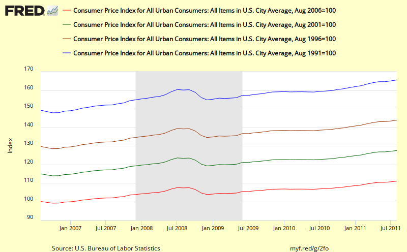
A 20 year cumulative view of headline cpi from FRED

Here's another view of the headline CPI number created using some advanced features of FRED (the wonderful St Louis Federal Reserve Economic Data charting program).


This chart shows the cumulative effect of cpi inflation over the past 5, 10, 15, and 20 years
http://research.stlouisfed.org/fredgraph.png?g=2fo


Update: 20 September 2011
The first key thing that I see in this chart is the relatively steady slopes of the 10, 15, and 20 year cumulative changes in inflation.  For example, the blue line (20 year) shows a sharp dip during the most recent recession, but then quickly ramps back to close to the same trend line.  Similary for the 15 year (brown line).  Even though it is claimed that headline cpi is too volatile, when we deal with cumulative change as shown above, that by itself smooths out almost all the volatility.  

What this means is that if we use cumulative data, we do not need to resort to thinking we need to use Core Cpi or other less volatile measures of inflation.  We can include energy and food and still get a clear, smooth picture of what's going on and how it might impact real citizen households.

The second thing that is important to note in these charts is the considerable magnitude of the cumulative change for each for these periods (e.g. 27.5% for the past 10 years) as listed below.  These changes can be compared with changes in nominal income achieved over similar periods - e.g. for households that fall in different income percentile categories as shown in the recent Census Bureau report: Income, Poverty, and Health Insurance Coverage: 2010 which includes an adjustment for CPI.   What we learn from that report is that cumulative changes in income over time are different for different groupings of citizen (e.g. by income level or by race).  This in turn leads to differential impacts of changes in cumulative inflation on each groups.  In the most recent 20 year periods, some groups have been advancing their standard of living while other groups have seen their standard of living reduced.  

We plan to discuss the Census Bureau report and work up some of these figures in more detail in future posts.  

The shortest red line shows 11.0 % total inflation over the past 5 years;
the green line shows a total of 27.5% total cpi inflation over the past 10 years;
the brownish line shows 43.9% increase in total inflation over the past 15 years; and
the longest blue lines shows  a total increase of inflation of 65.6% over the past 20 years.

If you want to play further with variations to this chart over at FRED or if you want to download the data that was used to create this chart you can use the following link:  FRED 20 year cumulative view of cpi

Key take away  - except for a little hiccup in 2001 and for a  dramatic drop in 2009, headline cpi inflation has increased at a rather steady and substantial rate as can be seen by the readily visible even slope of these trend lines.  It also looks like the latest rise over the past year has been bring the cumulative number back previous trend line..  


Thursday, September 15, 2011

Taking a longer view of CPI trends

Doug Short has now posted some longer views of the Consumer Price Index CPI to complement those published by the Bureau of Labor Statistics (BLS).  This provides additional context to help us think about what the latest numbers mean.

Here's his view of the data since 2000 with the shaded area from 1.75% to 2.00% representing the Core (CPI less food and energy) target rate for the Federal Reserve. 

http://advisorperspectives.com/dshort/charts/inflation/headline-core-comps.html?CPI-headline-core-since-2000.gif
UPDATE 20 September 2011
With the benefit of this 12 year view, we can now put the 1 year view from BLS into better perspective.  For example, we can see the headline value of 3.7% (in red) is now back up into it's 2004-2007 range following a 2 step process which looks like a reversion to mean process.  Will it overshoot? we can't tell?  We also see that the CORE CPI (in blue) looks like it is reverting to the mean of the past 12 years.  

And here's Doug's  really long view since 1957.

http://advisorperspectives.com/dshort/charts/inflation/headline-core-comps.html?CPI-headline-core.gif
UPDATE 20 September 2011
In this much longer view, some further nuances come into view including the obvious 3 peaks of inflation in 1970, 1975, and 1980, the much lower inflation rates from 1960 to 1965. We can also see how the Headline CPI and the Core CPI are more likely to diverge from each other after 1985.  We also see the CORE rate showing a steady decline since 1990 that was not matched by the Headline CPI.

Doug also has some charts showing the PCE (Personal Consumption Expenditure) Index and the Core PCE Index as shown below since 2000.:
http://advisorperspectives.com/dshort/updates/CPI-Headline-and-Core.php


Check out Doug's original post for additional details.

We will keep our eyes open for other alternatives view of these metrics that get posted today.

CPI - year over year; not looking pretty

The latest Bureau of Labor Statistics (BLS) CPI numbers are out this morning and they don't look pretty.

BLS August 2011 CPI news release
UPDATE 19 September 2011
With the benefit of the context we established in Providing some Context for looking at CPI charts  we can now revisit  this month's collection of CPI charts and see what stories they might have to tell.  We can see there are some striking changes underway the past 9 months for both the headline CPI figure (blue line) and the Core CPI (red line).  

But with such a short window, it's really hard to interpret what this chart is trying to tell us.  Is this a significant inflation trend taking off and something of real concern, or is it more a matter of these metrics undergoing reversion to their mean values.  We will be posting comments in chronological sequence for our other recent CPI posts that include charts over the next few days and perhaps we can better understand what this chart means once we have looked at the others.

We will be color coding our updates to distinguish them from the original post. 
End Update

The all items index has increased by more than 3x over the past year
Excluding food and energy, the increase is more than 2x.

While this is a nice crisp clean easily understood chart, this view shows only the past 12 months and is way too short a window all by itself.  Longer views would help put the latest numbers in better context and allow the development of a supportable storyline.  But the BLS tradition is to go with their template approach using short 1 month and 1 year durations for most of their findings.  For example, see the story lines shown below in the lead paragraph (emphasis added showing the small number of instances of longer views)

CONSUMER PRICE INDEX – AUGUST 2011
The Consumer Price Index for All Urban Consumers (CPI-U) increased 0.4 percent in August on a seasonally adjusted basis, the U.S. Bureau of Labor Statistics reported today.
Over the last 12 months, the all items index increased 3.8 percent before seasonal adjustment.
The seasonally adjusted increase in the all items index was broad-based, with continuing increases in the indexes for gasoline, food, shelter, and apparel.
The gasoline index rose for the 12th time in the last 14 months and led to a 1.2 percent increase in the energy index, while the food index rose 0.5 percent, its largest increase since March.
The index for all items less food and energy increased 0.2 percent in August, the same increase as the previous month. Shelter and apparel were the biggest contributors, though the indexes for most of its major components posted increases, including used cars and trucks, medical care, household furnishings and operations, recreation, tobacco, and personal care. The new vehicles index, unchanged for the second month in a row, was an exception.
The 12-month change in the all items index edged up to 3.8 percent after holding at 3.6 percent for three months, while the 12-month change for all items less food and energy reached 2.0 percent for the first time since November 2008. The energy index has risen 18.4 percent over the last year, while the food index has increased 4.6 percent. 
We'll keep our eye out for other postings this morning with longer time line views which should help clarify the picture and help us evaluate just how serious the most recent 12 month behavior of CPI is likely to be.


Thursday, August 25, 2011

Showing a key metric with multiple views: a nice example

Bill McBride's Calculated Risk blog has some crisp charts showing the latest new unemployment claims. The main chart shows this key metric since January 2000.


A second chart shows the same metric going all the way back to January 1971.


Both charts use a 4 week moving average to smooth out the more erratic week to week behavior. Bill's use of a dual chart approach helps present a much more complete picture of this important metric that puts recent behavior in context. Of course, even his "short" period is almost 11 years long so doesn't suffer from the common weakness of plotting too few data points.

Additional employment related charts showing other metrics and other views can be found in the Employment tab of Calculated Risk's Graph Gallery. Bill is prolific and posts some of the best looking, most unique charts related to economics and finance. Check out his gallery for yourself. You won't be disappointed

Despite these two excellent charts, one weakness I see in Calculated Risk's presentation of this important unemployment metric is that the verbal storytelling is weak. Bill's charts have potential explanatory power with important stories to tell, especially combined with the other charts in the Employment tab of the gallery, but these stories are left mostly as an exercise for the viewer.

In the blog post, the "story" told is mostly quotes from the dull boilerplate in the Department of Labor's UNEMPLOYMENT INSURANCE WEEKLY CLAIMS REPORT. This text discusses this metric with a very short term focus of only the preceding 4 weeks.

A second weakness is that the reporting (like almost all other reporting on the subject) only talks about and shows charts for this one Headline Initial Claims metric from the report while other complementary metrics are shunted aside. For example, some key missing metrics that are mentioned in the DOL report and whose short and long term time series charts could help us better understand the unemployment situation include:
  • insured unemployment rate - the percentage of "covered" workers collecting regular state benefits
  • insured unemployment - the number of people currently collecting regular state benefits
  • total persons claiming benefits in all programs
Some other metrics from other sources might also be added to the mix for fuller understanding such as:
  • total persons unemployed
  • percentage of total unemployed who are collecting benefits in all programs
  • total unemployed who are NOT collecting benefits
Note that Calculated Risk's Employment Tab does include these useful and complementary metrics shown in easy to digest graphic form but a story line to tie all these metrics together remains a challenge for another day.
  • headline unemployment percentage
  • employment population ratio
  • participation rate
  • number of workers who are part time for economic reasons
  • number unemployed for over 26 weeks
  • number unemployed for over 26 weeks as percentage of civilian labor force
What other employment related metrics would you like to see?

Do you know of others posting on the initial claims number who are crafting more complete stories than the standard laid down by the DOL report?


Sunday, April 22, 2007

Looking behind the headline number.

Here's a good example of the power that acrues the minute that we begin to look behind the headline number and see what other factors might bear on the meaning of what we are seeing.

The Big Picture Watching Trading Volume Fade . . .

In this case, insteaed of just looking at the S&P 500, Barry Ritholtz points us to a Michael Kahn Barron's article where he takes a look at the volume as well and discovers some interesting patterns.

What other factors might be worth adding into the mix and giving us even more depth of understanding of the basic workings of this important headline financial indicator?

For example, it would be interesting to see what percentage of the S & P volume was NEW short sales and what percentage of the volulme was Covering Purchases for previous short sales.

It might also be worthwhile to look at the average number of shares per trade which might give a clue into what percentage of the volulme was due to large financial instituions and what part was coming from the "little guy."

Friday, April 13, 2007

Chart of the Day - www.chartoftheday.com

Here's another nice chart from Chart of the Day - www.chartoftheday.com

On the plus side we have the complete time range and the use of the derived value of the inflation adjusted DOW as the variable to watch rather than the Headline raw DJIA value. In my view, the inflation adjusted number really should be the Dow value that we watch for the same reasons that we use inflation adjusted numbers everywhere else.

Saturday, April 7, 2007

Selective Perception, Cognitive Bias, & the Recency Effect

Barry Ritholtz has an excellent post this morning commenting on NonFarm Payroll (NFP) increase of 180,000 from yesterday's Bureau of Labor Statistics Employment Situation Report.

His comments on selective perception, cognitive bias, the "recency effect" and the soft prejudice of low expectations apply well beyond the NFP example.

Let's begin with a quick word on cognitive bias. Humans are guilty of this -- selectively perceiving and recalling what agrees with their world view. We are all guilty of this, and while we cannot escape it, being aware of it at least allows some measure of recognition, and perhaps, adaptation to the phenomena.

Let's use the NFP data as an example: Consider another bias, the Human tendency to overemphasize more recent data versus the totality of information and the overall trend. This is a cognitive bias known as the recency effect. Despite the overwhelming evidence showing this to be a generally weak jobs recovery (the worst since WWII), our primate brains interpret a single good data point as proof of something better. ...

Regardless, we also see some of the soft prejudice of low expectations in yesterday's data: 180k is hardly a rockin' strong number, relative to population growth,. Put that into the context of recent expansions such as the 1990s. Oh, and in that more recent period, there was no BLS Birth/Death adjustment, responsible for nearly a million fictitious jobs in 2006.
Unfortunately, the two trend chart he shows only go back three years (suffering themselves from the recency effect) so we can't compare the relatively weak current numbers to the NFP increases of the 1990s. The two charts shown in the Bureau of Labor Statistics Employment Situation Report also only go back 3 years.

So, below I have posted a 15 year view showing year over year percentage change for the seasonally adjusted value of the growth in NonFarm Payroll. It's pretty clear from this longer term chart that our growth in non-farm employment during this latest expansion never got back to the steady, multi-year 2.5% growth rate of the late 1990's and appears to be declining again.

Of course, in a subject area as complex as employment, an equally important danger in my opinion is the almost universal tendency these days to stick with just a few headline factors. If we truly want to understand employment, I believe we have to make it easy to visualize and then examine a full range of factors over a substantial time period.

For example, the recent drop off shown above does not seem to square with the reported drop in the headline unemployment rate. Maybe some other factor of the thousands of factors recorded by Bureau of Labor Statistics (BLS) can help explain it.

Too often, really important factors aren't mentioned at all, and the ones that are mentioned are not accompanied by their corresponding trend charts.

Here's a link to a short list of the most popular BLS statistics which might be a useful starting point for a deeper analysis.