In the past few days, we've posted a total of 21 charts showing trends that matter on the ground in Iraq. These were culled and selected from 4 separate sources and posted in 4 separate posts. You can scroll down the January 2007 posts from January 17th back to January 13th and find all 21 of these charts in relatively close proximity to each other. Our theory is that by bringing them all to one relatively compact place, we make it easier for those who are interested in learning more about what is happening to have access to the combined analysis and reporting talent from the four sources.
What can we do next? We think this approach makes it easier, but it still is not easy. Due to the current limitations of this blog, the graphs that appear in the blog itself are relatively small in size and to get a full grasp of the message of each trend it is necessary to click on each trend graph to get a full size image. This is pretty unwieldy and involves a lot of extra back and forth clicks to navigate to a good sized view of each trend.
Here's a possible approach to make this a bit easier and less time consuming and require far fewer clicks and allow much better navigation back and forth between the different trend charts. What we've done is to take all 21 trend graphs to create a single down-loadable PDF document that will let you easily view all trends up to the full size your screen while navigating back and forth to the chart you want using the full navigational capabilities of Adobe Acrobat (e.g. page down, page up).
Here's the link - Combine-Iraq-Trends Please let us know what you think of this step towards making these important charts rank higher on a ready-viewability scale.
Did you find the navigation easier?
Did having easy access to all trends in full size improve understanding for you?
What other suggestions do you have to make this even easier?
Thursday, January 18, 2007


Wednesday, January 17, 2007
The Iraq Situation and Readily-Reusable Data
One of the difficulties I have encountered so far is that the data I would really like to examine first hand is not readily reusable and in some cases is completely unavailable in any form.
The first timeline collaboration principle that you will find on the right hand column of our blog template is:
Admittedly some of these sources have shared their trend data series, but the method they selected means that they are not easy or ready for reuse without investing a lot of time and effort.
For example,
Most people (both decision makers and ordinary citizens) are not particularly good or particularly thrilled by the idea of trying to make sense of trend data contained in a printed or online table.
My experience indicates that almost all adults (I would estimate the number at 90% or more) can make good sense of trend data presented in line graphs or bar graphs). On the other hand, I estimate that fewer than 10% of the people have the skills, interest or time to extract basic information from a trend table like the one on page 5 of the Brookings Iraq Index, or the many tables you can find at GlobalSecurity or at the Iraq Casualty Coalition.
What impact does this lack -- this lack of data / lack of readily reusable data / lack of easily viewable trend data for all key factors -- have on our ability to understand what's going on?
The way this plays out is that for 99% of the population, they will get their understanding of the trends from their most trusted source.
For a small percentage of people (I am guessing under 5% of the population), that trusted source might be one of the ones we have mentioned so far in this series on Iraq Trends or a similar detailed view of the situation that provides some depth and breadth and doesn't rely on just one or two metrics.
For this small group, if their source is Brookings, and they spend the time wading through the 30 page report, they will have a good chance of making good sense of the charts that Brookings selected. Similarly if their source is the State Department and if they wade through the Weekly Status report they will get a picture of the trends that the State Department selected but not the ones that Brookings was paying attention to. If their source is GlobalSecurity or the Iraq Casualty Coalition, they will get a good grasp of the charts presented at those sites.
Even in this small group that goes and gets their trend understanding from one of these useful and detailed sources (or other similar venues) a small percentage will dig any further into the tabular data that is available. The reason: primarily lack of time and secondarily lack of experience possibly combined with self conceived notions that reading tables is hard.
My reading is that few in this small group will consult and combine the trends from multiple sources like those mentioned above to get a broader perspective. Of course, if you have been reading this series of posts, we have done some of that lifting work for you and made it easier (still not easy in my opinion) to become more widely informed of the composite set of trends that are considered important drawn from a mix of analysts who may have vastly different axes to grind.
For a good portion of the rest of the population beyond this small group, the trusted source for trend data will turn out to be television and other mainstream media. Based on what I have seen from the MSM, this group of individuals will likely be exposed to quite limited trend information in any form and will often end up only being exposed to non-specific, non-numerical statements about the situation on the ground.
What to do? What to do?
Glad you asked. The answer for me is straightforward: ready reusability.
Ready reusability for the Iraq Trend data is easy to say and hard (time consuming, error prone) to do right now. In the next couple of posts, I will give you an example of what I mean by transforming some of the tabular data from expert sources into a readaily reusable form. Once the data is ready to go, I will provide some examples of why I think this is so important.
The first timeline collaboration principle that you will find on the right hand column of our blog template is:
1. Share the data series with the chart. Make sure it is readily reausableTo the best of my knowledge, not one of the 4 sources we have consulted so far (Brookings Iraq Index, The State Dept's Iraq Weekly Status, GlobalSeccurity, or the Iraq Casualty Coalition) has made the data that they used for their own analysis and charting both available and readily reusable as a spreadsheet or CSV file.
Admittedly some of these sources have shared their trend data series, but the method they selected means that they are not easy or ready for reuse without investing a lot of time and effort.
For example,
- Brookings Iraq Index does include some trend data tables with important metrics and frequently labels the data values on their charts. Not all of the interesting trend data that appears in the tables is translated into a chart in the report. For example, see the table on page 5 of the January 8th report that shows details of the trends in cause of death for US Troops.
- The Iraq Weekly Status Report from the State Department does not include any trend data at all beyond what they show in their charts. And the time period covered by the charts they have selected is rather short in most cases. For example the crude oil production chart only covers the last 10 weeks and other charts cover less than a year. Only the electricity chart stretches back to the beginning of 2004
- Global Security includes a lot of detailed trend data in tabular form in addition to and complementing the charts they provide. The range of the data presented tabularly tends to cover the entire period from the start of the war until the present.
- The Iraq Casualty Coalition also provides substantial amounts of tabular trend data in addition to their charts and their data covers the entire period from the beginning of the war.
Most people (both decision makers and ordinary citizens) are not particularly good or particularly thrilled by the idea of trying to make sense of trend data contained in a printed or online table.
My experience indicates that almost all adults (I would estimate the number at 90% or more) can make good sense of trend data presented in line graphs or bar graphs). On the other hand, I estimate that fewer than 10% of the people have the skills, interest or time to extract basic information from a trend table like the one on page 5 of the Brookings Iraq Index, or the many tables you can find at GlobalSecurity or at the Iraq Casualty Coalition.
What impact does this lack -- this lack of data / lack of readily reusable data / lack of easily viewable trend data for all key factors -- have on our ability to understand what's going on?
The way this plays out is that for 99% of the population, they will get their understanding of the trends from their most trusted source.
For a small percentage of people (I am guessing under 5% of the population), that trusted source might be one of the ones we have mentioned so far in this series on Iraq Trends or a similar detailed view of the situation that provides some depth and breadth and doesn't rely on just one or two metrics.
For this small group, if their source is Brookings, and they spend the time wading through the 30 page report, they will have a good chance of making good sense of the charts that Brookings selected. Similarly if their source is the State Department and if they wade through the Weekly Status report they will get a picture of the trends that the State Department selected but not the ones that Brookings was paying attention to. If their source is GlobalSecurity or the Iraq Casualty Coalition, they will get a good grasp of the charts presented at those sites.
Even in this small group that goes and gets their trend understanding from one of these useful and detailed sources (or other similar venues) a small percentage will dig any further into the tabular data that is available. The reason: primarily lack of time and secondarily lack of experience possibly combined with self conceived notions that reading tables is hard.
My reading is that few in this small group will consult and combine the trends from multiple sources like those mentioned above to get a broader perspective. Of course, if you have been reading this series of posts, we have done some of that lifting work for you and made it easier (still not easy in my opinion) to become more widely informed of the composite set of trends that are considered important drawn from a mix of analysts who may have vastly different axes to grind.
For a good portion of the rest of the population beyond this small group, the trusted source for trend data will turn out to be television and other mainstream media. Based on what I have seen from the MSM, this group of individuals will likely be exposed to quite limited trend information in any form and will often end up only being exposed to non-specific, non-numerical statements about the situation on the ground.
What to do? What to do?
Glad you asked. The answer for me is straightforward: ready reusability.
Ready reusability for the Iraq Trend data is easy to say and hard (time consuming, error prone) to do right now. In the next couple of posts, I will give you an example of what I mean by transforming some of the tabular data from expert sources into a readaily reusable form. Once the data is ready to go, I will provide some examples of why I think this is so important.
One More Source of Iraq Trend Graphics - Iraq Coalition Casualties
So far, in our previous posts on Iraq we have pulled together a set of 16 different How Are Things Going in Iraq Charts from three different sources. We have:
The 5 charts show:


This brings us to a total of 21 charts. I think you will see that by arranging these together in a somewhat more convenient and time-saving format than the separate originals, your understanding of what's happening in Iraq has been boosted. I think you will also see that being able to look at all 21 one of these in a relatively short period of time by scrolling down this blog allows you to develop more of a gestalt understanding of how all the factors interact and impact on each other.
- 9 trends from the Brookings Iraq Index
- 4 trends from the Department of State Weekly Iraq Status Report
- 3 trends from Global Security.org
The 5 charts show:
- US Soliders Killed with moving avg & event timing - March 2003 - December 30, 2006
- US Soldiers Wounded with moving avg - Sept 6, 2003 - Dec 29, 2006
- IED Fatalities per month - July 2003 - January 2007
- Iraqi Police/Military fatalities - January 2005 - December 2006
- Iraqi Civilian fatalities - January 2005 - December 2006


This brings us to a total of 21 charts. I think you will see that by arranging these together in a somewhat more convenient and time-saving format than the separate originals, your understanding of what's happening in Iraq has been boosted. I think you will also see that being able to look at all 21 one of these in a relatively short period of time by scrolling down this blog allows you to develop more of a gestalt understanding of how all the factors interact and impact on each other.
- How many charts is enough?
- Are we there yet?
- Do we already have everything we need to understand the situation?
- Is it relatively easy for decision makers or interested citizens to get rapid access to all of the most important factors?
- Do we now have the full deck of cards that will allow us to make wise choices?
- Have we arranged things so that automatic monitoring and reporting of key factors enables us to determine quickly whether the actions we take are having the desired effect as we go forward?
More Iraq trend charts from GlobalSecurity.org
Here's a third source of recent trend charts showing what's going on in Iraq from GlobalSecurity.org - Reliable Security Information.
The three trend charts I have selected from their web site are:


The three trend charts I have selected from their web site are:
- US Ground troops in Iraq from March 2004 through December 2006
- Average daily casualties - Iraqi and Coalition from 01 April 2004 through 12 May 2006
- Average weekly attacks by time period 01 April 2004 through 12 May 2006


Tuesday, January 16, 2007
Some Additional Iraq Trends from the Iraq Weekly Status Report
Here are four additional trend charts about the situation on the ground in Iraq drawn from the U.S Dept. of State's Iraq Weekly Status Report (30 pages, January 10, 2007). The State Department describes this report as providing "weekly updates in the eight key areas identified as pillars of U.S. Government policy." You can find the most recent report and previous issues starting at the link shown above.
The first shows crude oil production for the past 10 weeks.
The second shows crude oil export since February 2006
The third shows electricity production compared to electricity demand since January 2004.
The fourth shows the strength of the local Iraqi currency compared to the dollar since April 2nd, 2006
The Iraq Weekly Status Report is one of the sources used to create the Brookings Iraq Index whose trend charts we have been featuring in previous posts..
Please click for full size images.


The first shows crude oil production for the past 10 weeks.
The second shows crude oil export since February 2006
The third shows electricity production compared to electricity demand since January 2004.
The fourth shows the strength of the local Iraqi currency compared to the dollar since April 2nd, 2006
The Iraq Weekly Status Report is one of the sources used to create the Brookings Iraq Index whose trend charts we have been featuring in previous posts..
Please click for full size images.


What Gets Measured Gets Done
Michael O'Hanlon is a co-author (along with Jason H. Campbell) of the Brookings Iraq Index report that we have discussed in several recent posts.
In a recent Brad DeLong post
(Grasping Reality with Both Hands: Brad DeLong's Semi-Daily Journal: Matthew Yglesias and His Commenters Look at the Brookings Institution, Michael O'Hanlon, and Jeff Herf)
I came across the following quote (originally posted here as a comment to Matthew Yglesias post) and found it interesting and relevant to the mission of this site (emphasis added):
My reading is that O'Hanlons' and Brookings' Iraq Index is useful exactly becauseAlso of note, the one guy in Brookings who was actually right about the whole mess, that is, Ivo Daalder, isn't working there anymore. As for the Hanlon's (sic) major contribution to the war of ideas, the Iraq index, the best I can say is that this is a very American idea: the idea that problems can be analyzed and solved if we only quantify them and measure them.
Posted by: Nick Kaufman on January 14, 2007 12:22 AM
- it works hard at identifying the key factors that give us clues to how things are really going in Iraq, and
- it does the heavy lifting work of pulling the measurements of these factors together in a single place and making them available for others to examine and think about.
The converse of the proposition that "problems can be analyzed and solved if we only quantify and measure them" is likely to be more on target. Namely something like:
If we don't identify the key factors, quantify them, measure them, make them available to others, analyze them, and discuss them, then this will severely limit our individual and collective ability to understand the problems we face.Under this new framing (effective measurement leads to greater understanding), we also note that the identification of potential solutions will be sharply limited, much more difficult, and much more a matter of guesswork when such measurement is absent.
One other benefit of a measurement-aided approach is that when a given solution (an intervention) is initiated, the next measurements of these same key factors will provide the essential grist for determining whether that intervention is delivering on its promise.
In other words we might want to designate the idea: what gets measured, gets done as the bugle call order of the day, knowing that measurement, sharing, and collaboration can help us at each step along the way from problem definition to proof that our solutions have actually worked.
In future posts, we will make an attempt to build further on the work started in the Iraq Index and on the measurement work we can cull from other Iraq sources so as to add some substance to the theoretical statements of this post.
In my view, if we are going to find and implement a solution to the deteriorating Iraq situation, we need more quantification, measurement, sharing, analysis, and collaboration and that extensions to and improvements on the Iraq Index can help pave the way.
Sunday, January 14, 2007
Recent Trends in Iraq
Below you will find 9 trend graphs that I've culled from the Brookings Iraq Index Report. These cover a only a fraction of the 23 trend charts that appear in the report and represent the ones that I believe are some combination of "most important" and "most readily understandable" without a lot of accompanying text discussion. Unfortunately, some other important trends that are included in the Brookings report are available only in table format.
Please note that the time interval varies from chart to chart based on what data was available.
What do you think these mean?
What do you see?
What else do you want to know?
Do you find that having all the charts together deepens understanding or saves you time in grasping the situation?
You can click on each trend graph for a full size image.


 The chart above makes a pretty strong statement of recent trends in the number of attacks.

Please note that the time interval varies from chart to chart based on what data was available.
- Multiple Fatality Bombings – May 03 – Jan 07
- Killed and Wounded in Multiple Fatality Bombings – May 03 – Jan 07
- Average Weekly Attacks by Time Period – 01 Jan 2004 – 11 Aug 2005
- Improvised Explosive Devices (IED’s) Detonated and Disarmed - Jan 2006 –June 2006
- US Troops Wounded in Action March - March 2003 – Jan 2007
- Iraqi Military and Police Killed Monthly – Apr 03 – Jan 07
- Iraqi Deaths from All Violet Causes – Jan 06- Oct 06
- Number of Daily Attacks by Insurgents and Militias - June 03 – Nov 06
- Enemy-Initiated Attacks Against the Coalition and its Partners May 2003 –Aug 2006
What do you think these mean?
What do you see?
What else do you want to know?
Do you find that having all the charts together deepens understanding or saves you time in grasping the situation?
You can click on each trend graph for a full size image.


Iraqi Deaths from All Violent Causes

 The chart above makes a pretty strong statement of recent trends in the number of attacks.
Saturday, January 13, 2007
Trends That Matter - Latest Iraq metrics from Brookings
Here's a resource from The Brookings Instituation for discovering more about the latest trends that show how well or badly things are going in Iraq - Brookings Iraq Index. The trends in Iraq are of course trends that matter quite a lot to a large number of people.
This kind of information and depth of detail and range of scope about what's happening in Iraq rarely reaches the ordinary citizen. Tidbits of this important data have appeared occasionally in the mainstream media. I would venture a guess that most people have never seen any of this data and that they might find the academic approach of the report itself to be a bit daunting.
Nevertheless, the data in the report is important and ordinary citizens are certainly capable of understanding it and coming to their own conclusions about what these trends might mean while engaging in meaningful discussions with others.
What's holding us back is that these data are neither readily-reusable in the sense we have been discussing in the blog, nor are they organized in a form to making then readily digestible by all interested citizens. We'll be commenting further in future posts on how we might move from the data in this report to both ready-reusability and ready-digestibility. For now, to give a flavor of why I think this report is so important to dig into, here is just a sample of the range of factors that are covered.
The list includes metrics covered is extensive and includes security indicators, insurgency indicators, migration indicators, education indicators, economic and quality of life indicators.
This kind of information and depth of detail and range of scope about what's happening in Iraq rarely reaches the ordinary citizen. Tidbits of this important data have appeared occasionally in the mainstream media. I would venture a guess that most people have never seen any of this data and that they might find the academic approach of the report itself to be a bit daunting.
Nevertheless, the data in the report is important and ordinary citizens are certainly capable of understanding it and coming to their own conclusions about what these trends might mean while engaging in meaningful discussions with others.
What's holding us back is that these data are neither readily-reusable in the sense we have been discussing in the blog, nor are they organized in a form to making then readily digestible by all interested citizens. We'll be commenting further in future posts on how we might move from the data in this report to both ready-reusability and ready-digestibility. For now, to give a flavor of why I think this report is so important to dig into, here is just a sample of the range of factors that are covered.
The list includes metrics covered is extensive and includes security indicators, insurgency indicators, migration indicators, education indicators, economic and quality of life indicators.
- Iraqi Military and Police Killed since January 2005
- Car Bombs in
- Iraqi Civilians Killed by US Troops
- Iraqi Civilians Killed By Violence
- Multiple Fatality Bombings in
- Killed and Wounded in Multiple Fatality Bombings
- Iraqis Kidnapped
- Total Number of Insurgents Detained or Killed
- Iraqi Prison Population
- Estimated Number of Foreign Fighters in the Insurgency
- Coalition Troop Strength in
- Average Weekly Attacks by Time Period: 1 January 2004 – 20 January 2006
- Improvised Explosive Devices (IED’s) Detonated And Disarmed January – June, 2006
- Average Number of Daily Patrols and Violent Events in
- Internally Displaced Persons in
- Refugees And Asylum Seekers
- Size of Iraqi Security Forces on Duty
- Estimated Ministry of Defense Forces’ Capabilities
- Estimated Ministry of Interior National Police Forces’ Capabilities
- US Air Missions
- Fuel
- Oil Revenue from Exports
- Electricity
- Nationwide Unemployment Rate .
- Estimated Costs of
- Relative Amount of Car Traffic
- Typical Length of Gasoline Lines
- Telephone subscribers
- Internet subscribers
- Doctors in
- Current Water Projects outputs Vs. CPA Goals
- Education Indicators - Enrollment
Thursday, January 11, 2007
Some Background on the T4 & Friends Project
In several previous posts we have mentioned the T4 & Friends project. If you want to learn more about this project, you can check out the HP T4 & Friends web site where you can download the general purpose TLViz and CSVPNG software. Additional valuable information can be found on the T4 FAQ page where at the bottom you will also discover some links to valuable related documents.
Initially and on the surface T4 was a project that was intended to make things better for OpenVMS Engineering as it carried out various performance analysis duties. Converting proprietary format performance trend data to readily reusable (R-R) format turned out to be both easy and amazingly powerful. This step alone was a huge win as we were able to use the powerful features of tools such as Excel to help us do our jobs better.
Then, suddenly, tools such as TLViz the timeline visualizer and the versatile CSVPNG utility came on the scene and added at least another order of magnitude productivity benefit to our work. With better downstream tools, more and more people were able to see the value of converting proprietary data formats to the readily-reusable T4-style format so that they could benefit form the downstream tools such as TLViz and CSVPNG, not to mention Excel or MySQL.
As the number of converters and extractors came on the scene to create R-R data, it became clear that the T4 & Friends project provided value well beyond VMS and even well beyond situations where trend data was needed for system performance analysis. The more collectors that were built, the more it was clear that Readily-Reusable data in CSV format combined with tools such as TLViz and CSVPNG were truly universal in scope and available as helpers on any project involving trend data.
Tying things together: This blog sets out as a fundamental assumption that as we learn together how to better harness trend data our ability to create the future that we want for ourselves on this planet will be enhanced.
In upcoming posts, we will be looking into how we might use Ready-Reusability combined with the T4 downstream tools TLViz and CSVPNG to look at the trend data that is most important to us in our lives.
We are also going to be looking at how we might make our downstream tool capabilities even better as well as looking to how we can automate the creation of R-R data from an ever growing set of collectors and extractors reporting on the most important factors controlling the most important aspect of our lives.
Comparing Nasdaq to S & P - another nice chart
Here's another nice chart from: MarketBeat Blog - WSJ.com : Getting Technical on Tech comparing the Nasdaq indesx (NDX) to the S & P index over the past 10 days.

These kinds of simple two way comparisons create charts that are easy to read and understand.

These kinds of simple two way comparisons create charts that are easy to read and understand.
Wednesday, January 10, 2007
CSVPNG – A Handy Utility for Readily-Reusable (R-R) Data
The T4 & Friends project at HP we mentioned in earlier posts was at its foundation a project that converted trend data from its original complex format into Readily-Reusable (R-R) format as CSV files. We discovered that any trend data could be so converted and that in most cases the transformation was straightforward, relatively painless and often quite rapid.
As a result of the T4 project, more complex data from a variety of sources was converted to R-R format. Those with interests in this data were then able to enjoy the possibility of looking at it with Excel, loading it into their favorite database or in many cases, analyzing and reporting on what the data meant using TLViz.
We sometimes find it convenient to use the metaphor that
- data is collected ‘upstream’,
- it is saved in R-R format in historical ‘reservoirs’ for possible future use, and
- it is fed, as needed into ‘downstream’ tools for analysis, reporting, collaboration, …
Since no single such downstream tool does everything you might want, the availability of growing reservoirs of R-R data in CSV format systematically increased the possible value of building new tools or incrementally improving existing tools to take advantage and convert the potential value into real value.
CSVPNG (CSV file to Portable Network Graph Utility) is one such development that has blossomed in the world of ready-reusability. Developed in 2003 by Pat Moran of Hewlett Packard, CSVPNG’s initial purpose was to live up to its name – that is to convert CSV trend data automatically into a set of PNG graphics. These were then all embedded in a single output HTML page. Just this one feature alone added considerable value by automating the output of any sets of standard charts that you might always want to examine.
CSVPNG has then proceeded over the past 4 years to transform itself through a series of more than 100 improvements and extensions. You can download a copy of this great tool from the T4 & Friends web page or from TrendsThatMatter.
CSVPNG is written in C and has been made available for a steadily growing number of platforms including DOS under Windows, Linux, HP-UX, and OpenVMS on both Alpha and Integrity servers.
Here’s a brief rundown of some of the things you can do with R-R CSV data using CSVPNG. For a full list of possible benefits, be sure to examine the CSVPNG.TXT file thoroughly after you have downloaded the kit. If you are generating readily-reusable data in CSV format, CSVPNG will surely save you time in managing this data and will help make sure that you don't have to reinvent the wheel.
- Automatically create a selected set of graphs and format as html or PDF
- Slice and dice files to select out just the factors you want and just the time periods you are interested in. The trimmed down result can be automatically graphed and/or used to generate a new reduced file that satisfies the R-R rules. These files could then be fed into other tools such as TLViz or Excel.
- Combine R-R data from several files into a single synchronized file
- Search using expert rules for “interesting” conditions and then display only those charts for cases where one or more conditions were met
- Carryout column arithmetic to create new factors by recombining several original factors.
Here’s a sample graphic output from CSVPNG showing how it can find and highlight a peak period as well as display the original data with moving average value all in a single chart. The blue represents the raw data value, the red line shows the moving average, and the highlighted time interval identifies the peak interval.

The more R-R data you have to deal with, the more valuable you are likely to find the capabilities for CSVPNG for helping you automate and keep on top of all this data.
Why Is TLViz important and different from what you have seen before?
Quite quickly TLViz proved it was an excellent tool for all sorts of trend data, not just OpenVMS system performance trends. I have personally used it for example with environmental data gleaned from World Watch and with employment data from the Bureau of Labor Statistics (BLS) once these data streams were converted to readily reusable format. Once we had made this data transformation, we realized that TLViz made it possible to discover previously invisible patterns that would have been more difficult to find if we had limited ourselves to the World Watch or the BLS tools that came with the original data.
TLViz is not the end all or be all for graphical trend analysis. It has undergone a series of enhancements and improvements over the past 6 years and yet in some ways it is really only at the beginning of what else might be accomplished.
The virtue of TLViz is that like MS Excel it is a generic tool. It works with any trend data, not just stock prices. Once you add a feature, it can then be available for everyone. And, you may be surprised to find that TLViz provides capabilities today that are radically more time efficient than even the best stock market tools for certain heavily used types of graphic representation. One example is the ease of combining metrics on a single chart. We will be delving into these advantages with specific examples in future posts.
Third: by using readily reusable data as its base, TLViz helps further promote the idea of ready reusability (R-R). What this means is that someone else can come along and build another generic utility that does something else magical and wonderful with trend data and that once that happens, these new capabilities will be available to everyone who has created or converted their data to the R-R form. For example, there is now a utility called CSVPNG (more about this in future posts) that takes R-R data and provides an additional set of capabilities that extend beyond what TLViz can do. And of course, if you use R-R data, you will still be able to use Excel, or Oracle, or MySQL on these data sets.
Tuesday, January 9, 2007
Nice Chart of the impact of Apple's Launch
Nice Chart. simple, direct, powerful. The proverbial one that's worth a thousand words all on its own.

Hat tip again to Barry Ritholtz over at The Big Picture for an excellent chart ("via Andrew' via Yahoo charts) today showing the impact of Apple's Launch announcements today on the intra-day price of Apple's stock compared to some of its competitors (Palm & Rimm)

Hat tip again to Barry Ritholtz over at The Big Picture for an excellent chart ("via Andrew' via Yahoo charts) today showing the impact of Apple's Launch announcements today on the intra-day price of Apple's stock compared to some of its competitors (Palm & Rimm)
Wednesday, January 3, 2007
TLViz – A Little Historical Background
Originally, when we created these R-R files known as T4 files, we simply input them to Microsoft Excel. The R-R format allowed us to make full use of the trend visualization capabilities and other features already built into Excel. This immediately extended our ability to visualize the trend data beyond the limitations built into the tools that had originally collected the most important performance data that we had wanted to investigate. Conversion to R-R format by itself gave us an order of magnitude time-saving and productivity improvement compared to previous methods for looking at this trend data.
We also discovered that TLViz was helpful in multiple ways - it dramatically cut analyst time AND it also made it easier and faster to present the results of analysis to others (both expert and non-expert) AND it greatly increased the possibilities for collaboration.
These additional productivity improvements alone made TLViz a worthwhile tool to add to our repertoire for the OpenVMS performance work we were doing. TLViz at its conception was designed for the very specific purpose of looking at OpenVMS System Performance Data. TLVIZ not intended as a general purpose trend visualization mechanism. However, experience with TLViz in the past 5 years has shown that it can be mapped over to the general case and by doing so it can offer some of the same time-saving and productivity and collaboration advantages.
While there are certainly areas for improvement for the general case, TLViz today provides a demonstration of what might be possible to do in the general case of making trend data more accessible to a wider audience with the intention of radically improving productivity, promoting collaboration and encouraging mutual learning.
In the next post, we will outline some other key reasons why we think TLViz is such an important demonstration of what is possible for the general case of trend collaboration that we are advocating in this blog..
In the meantime, to give this a quick try yourself, we recommend you DOWNLOAD TLViz from HP's T4 & Friends page, then DOWNLOAD http://trendsthatmatter.com
Download Readily Reusable File Example
Following up our posts from yesterday. It was our intention to make it easy for you to download a readily reusable trend data file that you could try out with the TLViz (TimeLine Visualizer) software or read into your favorite tool such as Microsoft Excel.
Yesterday's method was too complex, took too many keystrokes and sometimes ran afoul of overly smart browser software that changed the format of the file upon downloading.
We now have arranged a workable method that uses a minimum of keystrokes and that preserves the file in its original format so that it will continue to work with TLViz.
Right click on the URL below and save the results to your desktop or designated folder.
http://trendsthatmatter.com/nbu/t4-data/rr-example.csv
Alternatively, you can open the CSV text file in your browser and then select File, Save as to save it to your desktop but the right click method takes fewer keystrokes.
Have fun trying out TLViz. We'll be posting more about this tool and why we think it represents an important demonstration of the potential of readily reusable trend data combined with timeline collaboration methods.
Yesterday's method was too complex, took too many keystrokes and sometimes ran afoul of overly smart browser software that changed the format of the file upon downloading.
We now have arranged a workable method that uses a minimum of keystrokes and that preserves the file in its original format so that it will continue to work with TLViz.
Right click on the URL below and save the results to your desktop or designated folder.
http://trendsthatmatter.com
Alternatively, you can open the CSV text file in your browser and then select File, Save as to save it to your desktop but the right click method takes fewer keystrokes.
Have fun trying out TLViz. We'll be posting more about this tool and why we think it represents an important demonstration of the potential of readily reusable trend data combined with timeline collaboration methods.
Tuesday, January 2, 2007
Some Sample TLViz outputs
Here are some sample trend charts. They were created in minutes with a minimum of keystrokes using TLViz (the TimeLine Visualizer). The input to TLViz was a readily reusable (RR) data file (see previous post) crafted with considerable effort from the original source data produced by World Watch in their State of World 2002 report.
The RR file included approximately 50 separate metrics covering a range of areas of interest. I hope you will give TLViz a test run using his data set so you can get a feel for how TLViz saves substantial amounts of your time and lets you get a feel for this rather complex data set in very short order. For example, try using the keyboard Up and Down Arrow keys to quickly look at each factor's trend all by itself with a single key stroke moving you to the next trend chart.
To get this first chart, we held down the CONTROL key and selected the second factor to display, achieving this result with a single key stroke combination. It's probably not important, but it did seem kind of curious that the number of bikes built each year in China was approximately the same as the number of passenger cars built world wide that year.
This next chart is a good example of how a non-expert can become knowledgeable in short order, simply by clicking on a single factor and taking a look at the shape of the curve and the Y-axis numeric range.
The data on the number of existing nuclear weapons is sobering. For me at least, seeing the size of the existing nuclear arsenals numbered in the 10's of thousands helps me think more clearly about the challenge for any work on nuclear non-proliferation.
 I found this next chart kind of surprising. The world population is growing but at least in this 10 year period, the rate of growth was slowing down, even in absolute terms.
 This is another sobering chart showing the huge number of worldwide refugees. To get 4 metrics displayed, we simply selected the first metric and then held down the control key as we selected each additional factor.
The RR file included approximately 50 separate metrics covering a range of areas of interest. I hope you will give TLViz a test run using his data set so you can get a feel for how TLViz saves substantial amounts of your time and lets you get a feel for this rather complex data set in very short order. For example, try using the keyboard Up and Down Arrow keys to quickly look at each factor's trend all by itself with a single key stroke moving you to the next trend chart.
To get this first chart, we held down the CONTROL key and selected the second factor to display, achieving this result with a single key stroke combination. It's probably not important, but it did seem kind of curious that the number of bikes built each year in China was approximately the same as the number of passenger cars built world wide that year.

This next chart is a good example of how a non-expert can become knowledgeable in short order, simply by clicking on a single factor and taking a look at the shape of the curve and the Y-axis numeric range.

The data on the number of existing nuclear weapons is sobering. For me at least, seeing the size of the existing nuclear arsenals numbered in the 10's of thousands helps me think more clearly about the challenge for any work on nuclear non-proliferation.
 I found this next chart kind of surprising. The world population is growing but at least in this 10 year period, the rate of growth was slowing down, even in absolute terms.
 This is another sobering chart showing the huge number of worldwide refugees. To get 4 metrics displayed, we simply selected the first metric and then held down the control key as we selected each additional factor.

World Watch State of the World data in Readily Reusable form
Temporary Workaround
We are still working on finding a convenient way to share readily reusable data so that it will be as easy as possible for you to download. We're not there yet. So in the Meantime, I thought I would try an experiment of pasting the data into this blog entry. It will be clumsy but you should be able to select copy the text data (just the text in Orange) and paste it into the Notepad editor and then save the file with a CSV extension.
Once you have done that, you will be able to have fun playing with this interesting data set using TLViz.
War & Peace,Source: World Watch State of the World 2002,Composite of selected factors including ,transportation,fossil fuel use,nuclear weapons,world food supply,armed forces manpower ,population,,,,,,,,,,,,,,,,,,,,,,,,,,,,,,,,,,,,,,,,,,,,
Sample Time,Air Billions of Freight Ton Kilometers,Air billions of passenger kilometers,Autos Passenger Cars,Autos People Per Car,Autos total,Autos World Wide Total Fleet,Bike production in millions China,Bike production in millions US,coal million tons oil equiv china,coal million tons oil equiv former soviet union,coal million tons oil equiv USA,coal million tons oil equiv world wide,Employment World Arms Industry in millions,Food - per capital food production index,Food - Prices in Constant 1999 dollars,fossil fuel consumptions millions of tons OIL world wide,fossil fuel consumptions millions of tons oil equiv ALL world wide,fossil fuel consumptions millions of tons oil equiv NATURAL GAS world wide,Grain Carryover in Days of supply,Grain Carryover in Millions of Tons,Grain Corn Millions of Tons,Grain for Feed Use in Millions of Ton,Grain Per Person in Kilograms,Grain Percentage for Feed Use,Grain Rice Millions of Tons,Grain Total Production in Millions of Tons,Grain Wheat Millions of Tons,Grain Yield in Tons Per Hectare - ALL,Grain Yield in Tons Per Hectare - Corn,Grain Yield in Tons Per Hectare - Rice,Grain Yield in Tons Per Hectare - Wheat,Nukes China,Nukes France,Nukes Soviet Union/Russia Nukes,Nukes Total World wide,Nukes United Kingdom Nukes,Nukes United States Nukes,Population - annual addition in Millions,Population Annual Growth rate in Percent,Population World Wide in Billions,Refugees per UNHCR Africa in Millions,Refugees per UNHCR Europe in Millions,Refuges per UNHCR Asia in Millions,Refuges per UNHCR World Wide in millions,Soldiers China in Millions,Soldiers India in Millions,Soldiers North Korea in Millions,Soldiers US in millions,Soldiers USSR in Millions,Soldiers World Wide in millions,Travel International Tourist Arrivals in Millions,Travel International tourist receipts in Billions of 1999 dollars
1/1/1990 0:00,58.8,1894.2,36.3,11.9,0,444.9,31.9,5.6,533.6,308,482.3,2270.3,16.3,100.8,51.7,3135.5,7150,1773.8,104,490,482,665,335,39,352,1769,588,2.54,3.75,2.4,2.54,432,504,38000,60236,300,21000,83.2,1.6,5.3,4.6,0.8,6.8,14.9,3.5,1.3,1.2,2.2,3.7,28.2,457.2,319.1
1/1/1991 0:00,58.6,1845.4,35.1,11.8,0,456,36.8,7.6,534.9,277.7,478.5,2224.5,15.4,99.4,50.1,3134.3,7165.1,1806.3,102,479,491,654,318,38,355,1708,543,2.47,3.73,2.41,2.44,434,538,35000,55772,300,19500,82.7,1.5,5.4,5.6,0.9,7.9,17.2,3.2,1.3,1.2,2.1,3.6,26.5,462.7,323.4
1/1/1992 0:00,62.6,1928.9,35.5,11.6,0,469.9,40.3,8.9,549.5,265.5,482.7,2211.3,14,100.6,49.1,3165,7185.8,1809.5,107,513,539,663,328,38,356,1789,562,2.57,4.05,1.97,2.52,434,538,33500,52972,300,18200,81.3,1.5,5.4,5.3,1.2,8.6,17,3.2,1.3,1.2,1.9,3.6,25.9,500.9,359.7
1/1/1993 0:00,68.4,1949.4,34.2,11.8,0,469.5,41,7.7,570.3,238.7,498.1,2206.1,13,100,48.6,3135.1,7190.4,1849.2,98,471,476,654,310,37,355,1713,559,2.5,3.64,2.45,2.52,434,524,32000,50008,300,16750,80,1.4,5.5,5.4,3.8,7.2,19,3,1.3,1.2,1.8,3.2,25,515.7,358.4
1/1/1994 0:00,77.2,2099.9,34.8,11.7,47.6,479.9,42,7.3,606.4,211.5,502.3,2224.4,11.6,101.6,49.3,3192.1,7274,1857.5,94,459,560,670,314,38,365,1760,524,2.57,4.15,2.47,2.44,400,512,30000,46542,250,15380,79.9,1.4,5.6,7.5,6.1,8,23,2.9,1.3,1.2,1.7,2.8,24.1,550.3,387.1
1/1/1995 0:00,83.1,2248.2,35.5,11.9,48.5,477,41,8.5,635.7,192.7,504.6,2258.3,10.6,102.3,49.4,3235.4,7406.9,1913.2,85,409,517,638,301,36,371,1713,538,2.52,3.85,2.51,2.46,400,500,28000,43200,300,14000,77.7,1.4,5.7,11.8,6.5,7.9,27.4,2.9,1.2,1.1,1.6,2.5,23.5,565.4,433.2
1/1/1996 0:00,89.2,2431.7,36.9,11.9,50.3,486,38,7.4,676.9,178.7,528.1,2341.6,9.4,105.1,58.1,3315.5,7662.2,2005.1,90,450,592,673,324,37,380,1871,582,2.66,4.2,2.54,2.53,400,500,26000,40100,300,12900,78.2,1.4,5.8,9.1,7.7,7.7,26.1,2.9,1.2,1.1,1.6,2.2,22.6,597.4,457.2
1/1/1997 0:00,102.9,2573,39.1,11.7,53.2,498,30,6,652.8,175.2,540.9,2326.8,9,106.3,54.5,3387.7,7707,1992.5,98,494,575,686,322,37,387,1880,609,2.72,4.24,2.55,2.67,400,450,24000,37535,260,12425,77.8,1.3,5.8,8.1,5.7,7.9,22.7,2.9,1.2,1.1,1.5,2,21.9,618.2,451.8
1/1/1998 0:00,101.8,2628.1,38.4,11.6,51.9,510.3,23.1,2.5,621.2,166.6,543.2,2281.1,8.5,106.8,48.5,3398.2,7694.9,2015.6,104,523,606,679,316,37,394,1872,589,2.74,4.35,2.55,2.62,400,450,22000,34535,260,11425,77.9,1.3,5.9,7.4,6.1,7.5,22.4,2.7,1.2,1.1,1.5,1.9,21.9,636,448.4
1/1/1999 0:00,108.7,2797.8,39.9,11.5,54.8,520,42.7,1.7,516.6,170.7,546.4,2159.9,8.2,108.3,42.1,3469.1,7694.2,2065.2,102,523,607,683,312,36,409,1871,586,2.78,4.26,2.56,2.65,400,450,20000,31960,185,10925,77.6,1.3,6,6.3,6.2,7.5,21.5,2.5,1.2,1.1,1.5,1.8,21.7,650,455.5
1/1/2000 0:00,118.3,3010.2,41.1,11.1,56.7,545.6,52.2,1.1,483.8,175,564.1,2186,8.2,108.2,43,3503.6,7853.6,2164,95,489,586,688,303,37,397,1840,583,2.76,4.31,2.62,2.66,400,450,20000,31535,185,10500,77.3,1.3,6.1,6.3,7.3,7.3,22.3,2.5,1.2,1.1,1.5,1.8,21.7,698,468.6
We are still working on finding a convenient way to share readily reusable data so that it will be as easy as possible for you to download. We're not there yet. So in the Meantime, I thought I would try an experiment of pasting the data into this blog entry. It will be clumsy but you should be able to select copy the text data (just the text in Orange) and paste it into the Notepad editor and then save the file with a CSV extension.
Once you have done that, you will be able to have fun playing with this interesting data set using TLViz.
War & Peace,Source: World Watch State of the World 2002,Composite of selected factors including ,transportation,fossil fuel use,nuclear weapons,world food supply,armed forces manpower ,population,,,,,,,,,,,,,,,,,,,,,,,,,,,,,,,,,,,,,,,,,,,,
Sample Time,Air Billions of Freight Ton Kilometers,Air billions of passenger kilometers,Autos Passenger Cars,Autos People Per Car,Autos total,Autos World Wide Total Fleet,Bike production in millions China,Bike production in millions US,coal million tons oil equiv china,coal million tons oil equiv former soviet union,coal million tons oil equiv USA,coal million tons oil equiv world wide,Employment World Arms Industry in millions,Food - per capital food production index,Food - Prices in Constant 1999 dollars,fossil fuel consumptions millions of tons OIL world wide,fossil fuel consumptions millions of tons oil equiv ALL world wide,fossil fuel consumptions millions of tons oil equiv NATURAL GAS world wide,Grain Carryover in Days of supply,Grain Carryover in Millions of Tons,Grain Corn Millions of Tons,Grain for Feed Use in Millions of Ton,Grain Per Person in Kilograms,Grain Percentage for Feed Use,Grain Rice Millions of Tons,Grain Total Production in Millions of Tons,Grain Wheat Millions of Tons,Grain Yield in Tons Per Hectare - ALL,Grain Yield in Tons Per Hectare - Corn,Grain Yield in Tons Per Hectare - Rice,Grain Yield in Tons Per Hectare - Wheat,Nukes China,Nukes France,Nukes Soviet Union/Russia Nukes,Nukes Total World wide,Nukes United Kingdom Nukes,Nukes United States Nukes,Population - annual addition in Millions,Population Annual Growth rate in Percent,Population World Wide in Billions,Refugees per UNHCR Africa in Millions,Refugees per UNHCR Europe in Millions,Refuges per UNHCR Asia in Millions,Refuges per UNHCR World Wide in millions,Soldiers China in Millions,Soldiers India in Millions,Soldiers North Korea in Millions,Soldiers US in millions,Soldiers USSR in Millions,Soldiers World Wide in millions,Travel International Tourist Arrivals in Millions,Travel International tourist receipts in Billions of 1999 dollars
1/1/1990 0:00,58.8,1894.2,36.3,11.9,0,444.9,31.9,5.6,533.6,308,482.3,2270.3,16.3,100.8,51.7,3135.5,7150,1773.8,104,490,482,665,335,39,352,1769,588,2.54,3.75,2.4,2.54,432,504,38000,60236,300,21000,83.2,1.6,5.3,4.6,0.8,6.8,14.9,3.5,1.3,1.2,2.2,3.7,28.2,457.2,319.1
1/1/1991 0:00,58.6,1845.4,35.1,11.8,0,456,36.8,7.6,534.9,277.7,478.5,2224.5,15.4,99.4,50.1,3134.3,7165.1,1806.3,102,479,491,654,318,38,355,1708,543,2.47,3.73,2.41,2.44,434,538,35000,55772,300,19500,82.7,1.5,5.4,5.6,0.9,7.9,17.2,3.2,1.3,1.2,2.1,3.6,26.5,462.7,323.4
1/1/1992 0:00,62.6,1928.9,35.5,11.6,0,469.9,40.3,8.9,549.5,265.5,482.7,2211.3,14,100.6,49.1,3165,7185.8,1809.5,107,513,539,663,328,38,356,1789,562,2.57,4.05,1.97,2.52,434,538,33500,52972,300,18200,81.3,1.5,5.4,5.3,1.2,8.6,17,3.2,1.3,1.2,1.9,3.6,25.9,500.9,359.7
1/1/1993 0:00,68.4,1949.4,34.2,11.8,0,469.5,41,7.7,570.3,238.7,498.1,2206.1,13,100,48.6,3135.1,7190.4,1849.2,98,471,476,654,310,37,355,1713,559,2.5,3.64,2.45,2.52,434,524,32000,50008,300,16750,80,1.4,5.5,5.4,3.8,7.2,19,3,1.3,1.2,1.8,3.2,25,515.7,358.4
1/1/1994 0:00,77.2,2099.9,34.8,11.7,47.6,479.9,42,7.3,606.4,211.5,502.3,2224.4,11.6,101.6,49.3,3192.1,7274,1857.5,94,459,560,670,314,38,365,1760,524,2.57,4.15,2.47,2.44,400,512,30000,46542,250,15380,79.9,1.4,5.6,7.5,6.1,8,23,2.9,1.3,1.2,1.7,2.8,24.1,550.3,387.1
1/1/1995 0:00,83.1,2248.2,35.5,11.9,48.5,477,41,8.5,635.7,192.7,504.6,2258.3,10.6,102.3,49.4,3235.4,7406.9,1913.2,85,409,517,638,301,36,371,1713,538,2.52,3.85,2.51,2.46,400,500,28000,43200,300,14000,77.7,1.4,5.7,11.8,6.5,7.9,27.4,2.9,1.2,1.1,1.6,2.5,23.5,565.4,433.2
1/1/1996 0:00,89.2,2431.7,36.9,11.9,50.3,486,38,7.4,676.9,178.7,528.1,2341.6,9.4,105.1,58.1,3315.5,7662.2,2005.1,90,450,592,673,324,37,380,1871,582,2.66,4.2,2.54,2.53,400,500,26000,40100,300,12900,78.2,1.4,5.8,9.1,7.7,7.7,26.1,2.9,1.2,1.1,1.6,2.2,22.6,597.4,457.2
1/1/1997 0:00,102.9,2573,39.1,11.7,53.2,498,30,6,652.8,175.2,540.9,2326.8,9,106.3,54.5,3387.7,7707,1992.5,98,494,575,686,322,37,387,1880,609,2.72,4.24,2.55,2.67,400,450,24000,37535,260,12425,77.8,1.3,5.8,8.1,5.7,7.9,22.7,2.9,1.2,1.1,1.5,2,21.9,618.2,451.8
1/1/1998 0:00,101.8,2628.1,38.4,11.6,51.9,510.3,23.1,2.5,621.2,166.6,543.2,2281.1,8.5,106.8,48.5,3398.2,7694.9,2015.6,104,523,606,679,316,37,394,1872,589,2.74,4.35,2.55,2.62,400,450,22000,34535,260,11425,77.9,1.3,5.9,7.4,6.1,7.5,22.4,2.7,1.2,1.1,1.5,1.9,21.9,636,448.4
1/1/1999 0:00,108.7,2797.8,39.9,11.5,54.8,520,42.7,1.7,516.6,170.7,546.4,2159.9,8.2,108.3,42.1,3469.1,7694.2,2065.2,102,523,607,683,312,36,409,1871,586,2.78,4.26,2.56,2.65,400,450,20000,31960,185,10925,77.6,1.3,6,6.3,6.2,7.5,21.5,2.5,1.2,1.1,1.5,1.8,21.7,650,455.5
1/1/2000 0:00,118.3,3010.2,41.1,11.1,56.7,545.6,52.2,1.1,483.8,175,564.1,2186,8.2,108.2,43,3503.6,7853.6,2164,95,489,586,688,303,37,397,1840,583,2.76,4.31,2.62,2.66,400,450,20000,31535,185,10500,77.3,1.3,6.1,6.3,7.3,7.3,22.3,2.5,1.2,1.1,1.5,1.8,21.7,698,468.6
TLViz - A Trend Visualization Tool for Readily Reusable (R-R) Data
TLViz - A Trend Visualization Tool for Readily Reusable (R-R) Data
The TimeLine Visualizer (TLViz) is an easy to use Windows PC tool. TLViz was originally conceived and developed for OpenVMS Engineering by Ian Megarity at Hewlett Packard in 2001. It was part of what became known as the T4 & Friends project (more about T4 in future posts).
Right from the start, TLViz was expressly designed to work directly with readily-reusable computer system trend data stored in CSV (comma separated values) files. The TLViz format for CSV files obeyed the few simple R-R rules outlined in our previous post on readily reusable data.
Since TLViz is a tool intended to dramatically enhance productivity for dealing with trend data through visualization, the best way to understand its capabilities is for you to try it out on some sample trend data yourself.
A working copy of the TLViz software can be downloaded without charge from the HP's T4 & Friends web site. It will take you just a few minutes to install it on your Windows PC.
At the HP T4 & Friends web site you will find additional background material about TLViz and about the T4 project. You might want to check out the T4 FAQ page and take a look at the Technical Journal Article on TimeLine Collaboration that's also available at that site.
In future posts, we will work through some examples showing the highlights of TLViz' capabilities. In the meantime, once you have it up and running on your PC, you can try out TLViz yourself with the following sample readily-reusable CSV trend data file. The source for this data is World Watch State of the World 2002. Many independent factors from many different areas of interest were combined together in a single file with each covering the same 1990 to 2000 time frame. The areas combined together include
- world population
- travel
- nuclear weapons
- population
- agriculture
- armed forces manpower
- fossil fuel use.
In the next post, we will show some possible impressions you might create/discover by playing with this composite readily reusable data file using TLViz by generating a few sample output graphs.
Update: January 2nd, 2006, 4:15 PM - If you would like a copy of the RR file, please send mail to steve.lieman@trendsthatmatter.com and I will forward it to you. We are working out different possible ways to make it easy for you to download such files in the future but they are not quite ready for prime time yet. My apologies for any inconvenience this may have caused you.
Tuesday, December 26, 2006
Readily Reusable Trend Data
One of the goals of this blog is to demonstrate approaches that lower the cost and time of working with trend data. Our intention is to make it possible for important trend data in any given area of interest to be available in an understandable form to a wider range of citizens including non-experts.
Trends matter. They matter a lot. Historically, only those with substantial resources of time, money, and expertise have had ready access. Despite advances in technology, these impediments to more widespread access remain firmly in place except for a few prominent exceptions (e.g access to stock market trend data).
Our thesis is that there already is enough technology in place to accomplish the goal of wider availability. On today's internet, massive storehouses of trend data are publicly available from a growing range of important areas of interest. We have discussed several of these internet web sites in previous entries (most recently focusing on the FRED data available from the Federal Reserve Bank of St. Louis).
Many of these data storehouses also include their own specialized software that makes it possible for ordinary citizens to examine trend behavior once you learn the unique rules for creating charts at that web site.
Drawbacks of this approach are several: each site is different; the range of different trend views available is limited by what the designer of the site thought were important; and the data is not readily combinable with data from other sources without applying a substantial amount of time and expertise.
This brings us to the topic of today's entry: the idea of Readily Reusable Trend Data. If the storehouse of data from each interesting web site were all converted to a common, straightforward format that was easy to understand and reuse, then it would be possible to use a single, powerful, generic trend data visualization tool to look at and analyze and play with and understand any combination of available trend data from any source.
There are many possible candidates for such a universal readily reusable trend data format. A format that has proven itself in the trend analysis work I have been doing in recent years is a Comma Separate Values (CSV) file that obeys a few additional rules that make it effective with trend data.
DEFINITION: a comma-separated values (CSV) file is simply a text file representing a two-dimensional table of rows and columns. The text file consists of a series of rows of data. The values in each row of the table are separated from each other by a comma. The Nth value represents the entry for the Nth column.
Existing table-oriented software applications such as spreadsheets and relational databases can accept CSV files as input.
DEFINITION: a readily reusable trend data file is a CSV file that obeys the following set of additional rules:
- the file consists of a header row and a series of data rows
- the header row contains the names of each trend data factor
- each data row represents one time interval
- for each time interval there is only a single row
- there is one column (typically the first) that shows the time for the interval represented by each row
- each column represents one and only one trend data factor - the value in the nth position in each row corresponds to the the nth trend data factor named in the header row
Here's an example of a readily reusable trend data file:
Time, Checking account balance, Saving balance, Total assets
Jan-06, 473, 1322, 1795
Feb-06, 841, 938, 1779
Mar-06, 143, 1222, 1365
...
It's easy to see how data in this format is readily reusable. For example, you could use Microsoft Excel to open this file and it would automatically arrange the data into exactly the desired two dimensional table. It would then be quickly possible to use Excel to create a variety of different trend charts using the powerful generic charting capabilities of Excel. For example, you could plot any individual factor, or all three factors together. In addition, you could decide to add features such as moving averages or perform further calculations to create a new trend series such as computing the percent of total assets represented by savings.
Ready reusability may seem simple and obvious and maybe not worth much thought. Our experience counters that impression. It turns out to be really important in helping move towards the goal of lowering the cost and time of working with trend data and making that data understandable to an ever wider range of citizens.
In an upcoming series of posts we will shift our attention to a demonstration of how the availability of readily reusable trend data combined with a powerful generic trend visualization tool (TLViz - the TimeLine Visualizer) can move us much closer to our goals.
Thursday, November 23, 2006
Normalizing trend data to bring out hidden nuances
This week's free weekly chart from Chart of the Day is an excellent example of the power available through judicious normalization of trend data. In this case, the folks at Chart of the Day take the trend series for the Dow Jones Industrial Average and combine it with the trend series for inflation (CPI) to produce a new normalized metric: Dow (Inflation-Adjusted). This brings out some hidden nuances that would not be obvious to someone looking at just the Dow and just the CPI trends by themselves.

What do you see in the chart? How does recent behavior (since 2000) compare to your previous understanding of what was happening to the Dow Industrial Average?
In addition to the skillful use of normalization, other excellent features of this chart include the appropriate use of a log scale for the Y axis, the long sweep of time covered by the chart (1925 - 2006), and the drawn in resistance-support trend line ranges for two of the periods. The accompanying text for this Chart of the Day posting also helps direct the attention of the viewer to additional aspects that might not be obvious at first glance.
The key take-away for anyone who knows what the non inflation adjusted Dow chart looks like is how remarkably different a story each of these two views tells. Having both view, gives us a better chance to try to understand what is actually happening.
Other normalized views of the Dow such as Dow in Euros, Dow in Ounces of Gold, Dow in Barrels of Oil might add even more insight.
Wednesday, November 22, 2006
John Maudlin's Thoughts from the Frontline
John Mauldin ( john@frontlinethoughts.com ) publishes a free weekly investment newsletter. In the latest newsletter for November 17th 2006 (which you can find by signing up at Thoughts from the Frontline ) John publishes a condensed version of a guest article written by Gary Shilling on the housing market. This article includes many excellent trend charts that shed light on the details of the trends at work and how they might play out in the future.
I've included a few that I liked best here for reference. The whole article is well worth reading. What I would love to see someone address is how the liquidity growth that we can see in the recently resurrected M3 charts (see previous posts) intersects with the housing market trends.
For example, will the extra liquidity in the system change (or soften) the outcome of these trends?
General Commentary on the Charts. I liked the long time sweep of these charts and how the chart title explicitly included the date of the most recent data point (which is not always obvious in many trend charts). I also liked the way that Gary skillfully used comparison of pairs of variables to bring important features of what is going on more to the surface.
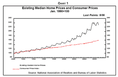
Chart 1. Note the long sweep of this chart plotting from 1990 to Sept 2006 and how these two metrics (median house price and cpi index) were initially parallel and then diverged at an accelerating rate.
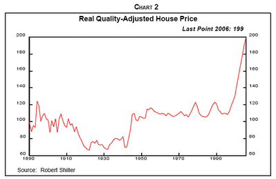
Chart 2. This chart has a sweep that goes all the way back to 1890! Note how relatively stable this metric (Real Quality Adjusted House Price) was from 1950 to about 1995 and the dramatic acceleration in the last 11 years.
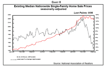
Chart 8. This chart plots from January 2000 through Sept 2006 and shows the Median Nationwide Single Family Home Sale Price in Red and the year over year percentage change in median home sale price in Black (right hand scale). Note the sharp spike up in the year over year percentage change in 2005 and the even sharper spike downward starting about November 2005.
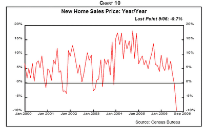
Chart 10. New Home Sales Price year over year percentage change. This chart would be even better if it showed a 3 month or 6 month moving average. Note the slow slope downward starting about January 2004 and the way in which this metric falls off the cliff beginning about June 2006.
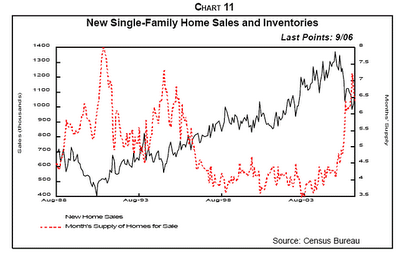
Chart 11. This chart shows the period from August 1988 to Sept 2006. This is a particularly powerful chart. It shows the relationship between total new single family home sales and Months Supply of Homes for sale. Note how the totals sales figure accelerates from about 400,000 per year in 1992 up to about 1.3 million per year in 2005 followed by a drop off to approximately 1 million per year in recent days.
Note also how stable the months supply of inventory is (ranging from 3.5 to 4.5 months) from about 1997 until 2005, and then how this metric skyrockets to over 7 months of inventory in Sept 2006.
Comment: using months of inventory has the effect of accentuating the visual impact of the curve when the sales figure is changing rapidly in either direction as the rate of sales is used in the calculation for months of inventory. A chart showing total inventory compared to total sales would show a similar pattern but with less exaggeration.
You can check out the full article at http://frontlinethoughts.com/ for more details.
I've included a few that I liked best here for reference. The whole article is well worth reading. What I would love to see someone address is how the liquidity growth that we can see in the recently resurrected M3 charts (see previous posts) intersects with the housing market trends.
For example, will the extra liquidity in the system change (or soften) the outcome of these trends?
General Commentary on the Charts. I liked the long time sweep of these charts and how the chart title explicitly included the date of the most recent data point (which is not always obvious in many trend charts). I also liked the way that Gary skillfully used comparison of pairs of variables to bring important features of what is going on more to the surface.
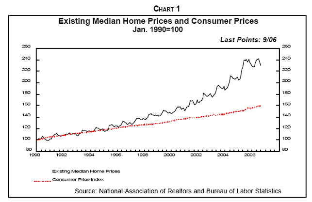
Chart 1. Note the long sweep of this chart plotting from 1990 to Sept 2006 and how these two metrics (median house price and cpi index) were initially parallel and then diverged at an accelerating rate.
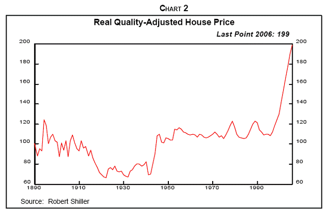
Chart 2. This chart has a sweep that goes all the way back to 1890! Note how relatively stable this metric (Real Quality Adjusted House Price) was from 1950 to about 1995 and the dramatic acceleration in the last 11 years.
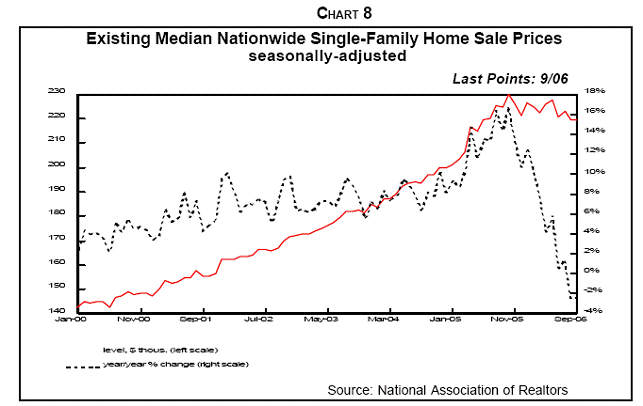
Chart 8. This chart plots from January 2000 through Sept 2006 and shows the Median Nationwide Single Family Home Sale Price in Red and the year over year percentage change in median home sale price in Black (right hand scale). Note the sharp spike up in the year over year percentage change in 2005 and the even sharper spike downward starting about November 2005.
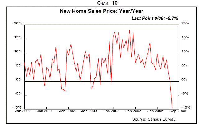
Chart 10. New Home Sales Price year over year percentage change. This chart would be even better if it showed a 3 month or 6 month moving average. Note the slow slope downward starting about January 2004 and the way in which this metric falls off the cliff beginning about June 2006.
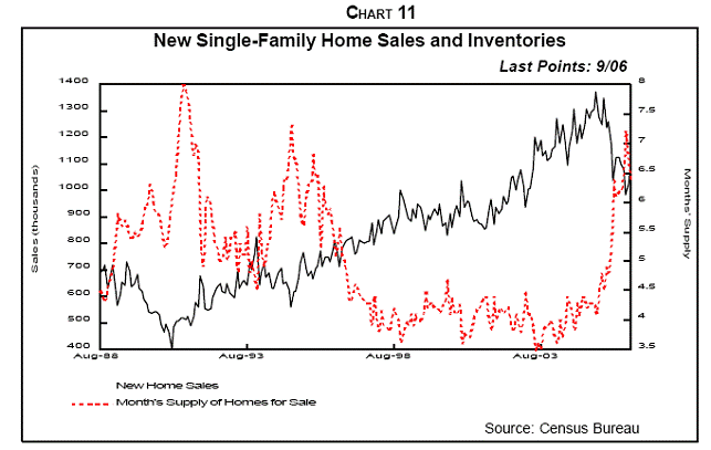
Chart 11. This chart shows the period from August 1988 to Sept 2006. This is a particularly powerful chart. It shows the relationship between total new single family home sales and Months Supply of Homes for sale. Note how the totals sales figure accelerates from about 400,000 per year in 1992 up to about 1.3 million per year in 2005 followed by a drop off to approximately 1 million per year in recent days.
Note also how stable the months supply of inventory is (ranging from 3.5 to 4.5 months) from about 1997 until 2005, and then how this metric skyrockets to over 7 months of inventory in Sept 2006.
Comment: using months of inventory has the effect of accentuating the visual impact of the curve when the sales figure is changing rapidly in either direction as the rate of sales is used in the calculation for months of inventory. A chart showing total inventory compared to total sales would show a similar pattern but with less exaggeration.
You can check out the full article at http://frontlinethoughts.com/ for more details.
Tuesday, November 21, 2006
The Big Picture: The Return of M3
Nice post this morning from Barry Ritholtz over at the Big Picture with some more commentary about the return of M3 money supply trend information . Well worth reading.
The Big Picture: The Return of M3
The Big Picture: The Return of M3
Friday, November 17, 2006
The Return of M3
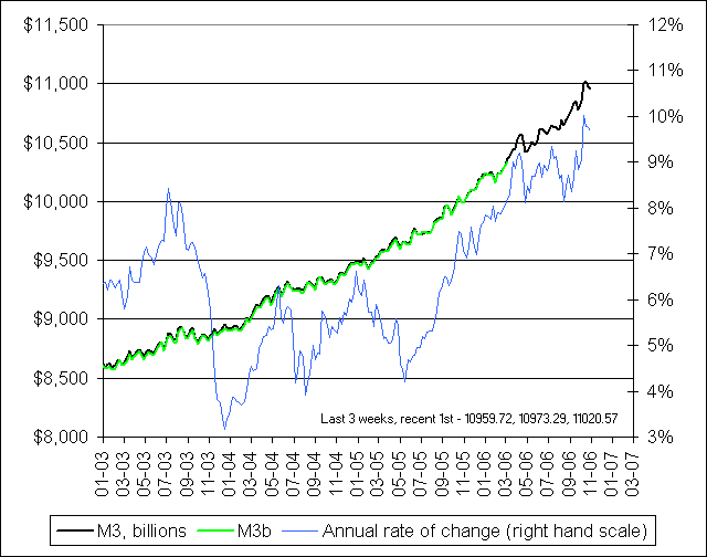 Hat tip to Barry Ritholtz over at The Big Picture for this link to NowAndFutures.Com where they have resurrected the important M3 money supply metric that was unceremoniously dropped by the Federal Reserve earlier this year. It looks like this site has lots of other timeline views of vital metrics that will be worth studying in more detail.
Artful Comparisons Reveal Hidden Meanings
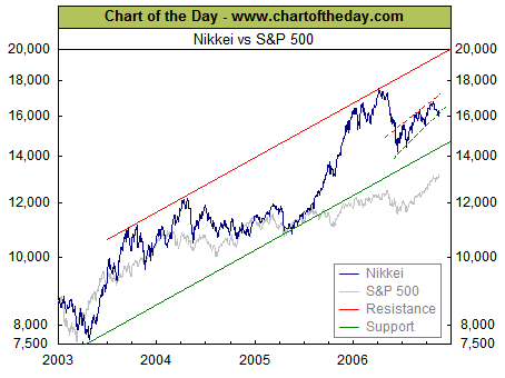
The free weekly posting at Chart of the Day - www.chartoftheday.com is often worth a look. This week's chart is a good example of how artful, carefully selected comparisons can reveal previously hidden meanings. In this case, the performance of the S & P 500 over the last 3 years (shown in grey) is compared to the performance of the Japanese Nikkei large stock index (shown in blue).
The divergence around mid year 2005 is sharp and striking. Also, the same chart makes it easy to see that the mid year 2006 correction was much steeper for the Nikkei and that both the Nikkei and the S & P 500 seem to be driving upward now at about the same rate.
If we zoomed in and looked at just the last year, or just the last 6 months and did the same comparison, different hidden meanings might come to the surface.
Bottom Line: all performance is relative so it's important to have a useful benchmark for making comparisons.
Wednesday, November 15, 2006
Creating new metrics out of thin air
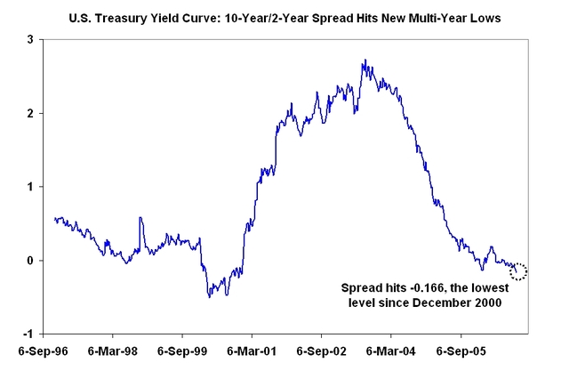
The Big Picture: U.S. Treasury Yield Curve
This is a nice example of how new and important metrics can be created by recombining the values of other metrics. In this case, the 10 year US Treasury yield and the 2 year Treasury yield metrics provide the raw ingredients. The recombination is to simply subtract the 2 year yield from the 10 year yield to get the new variable or "SPREAD" which is then plotted.
This seemingly simple approach brings some trend patterns into clear view where they otherwise might have remained invisible.
My own reading of this chart is that drop off in 2000 was much sharper (almost straight down) whereas the current drop represents a much longer, slower slide into the negative yield curve territories.
To fully understand what's going on, it would be useful to check out some other spreads such the 10 year - 3 months spread. It would also be useful to easily reference the original metrics to see what their trend looks like.
Subscribe to:
Posts (Atom)