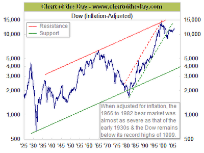
This week's free weekly chart from Chart of the Day is an excellent example of the power available through judicious normalization of trend data. In this case, the folks at Chart of the Day take the trend series for the Dow Jones Industrial Average and combine it with the trend series for inflation (CPI) to produce a new normalized metric: Dow (Inflation-Adjusted). This brings out some hidden nuances that would not be obvious to someone looking at just the Dow and just the CPI trends by themselves.

What do you see in the chart? How does recent behavior (since 2000) compare to your previous understanding of what was happening to the Dow Industrial Average?
In addition to the skillful use of normalization, other excellent features of this chart include the appropriate use of a log scale for the Y axis, the long sweep of time covered by the chart (1925 - 2006), and the drawn in resistance-support trend line ranges for two of the periods. The accompanying text for this Chart of the Day posting also helps direct the attention of the viewer to additional aspects that might not be obvious at first glance.
The key take-away for anyone who knows what the non inflation adjusted Dow chart looks like is how remarkably different a story each of these two views tells. Having both view, gives us a better chance to try to understand what is actually happening.
Other normalized views of the Dow such as Dow in Euros, Dow in Ounces of Gold, Dow in Barrels of Oil might add even more insight.
1 comment:
Post a Comment