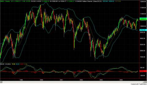
Dow Jones Industrial Average over the past 5 years. (Please CLICK for Full Size Image). This time series picture (denominated in its default of US Dollars) is in marked contrast to the view of the same average denominated in Euros posted earlier today. This picture makes it seem that the Dow has recovered to close to 1999 through 2001 high values. This chart shows a very strong rise from January 2003 through December 2003, a slow drop off during 2004, with a recent sharp rise. Which view is "right"? My sense is that both of these charts have value and help fill in part of the picture. What else do you want to look at after seeing these two charts?
