Monday, December 13, 2004
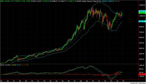
Dow Jones - A 20 Year View
Changing the time scale makes a big difference in the look and feel of a time-series chart. Here's what the Dow Industrials look like over the past 20 years.
Dow Jones - 20 Year View
Compare this to the 5 year view at: http://photos1.blogger.com/img/165/2326/1024/DowJonesAvg5year.jpg or to the the 5 year view normalized and denominated in Euros at: http://photos1.blogger.com/img/165/2326/1024/DOWperEURO5yearsWeekly.jpg. Each tells a different story.
Dow Jones - 20 Year View
Compare this to the 5 year view at: http://photos1.blogger.com/img/165/2326/1024/DowJonesAvg5year.jpg or to the the 5 year view normalized and denominated in Euros at: http://photos1.blogger.com/img/165/2326/1024/DOWperEURO5yearsWeekly.jpg. Each tells a different story.
Subscribe to:
Post Comments (Atom)
No comments:
Post a Comment