Each chart shows 4 trends, 1 for the past 5 years, 1 for the past 10, one for 15 and one for 20 years. It's possible to read off the approximate end value of percentage increase. It's also possible to get a feel for the overall trends by observing the slopes of each trend line.
Note that the Y axis scale max value changes with each chart based on the 20 year curve so the slopes are not directly comparable in this view. .
Update 20 September 2011
Note other updates in this post are highlighted using this same brownish orange text color
Below, we have added some comments regarding what we see as important in each chart. The key takeaways for us are:
- Combining the two ideas of taking a cumulative view and drilling down on sub-components proves itself ot be most useful in helping us discover patterns previously not visible.
- Food inflation turned out much smoother than expected
- Energy was volatile but the cumulative approach still provided meaningful insights not otherwise available
- The wide variation in cumulative effects that we witnessed in Doug Shorts's 12 year chart also showed up in the series of charts below with some factors showing inflation rates far above the average value
- Many new questions were raised by the behavior we saw in the charts such as why are Medical and Tuition rising so relentlessly and smoothly and so fast while other categories show more variability?
Food
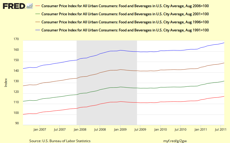 |
| With this long view Food does that seem all that volatile or variable |
In the Food chart, note the steady slope of the trend lines and the quick reversion to trend for the 10,15, 20 year cumulative lines following the most recent recession. If anything it looks as if cumulative food price inflation may be increasing faster than trend (greater slope).
Despite the stated volatility in food prices, when we take a cumulative view, the volatility virtually disappears so in our opinion it is perfectly fine to include Food price inflation in with a composite such as Headline CPI whenever we are using cumulative inflation thinking. .
Energy
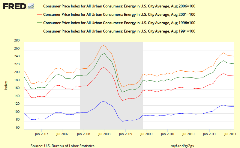
Energy prices undoubtedly have been volatile, especially since 2001. But the cumulative view of this key subcomponent is still the best way to understand energy price inflation and to spot trends when they appear as in the very sharp upswing from 2001 to 2008. It also looks as if following the recent recession, that energy inflation may be trying to revert to the slope of the earlier trend line.
Key take away for me in this chart is the red line which shows doubling in energy prices over the past 10 years.
Gasoline
Key take away for me in this chart is the red line which shows doubling in energy prices over the past 10 years.
Gasoline
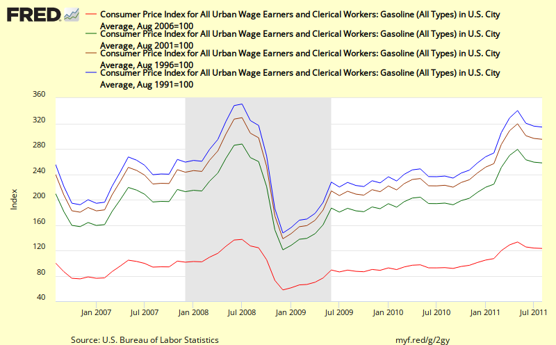
Gasoline inflation shows a pattern quite similar to overall energy but with even higher inflation rates of over 20% or the past 5 years and about by 160% over the past 10 years.
Medical
Medical
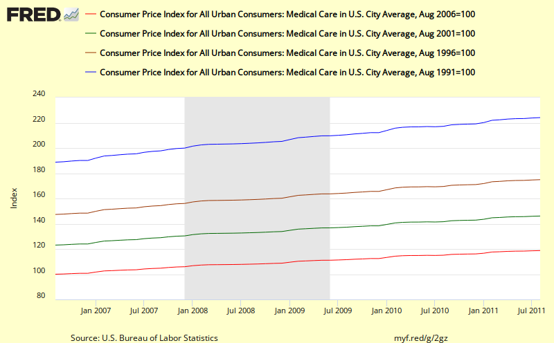
What's striking about this picture of Medical inflation is the absolute smoothness of the lines and the steady slope of each chart and the degree to which medical inflation far exceeds the average Headline CPI inflation.
Why is this so steady and relentless? If we can figure that out, we might be able to do something slow inflation in this category. .
Tuition
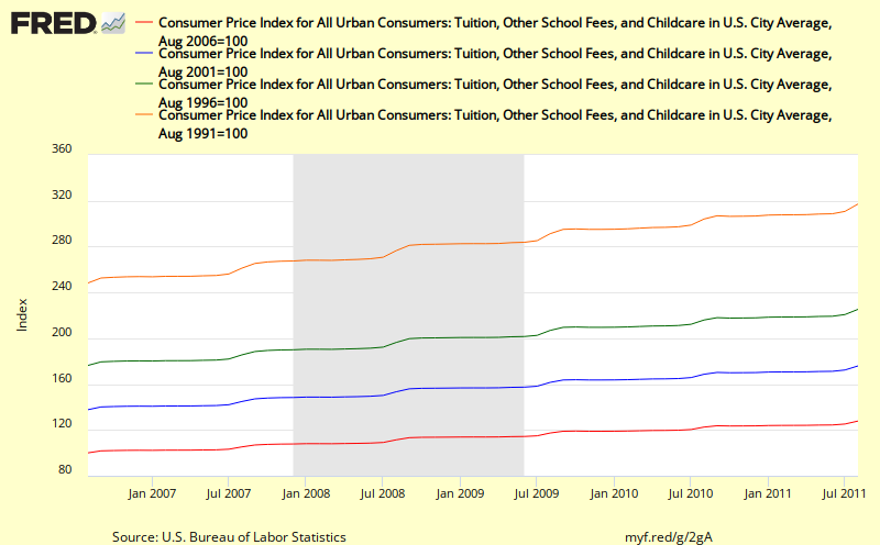
Tuition also shows a relentless upward pattern that looks like it is accelerating and runs far above the average headline cpi values. Why is this so? What is driving it?
Rent

Until 2008, rent also showed a relentless smooth upswing at just slightly above Headline CPI inflation. Following the most recent recession, it now looks like it might be reverting to its old trendline.
Transportation
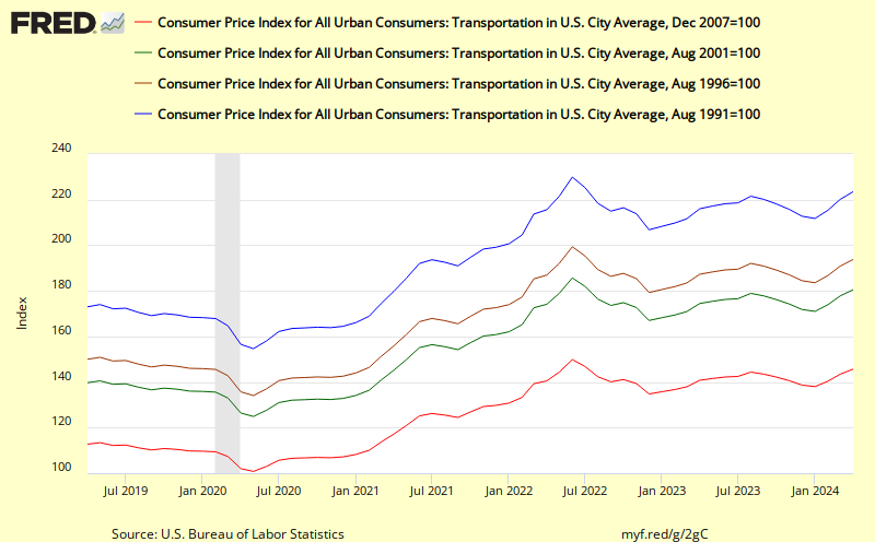
Transportation looks very much like energy and gasoline charts, with more volatility but still some quite claer visible trends and what looks like a reversion to trend following the recent recession.No doubt this is due to the fact that the Transportation cpi includes energy components in a major way.
Public Transportation
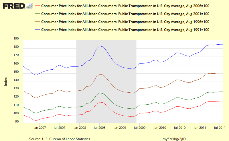
It is interesting to see how different public transportation is from Transportation as a whole. Public Transportation shows a smooth upward trend line despite high month to month volatility with a version to trend line slope following the recent recession. Overall, its cumulative effects are slightly higher than headline cpi
Other Goods and Services
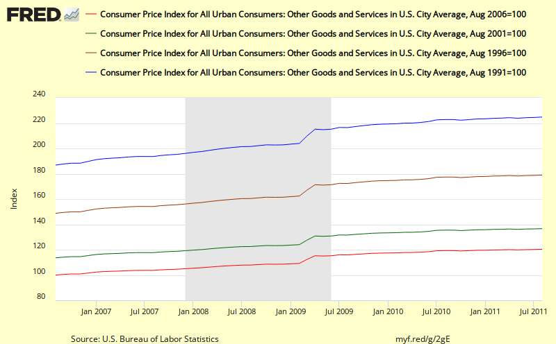
This chart for Other Goods and Services shows some interesting square wave patterns that may be a result of some change in the way this metric is calculated. Overall, the slope of the trend lines are smooth and this sub-category shows substantially higher inflation values than headline cpi
What new insights can we gain by drilling down/disaggregating?
No comments:
Post a Comment